The London Popcorn Co. by B&B Studio
Opinion by Richard Baird Posted 16 January 2017
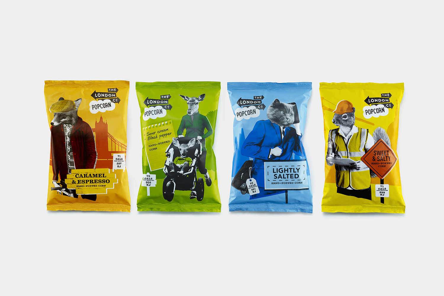
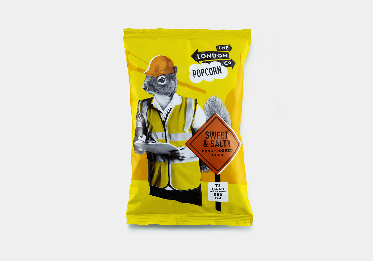
The London Crisp Co., a hand cooked British crisp brand available in local pubs throughout the capital, has expanded to include popcorn. Local graphic design studio and packaging specialists B&B Studio returned to the project that they help establish the visual language for. This time, introducing anthropomorphised animals inspired by what the studio describe as modern London tribes, and include yummy mummies, Hoxton hipsters, hi-vis vesters and city slickers. Popcorn and crisps share a similar collage aesthetic but popcorn features fewer images and more colour coverage across pack.
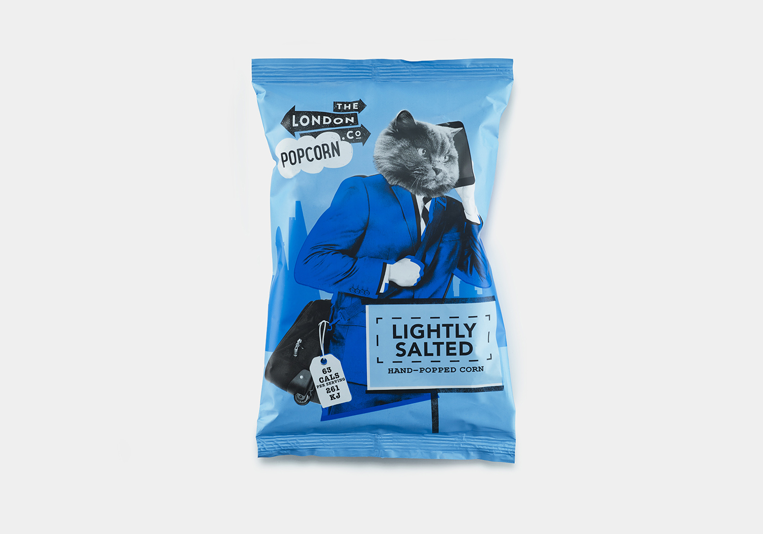
As noted in BP&O’s review of The London Crisp Co. back in 2015, B&B Studio’s direction, absent the brand story you might expect from a small artisan crisp company and avoiding the current favour for reduction, goes all in for a London origin, visual impact and character. This continues through to the popcorn range.
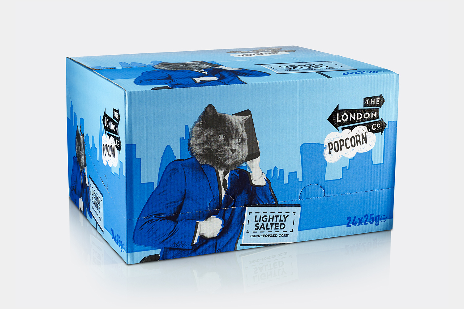
With tongue firmly in cheek, the London Tribes concept is amusing, understandable within the market and well-implemented. There is both commonality and distinction between popcorn and crisps. Both favour a contrast of illustration and photography, but are distinguished by their colour and concept, although this remains firmly rooted in London’s diverse cultural landscape.
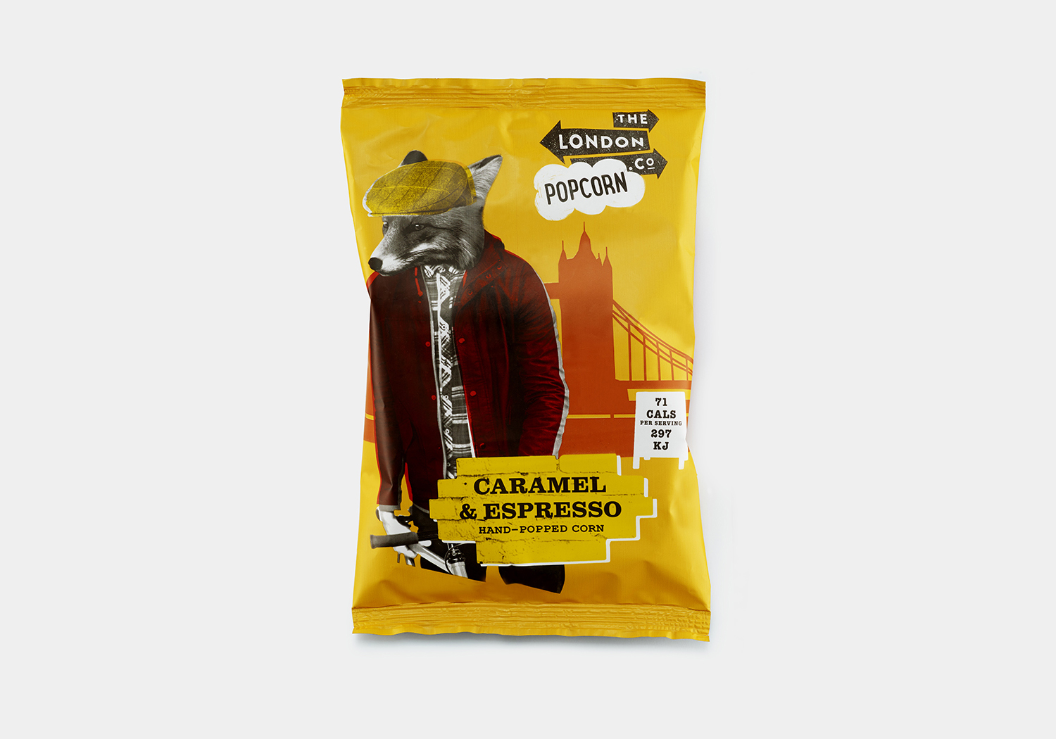
The popcorn range feels far more refined. Simpler in its composition but just as impactful in its juxtaposition of imagery, solid colour and visual texture. This is helped by a clear sense of detailed foreground and the silhouettes that make up the background. There are some neat little details, particularly in the framing of favour and calorie information. Highlights include the exposed brick walls and the sandwich boards of Hoxton.
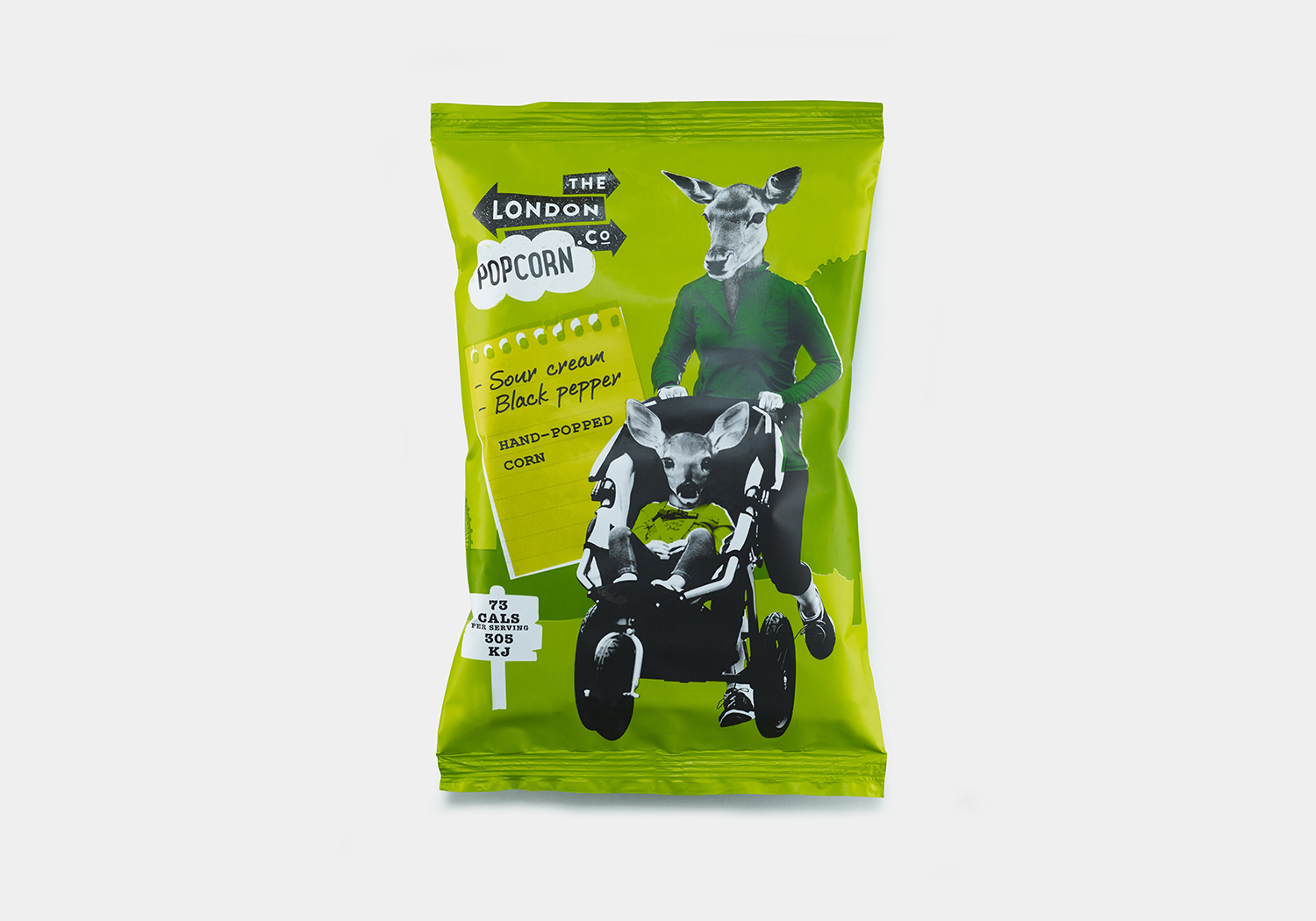
Where crisps favoured white packs and bright overprints, popcorn goes with full ink coverage, and the shades and tints of single hues. Black and white photography, the intentional miss-alignment of ink and a rough compositional style calls to mind something of a British period punk aesthetic, but also in the way it pokes fun at stereotypes. It is these stereotypes, alongside colour, that infuses a familiar aesthetic with something of a playful and modern observational quality, giving relevance to the use of anthropomorphised animals and the idea of “natural” habitats. More from B&B Studio on BP&O.
Design: B&B Studio. Opinion: Richard Baird.
