Black Block Foil
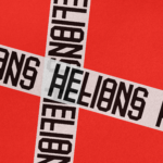
Helions by Pentagram
HELIONS… now that sounds impressive. Something to do with helium atoms and stellar fusion, the force that powers stars? Or perhaps it’s invoking Helios, the Greek god of the sun, blazing his chariot across the sky? Nope – it’s actually a tribute to Helions Bumpstead in Essex, a beneficiary of the British gift for naming that also gave us Pratt’s...
Kettle Kids by Two Times Elliott
The once laudable claim to have started a thriving business with ‘a small loan’ from a doting family member may have been muddied beyond recognition by the truth-stretching of serial tax-offender and part-time Presidential candidate Donald Trump. Despite this, turning ‘one thousand pounds from nan’ into a luxury watch and diamond dealership with a sparkling flagship store in Mayfair remains...
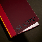
Sucre by DutchScot
It’s always satisfying to see smart, bold new identity designs for a household name brand, often by one of the big name studios: things like the still-hyped 2021 JKR Burger King rebrand; Collins’ Girl Scouts revamp in 2022; Springetts’ fresh look for Ryvita that same year, which makes the much-maligned crispbread seem a lot more palatable. And while such projects...
Stereoscope by Olssøn Barbieri
Oslo-based multi-disciplinary design studio Olssøn Barbieri has created the brand identity for Los Angeles-based speciality coffee roastery Stereoscope, working across its packaging design and printed materials with a typography-led approach that celebrates tactility. According to Olssøn Barbieri, Stereoscope is underpinned by a philosophy that sees coffee as a living organism rather than a commodity, and which takes its responsibility to...

Eadem by Lotta Nieminen
The skincare industry is a varied visual landscape. At one end of the spectrum, brands like Glossier and Soft Services (reviewed July 2022) have found balance in softness and understated minimalism. At the other Dr.Jart+ (reviewed Jan. 2018) and Malin+Goetz bring pharmacy-chic with functional, type-led packaging. And then we have our classic, heritage brands – like Kiehl’s and Elizabeth Arden – which...

Marc Jacobs by Triboro
Fashion designer Marc Jacobs heads his own eponymous fashion brand, as well as diffusion lines The Marc Jacobs and Heaven by Marc Jacobs. He was also creative director at Louis Vuitton from 1997 to 2014, where he created the company’s first ready-to-wear clothing line. In his own words, Jacobs’ work is ‘a little preppy, a little grungy, a little couture’, and this...
Autex Acoustics by Marx Design
With manufacturing and sales teams throughout Australia, UK and the USA, Autex has grown to become the market leader in interior acoustic products in New Zealand, and the go to choice for leading architects aspiring to reduce the amount of atmospheric noise within cutting-edge residential and commercial spaces. Their products are innovative, produced in a variety of forms and colours,...
Metamorphoses by A Practice For Everyday Life
Metamorphoses is a contemporary art gallery that curates unique pieces by makers who turn one thing into another. It takes a special interest in works that are inspired by the past while displaying keen attention to present issues. These pieces, selected by the gallery, are often drawn from a body of work by artists who reflect on aspects of cultural...

Unfolded by Commission
Unfolded is a design and print festival that celebrates the creative work happening across Europe in the disciplines of design, printing and brand communication. This was held by and at The Gmund Paper Factory in Germany on the 9th November 2018. The event created a space for sharing ideas and fostering dialogue between creative individuals, providers of printing services, brand...

Rimowa by Commission
Rimowa is a Cologne-based manufacturer of luxury luggage. It has a significant history, beginning in 1898 as a travel and leather goods maker known for its innovative approach, and growing to become an international brand with a line of polycarbonate and aluminium products with a distincive ribbed relief. Commission worked with Chief Executive Alexandre Arnault and Chief Brand Officer Hector Muelas to create...

Näsby Slottspark by Bedow
Näsby Slottspark is a residential property development located in Täby, a municipality situated north of Stockholm. The development is built around a 17th-century castle and its gardens, and is made up of three distinct structural groupings, Södra Parken, Norra Parken and Strandängarna. Each of these is characterised by a Scandinavian simplicity, lightness and truth to materials inside and out and...

Strömma Arkipelag by 25ah
Strömma Arkipelag is a new residential property project from Swedish developer Innovation Properties, and located in between the inner city and outer archipelago of Stockholm. Strömma Arkipelag offers a unique intersection of modern living spaces and an unspoilt rural environment, with the two interlinked by large windows and a material commonality. This relationship is also expressed by the development’s graphic identity, designed...