Sucre by DutchScot
Opinion by Emily Gosling Posted 13 July 2023
It’s always satisfying to see smart, bold new identity designs for a household name brand, often by one of the big name studios: things like the still-hyped 2021 JKR Burger King rebrand; Collins’ Girl Scouts revamp in 2022; Springetts’ fresh look for Ryvita that same year, which makes the much-maligned crispbread seem a lot more palatable.
And while such projects are surefire design press headline-grabbers, there’s an unspoken sense of the gravity and process of it all: however clever the strategy or striking the new identity is on an aesthetic level, you can feel the layers and layers of process, stakeholder negotiations, boardroom negotiations, corporate red tape.
With projects for smaller entities by smaller studios, however, there’s more light-footedness to it all: the case studies often convey the designers’ delight in working on the project – researching unusual facets of other cultures, or diving into the minutiae of a certain sector; exploring archives; meeting the individuals who’ve made a brand/company/eaterie/gallery, etc. their entire life’s work.
Whether or not they were a true joy to work on is something that we as viewers will likely never know, but there’s certainly a sense of delight and wonderment to this recent work by London-based studio DutchScot for Argentinian restaurant Sucre London.
DutchScot came to work on Sucre’s branding through word of mouth ‘a few years’ ago, having been recommended by a copywriter the studio was sharing a space with. This was before the pandemic hit, and the work was put on hold. ‘For us it was one of those projects that seemed to last forever,’ says Ross Goulden, creative partner at DutchScot.
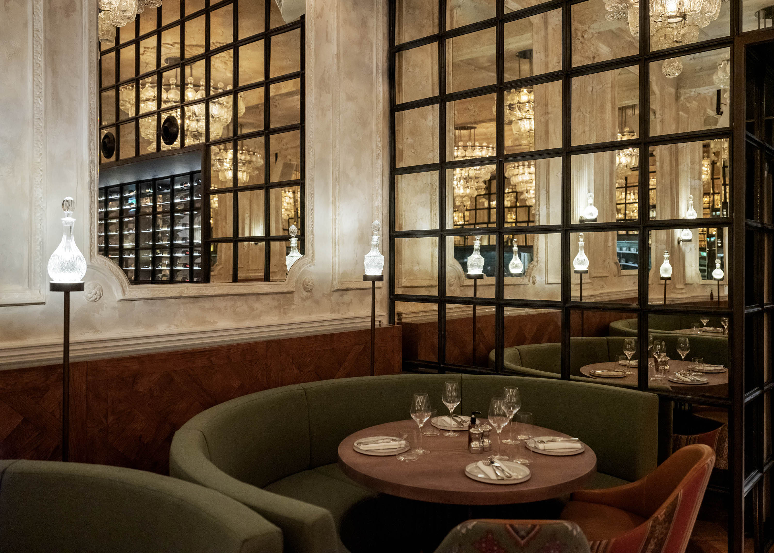
The first branch of Sucre was opened by its chef Fernando Trocca in 2001, and has since become a well-respected staple of the Buenos Aires dining scene, renowned for its use of seasonal, fresh, organic ingredients sourced from local farms, and for its wine cellar. While the Argentina-based branch uses different branding to its London counterpart, the look and feel of the newer UK establishment still had to subtly nod to sucre’s origins on a street called Mariscal Antonio José de Sucre, from which it takes its name.
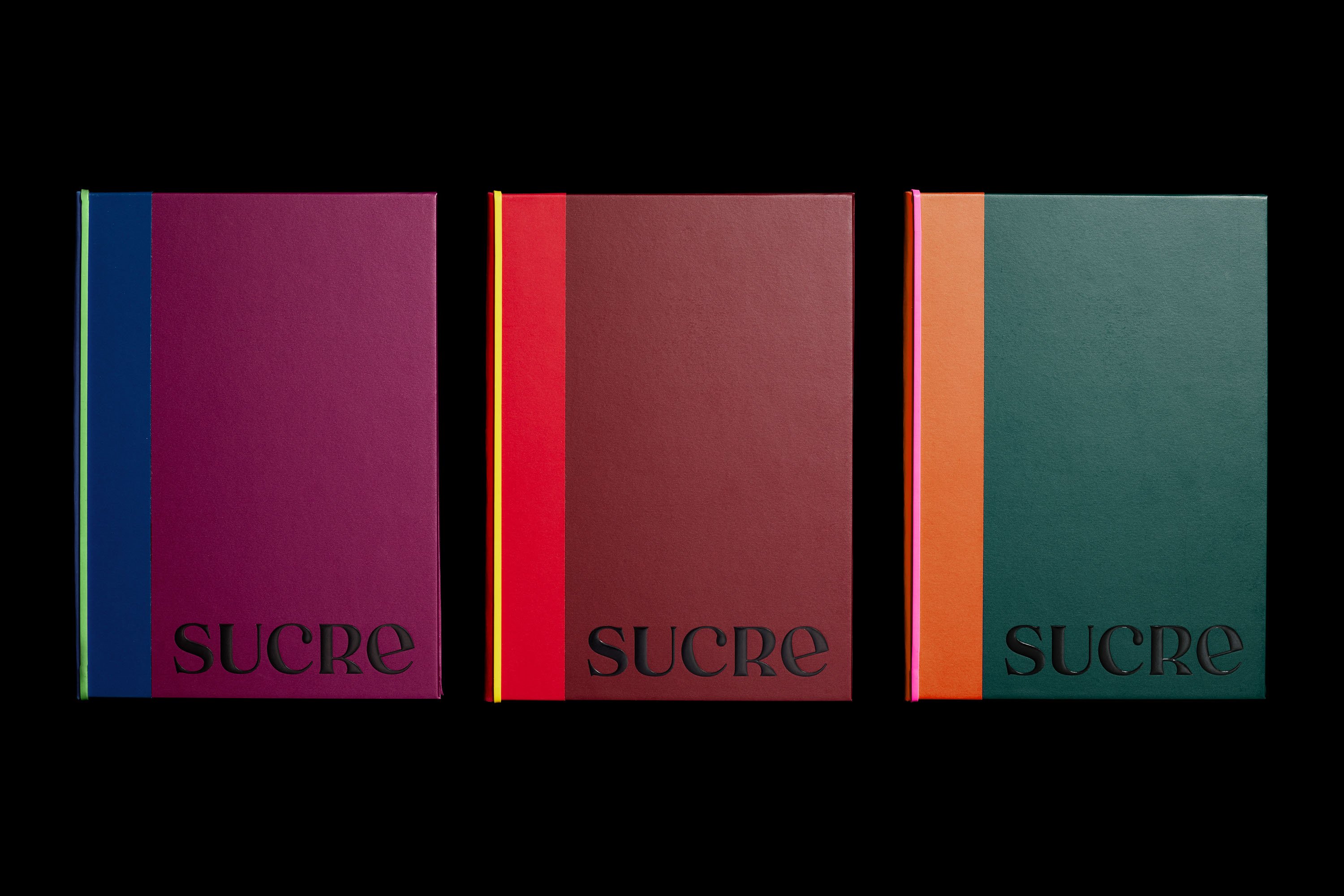
The brief was to create something that spoke of Trocca’s cooking, which like Argentina itself, has many influences, namely Spanish, French and Italian cuisine. ‘Many people think Argentine cooking is basically steaks, and this isn’t the case at all,’ says Goulden, ‘So we needed to be careful about that pitfall.’
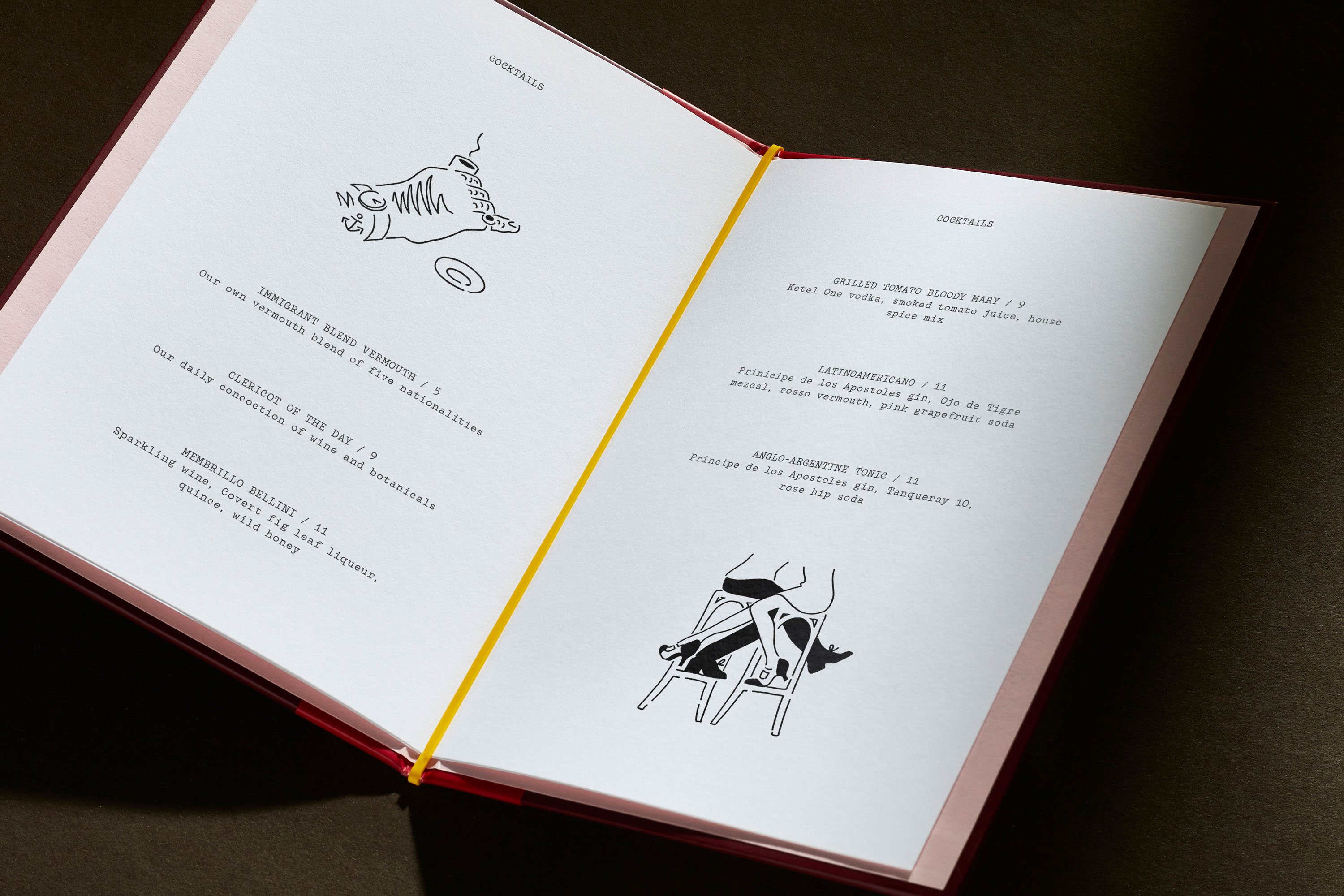
The overall look of the brand identity is a beautiful balance of restraint and ornamentation in all the right places. For the most part, the striking typography of the wordmark does the talking, augmented by charming illustrations by Rebecca Sutherland that use simple black linework and a distinctly hand-wrought feel. DutchScot opted for this illustrative route to convey a sense of ease and charm, ‘almost like little studies of the people of Buenos Aires in a notebook’.
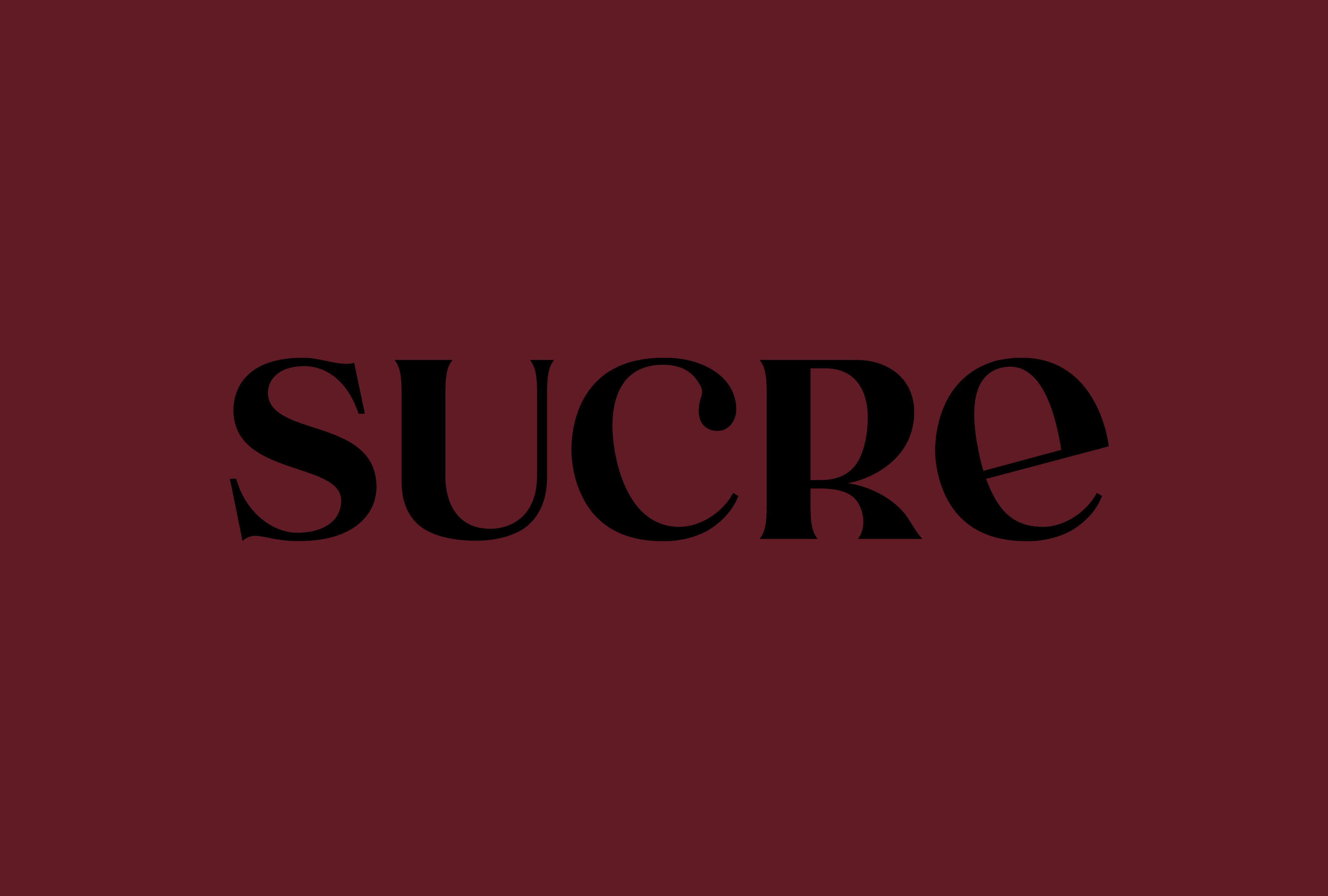
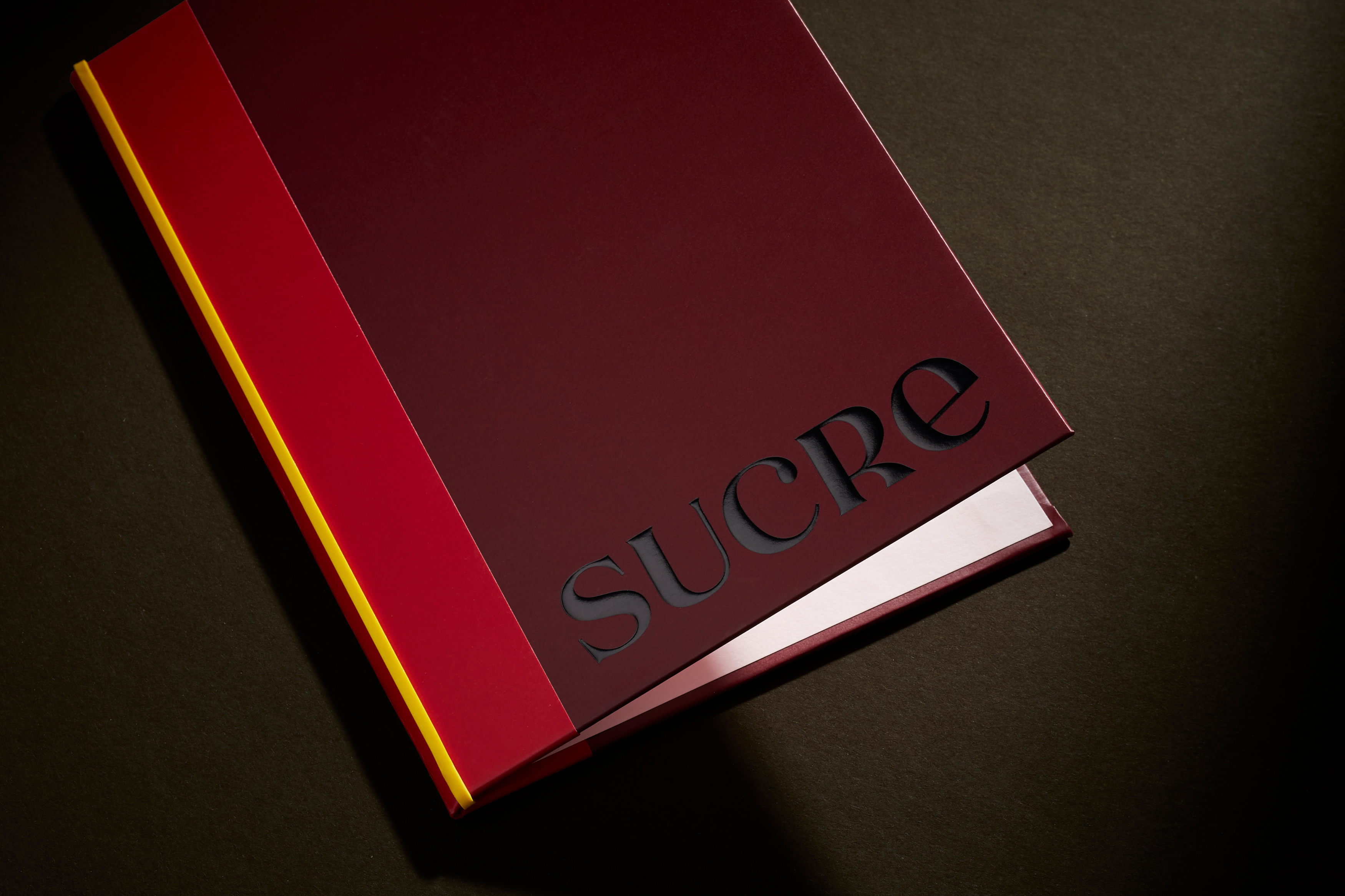
The logo looks to reflect the immigrant background and influences of Trocca and Sucre itself, using contradictory and mismatching elements and carefully crafting these into a new unified expression. The letterforms of the Sucre logo were created as bespoke type, with DutchScot drawing on various found images of old forgotten signage from Spain, Italy and France.
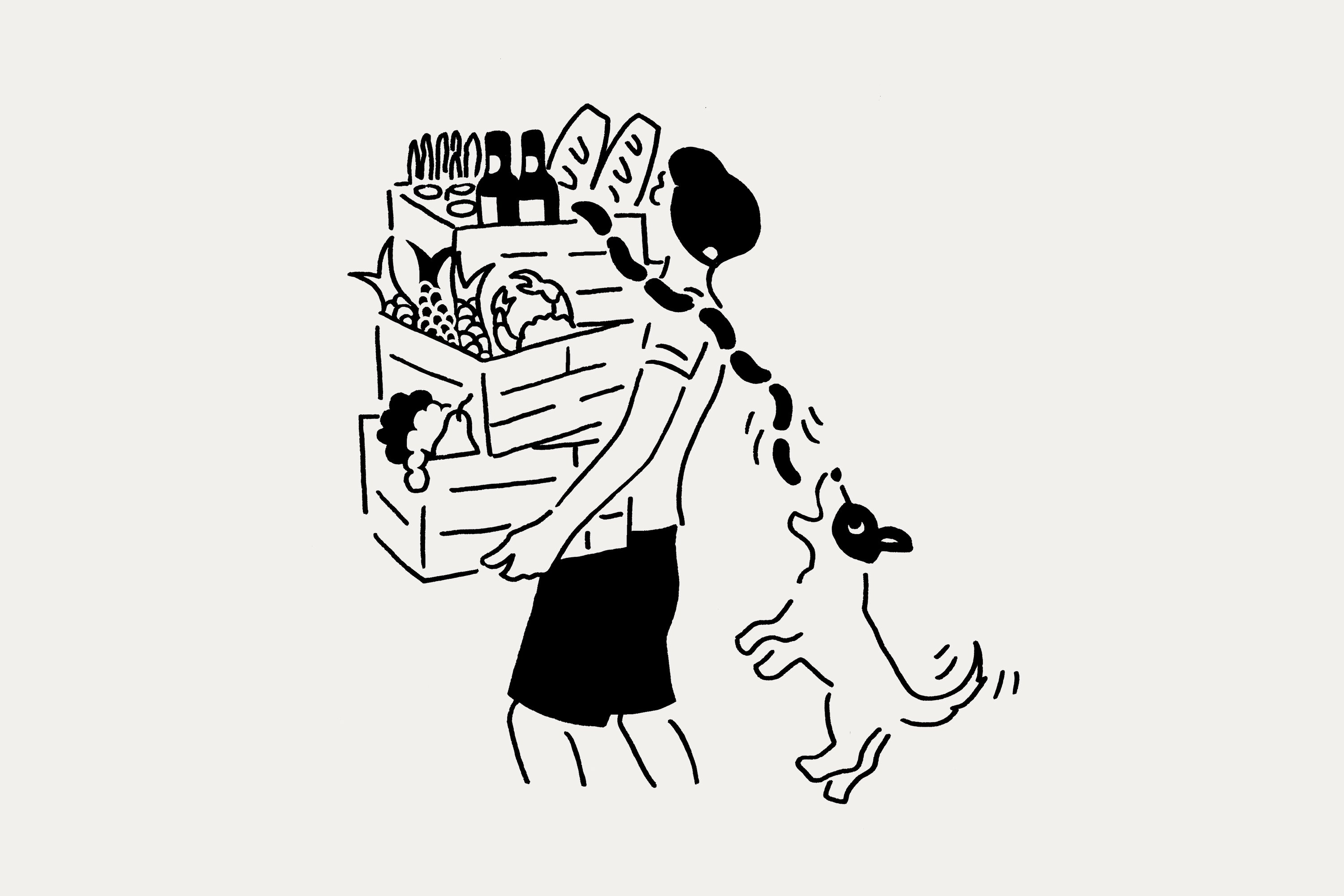
The result is a gorgeous evolution of the now-ubiquitous ‘post-Chobani’ breed of quirky serifs beloved of certain startups and anyone trying (and often failing) to appeal to a certain demographic of older millennial types with the disposable income to spend on things like organic wine and Aesop toiletries. The hefty contrast of stroke weights on the lettering is beautiful, and there’s something beguiling about the mixture of upper and lowercase that isn’t necessarily evident on first glance. It’s effortlessly, subtly quirky; and deftly avoids any semblance of a brand that’s trying too hard to be hip.
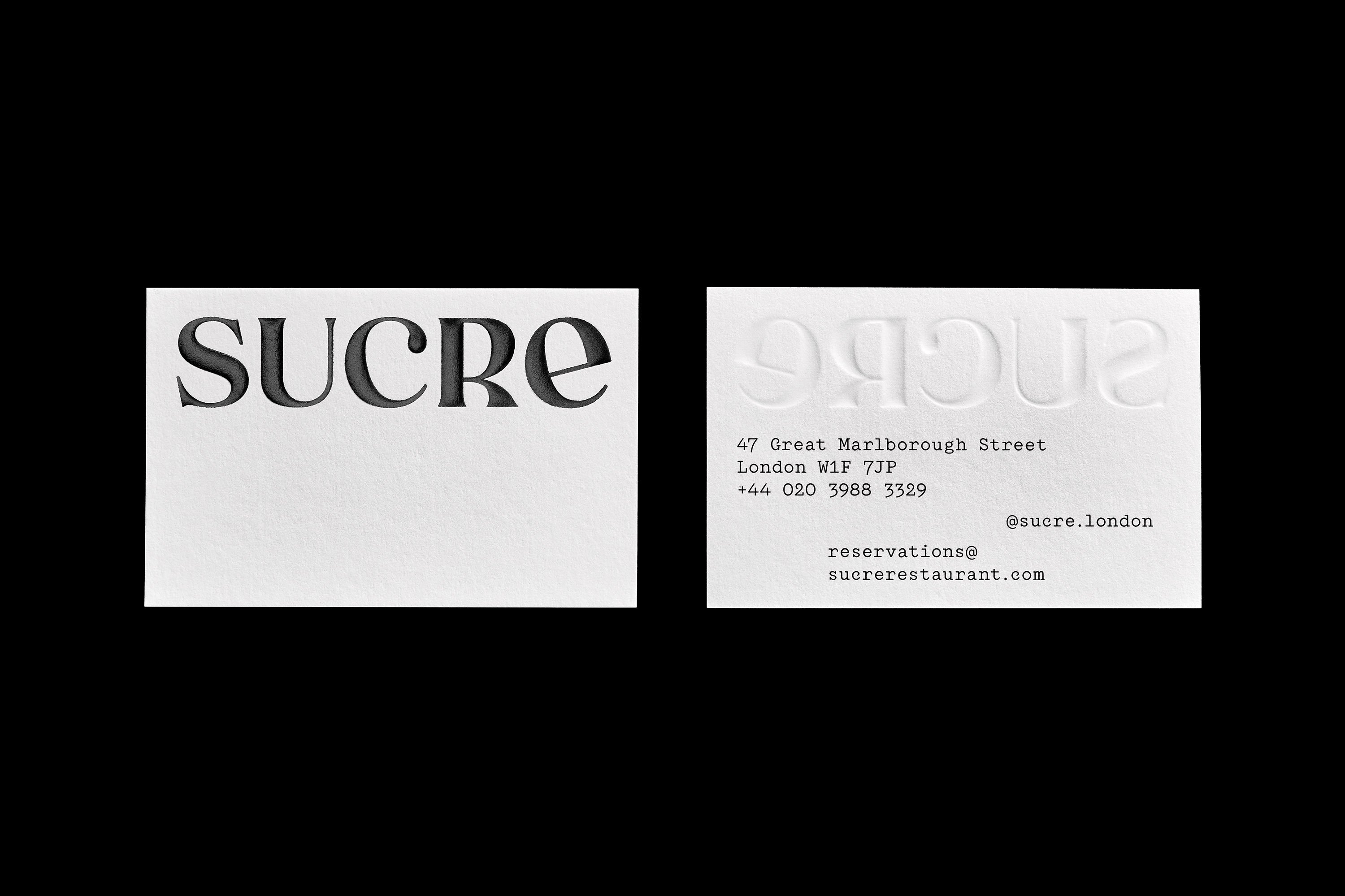
The bespoke type of the wordmark is supported by Colophon foundry’s Garton, which references typewritten lettering from the late 19th century. As such, it’s legible but elegant; mechanical but with a historical twist that makes it feel thoroughly contemporary, but with a gentle dusty patina of classic analogue tradition. Essentially, it’s a font that’s crying out to be used on things like menus. ‘We wanted something simple and unassuming but with a bit of charm of its own,’ says Goulden, and Garton certainly does the trick.
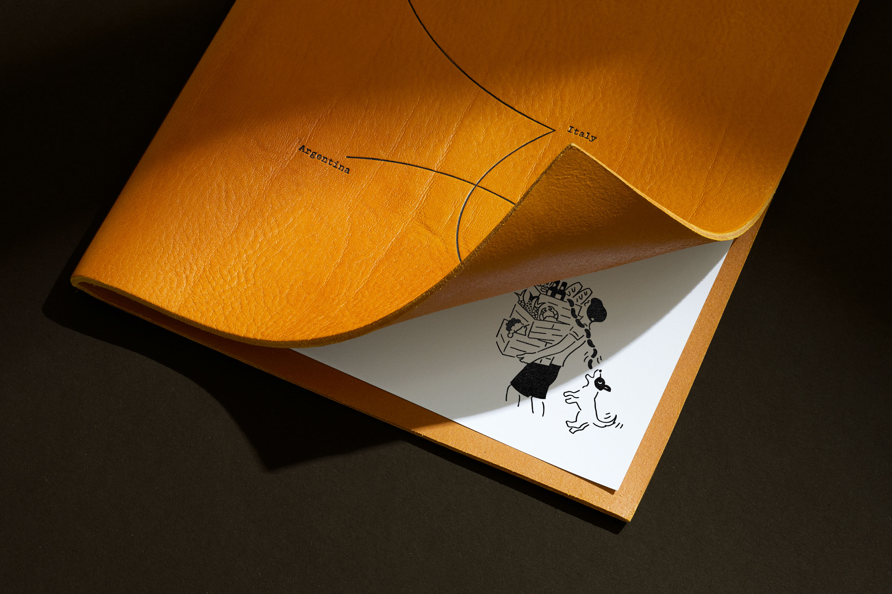
The colour palette for Sucre’s branding was inspired by ‘the colourful fabrics of the Andean people,’ Gouldon continues. ‘The restaurant also has some upholstery that does the same so it was a natural fit.’ Common Argentine tango steps were also studied and used decoratively throughout the branding, which gives it a sense of playfulness and whimsy.
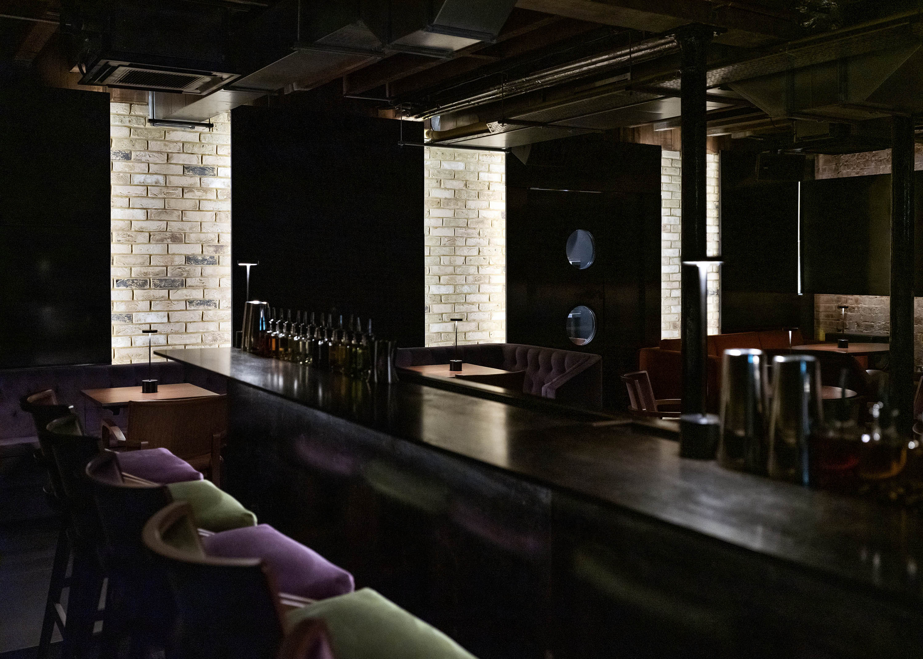
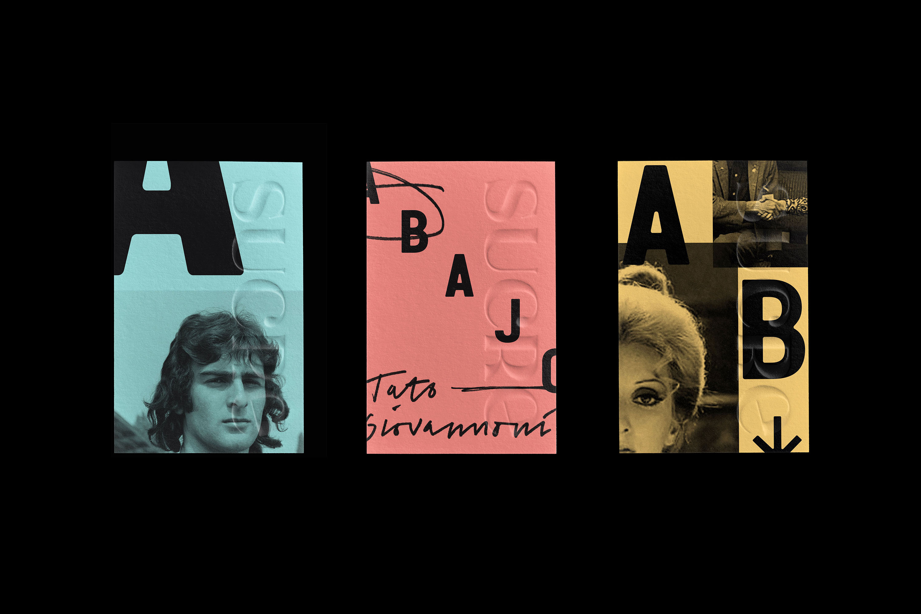
As well as creating the branding for Sucre’s main London restaurant, DutchScot also worked on the branding for its downstairs bar Abajo, which translates to ‘below’ or ‘downstairs’ and is based on the underground spirit of ’80s Buenos Aires. This was a time when Argentina had just left a harsh military dictatorship, leading to an explosion of culture and optimism. But it was also a period when the Argentinian economy was struggling, so to reflect this items from Sucre have been overprinted, ‘in an expression of frugality’.
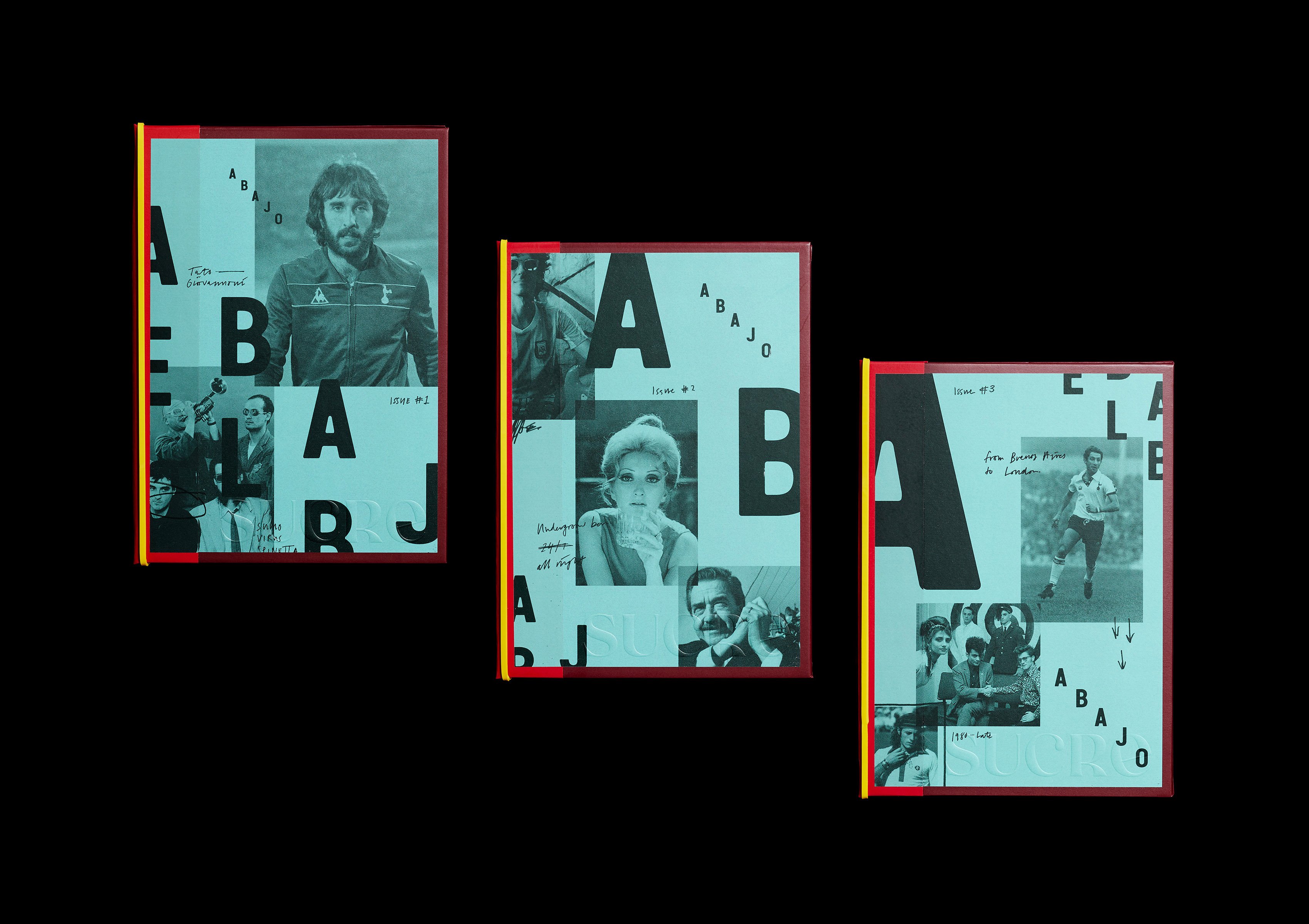
That idea is also reflected in the way the name Abajo is represented with a stepped logo that uses Van Condensed by Portuguese foundry Vanarchiv, a rounded display sans-serif typeface family with a geometric style. The soft corners give it a lo-fi grunge, as if the ink has bled a bit, like the process of printing of homespun fly-posters or zines.
Throughout both spaces, the branding does a brilliant job of uniting various cultures, and bringing Old World influences firmly into the here and now. Nothing seems forced, everything seems breezy and – crucially for something like a restaurant – so charming and intriguing that the designs alone almost dare you not to want to step inside.


