Bookmark Design

Norwich Castle by The Click
The competitive landscape for experiences has been significantly catalysed post-pandemic. Perhaps the sensory deprivation of stay-at-home orders created an intense need to make up for lost time, indulge in all manner of out-of-home activities and platform them. Times have changed. Old needs to feel new and fight on equal footing with what appears to be an endless stream of pop-up...
Whale Tales by Interbrand
Every year an impressive 40,000 humpback whales travel along the Sydney coastline. This annual migration pattern is one of the many awe-inspiring natural spectacles that make the city so unique. It is fitting then, that the New Sydney Waterfront Company chose to revitalise Sydney’s Western Harbour Precinct with an installation of thirty whale tail sculptures, telling thirty individual stories, or...

LCBA by Studio Bergini
Not a new project, but a lovely one nonetheless; it seems there couldn’t have been a more perfect fit for London Centre for Book Arts than Studio Bergini when it was looking for a design team to task with creating its new visual identity. Formed by two Central Saint Martins grads – Norwegian Kristian Hjorth Berge and Italian Francesco Corsini (hence...
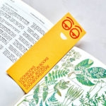
Lookbooks by Studio Lowrie
Lookbooks is an online bookstore that specialises in fun and quirky publications of the past. Recent acquisitions include Old Bohemian and Moravian Jewish Cemeteries by Petr Ehl, Arno Parik & Jiri Fiedler, 1991 and 101 Cake Design by Mary Ford, 1987. There is a cultural value to many of these, reflecting a time and particular niche interest, and how these...

The Architect’s Bookshop by Garbett
The Architect’s Bookshop is a new design-focused retailer, located in Sydney’s Surrey Hills, devoted to the books of architecture and interior design, landscaping and urban development. The space was conceptualised as being more than a bookshop but a place to take time out to browse, a chance to engage with the material and form of the books, and as a place...

New Chapter by Paul Belford Ltd
New Chapter is a UK-based word therapy start-up that offers a unique approach to counselling. This involves participants being invited to express themselves through the written word. The synergy between personal development, a forward momentum and the written word as a mode to achieving this forms the basis of New Chapter’s clever logo design created by Paul Belford Ltd. This appears...

Corps Reviver & L’Heure du Cocktail by Spin
Corps Reviver is a French publisher and revivalist, redesigning and reprinting classic literary works, the first of which is L’Heure du Cocktail, The Cocktail Hour, written by journalists Marcel Requien and Lucien Farnoux-Reynaud and originally published in 1927. L’Heure du Cocktail, at the time, revolutionised the cocktail book, approaching the subject in a new way. This 2017 bilingual edition, presented in French and English,...
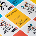
Sant Jordi Festival 2017 by Requena & Capdevila
Sant Jordi Festival is an annual celebration that combines culture and romance, and takes place in the city of Barcelona on April 23rd. The festival honours Sant Jordi, the patron saint of lovers in Catalonia, is rooted in the legend of Sant Jordi and the dragon, and in the tradition of visiting the Chapel of Sant Jordi at Government Palace where a rose...

Galerija Kranjčar by Bunch
Galerija Kranjčar is an art gallery, located at the heart of Zagreb, opened in 2006 to showcase the work of Croatian contemporary artists and function as hub for a variety of cultural activities. The gallery is a long and unique space, one that balances the modern and historic. This can be seen in the meeting of smooth white walls, concrete floor...
Rattis Books by The Counter Press
Rattis Books is a new London-based independent publisher that celebrates the convergence of traditional and modern print processes and has a firm belief that the book is an art object. To help convey this, the publisher worked with design studio, private press and typography workshop The Counter Press to create their brand identity, and the design for their first book Tiro, a collection of football writings....
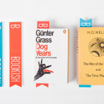
Booki.sh by A Friend Of Mine
Booki.sh is a simple to use facility for the reading and purchasing of ebooks that works across a multitude of platforms. Their new brand identity, developed by Melbourne based design agency A Friend Of Mine created an open aesthetic that blends an illustrative charm, the functionality of the internet and the accessibility of ebooks....