Rattis Books by The Counter Press
Opinion by Richard Baird Posted 12 July 2016
Rattis Books is a new London-based independent publisher that celebrates the convergence of traditional and modern print processes and has a firm belief that the book is an art object. To help convey this, the publisher worked with design studio, private press and typography workshop The Counter Press to create their brand identity, and the design for their first book Tiro, a collection of football writings.
Taking their cues from the name, Latin for raft or ship, and the publisher’s processes and beliefs, The Counter Press created a simple but neat logo and logotype combination, printed this across triplex business cards and weighty bookmarks with a deep impression, and used hand-inked and letterpress elements in their design of Tiro.

You will have to forgive the pun but the logo reads really well as a ship over waves, a book and an R. It is an ambitious combination that is drawn well, with a lovely sense of motion through the lines, and a compact, well-proportioned and nicely balanced structure that comfortable sits at the foot of a book spine.
Conceptually, it works as a metaphor for intellectual discovery and enlightenment, and although there have been a few good book and ship logos designed in the past, this remains distinctive and natural in its combination, and also benefits from a third component, the R.

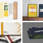
As you would imagine, coming from a typography workshop and private press, the identity, as it exists in print, is a blend of simplicity and materiality with a lovely deep impression across triplex business cards, which have a bound book quality, and across the surface of a thick dyed stock that serves as a branded bookmark.

The logo feels modern in its rendering and ideation. Rather than continuity, and with just two assets, the logotype built from Engravers Roman, which is based on an old letterpress typeface from Stephenson Blake, adds contrast, communicative and visual breadth to identity. The combination of type and mark also, although subtly, feels like a good reference to the use of both modern and traditional technologies and processes in the production of the publishers book’s. This is expressed more explicitly in the production of Trio.

Other neat details include the orientation of the logotype and the placement of the logo within the context of the bookmarks, much like the spine of a book, and the more playful quality of the “You are here”.


For Tiro, The Counter Press used a strong contrast between Commercial Type’s Publico (Text & Headline), and the irregular texture and impact of a variety of unnamed grotesques that, alongside a change in paper colour, function to divide content. Some of these details have been typeset by hand using traditional woodtype, individually hand-inked, printed letterpress and scanned.
Tiro’s production is an articulation of Rattis Books’ love for both traditional and modern production process, and a celebration of these two worlds working harmoniously together. Rattis Books’ logo, although far simpler, is informed by these ideas and serves as a suitable anchor (yep, another pun) from which to link a more diverse brand expression across the canvas of the publisher’s books. More from The Counter Press on BP&O.
Design: The Counter Press. Opinion: Richard Baird. Fonts Used: Engravers Roman.