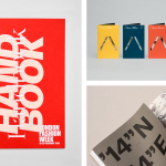
BP&O Collections — Brochures No.7
The seventh collection of brochures, annual reports, catalogues and event programmes published on BP&O. These mix layout, material choice and print finish, and between them effectively utilise colour, type, proportion, image, texture and paper contrast to communicate, compel and contribute to a distinctive graphic identity. This selection features uncoated and coated papers, spot colours, blind deboss and die cuts, and includes...
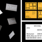
BP&O Collections — Business Cards for Architects
A continually updated collection of business cards designed as part of a broader graphic identity programme for architects, architectural studios, events and specialist retailers, reviewed and published on BP&O. Between them, these typically explore architectural enduring considerations and express these graphically and/or materially. This post moves between a simple use of type and arrangement to those employing dyed boards and...
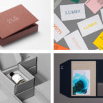
BP&O Collections — Dyed Papers & Boards
A continually updated gallery of graphic identity design work, reviewed and published on BP&O, that feature dyed papers and boards. This post includes work by Richards Partners, Manual and Bond, and covers a variety of projects, from new property developments and architecture publications to coffee and fragrances. Highlights include Socio Design’s mixing of dyed paper and corrugated board, Hey’s colourful...
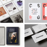
BP&O Collections — Framing
A continually updated gallery of graphic identity design work, reviewed and published on BP&O, that feature the framing of space, image, type or product. This collection includes simple white borders, containers that expand and contract, subtle framing through blind emboss, literal frames created by die cutting, and type used to define or imply a boundary. There are times where a contrast of...
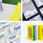
BP&O Collections — From Norway
A round-up of logo, graphic identity and packaging design projects from across Norway reviewed and published on BP&O. Featured studios include Bielke+Yang, Neue and Heydays, and cover a variety of clients from furniture companies and exhibitions to craft beer brands, cafes and restaurants. This collection encompasses simple logo and stationery projects, broader brand identity experiences that include packaging and publications....
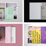
BP&O Collections — Inserts
A continually updated gallery of graphic identity design work, reviewed and published on BP&O, that feature an insert component. Where inserts have traditionally sat loosely within newspapers and magazines, quite separate from content and often adverts, the examples here are bound in and characterised by a proportional difference, either smaller than the cover, punctuating content in size, colour and content,...

BP&O Collections — Still Life
A continually updated gallery of graphic identity design work, reviewed and published on BP&O, that feature a still life component. It brings together those images that elevate product and intend to convey brand story or character, those that seek to express an artistic and craft sensibility, or those that look to convey a sense of play or a conviviality. This...
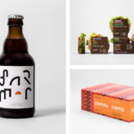
BP&O Collections — From Sweden
A continually updated gallery of some of BP&O’s favourite logo, graphic identity and packaging design projects from across Sweden. Featured studios include Bedow, Bold and BVD, and cover a variety of clients from craft beers, photographers and web developers, to restaurants and retailers. The collection encompasses simple logo and stationery projects, broader graphic identity programmes as well as packaging, record...
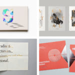
BP&O Collections — Block Foiling
A continually updated gallery of graphic identity and packaging design work, reviewed and published on BP&O, that utilise foil blocking. These include solid, clear and multi-coloured foils, and those that feature micro-structures or sculpted details. This post features work by Studio South, Triboro and Bedow, and covers a variety of projects, from property developments and artists to restaurants and coffee...
BP&O Collections — Wine
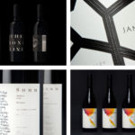
A continually updated gallery that takes a look at the visual, material and structural language of the wine industry, populated by projects reviewed and published on BP&O. This post features work by Inhouse, Mucho and Frost, and covers small and large wineries and their labels, wine events, wine bars and shops. These take a variety of approaches, from the illustrative...
BP&O Collections — Logotypes
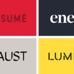
A continually updated collection of logotype’s created as part of a new graphic identity design project, reviewed and published on BP&O. Between them, these highlight how sans-serif simplicity and serif flourish, significant character or subtly, implied or actual motion can contribute to a distinctive and communicative brand identity. This selection includes monolinear, extended, condensed, calligraphic, brush drawn and stencil cut examples, and features...

BP&O Collections — Tote Bags
A continually updated collection of tote bags designed as part of a broader graphic identity programme, reviewed and published on BP&O. Between them, these bring to light how colour, type, form, orientation, layout and contrast can make a standard format distinctive and memorable, contribute to an effective graphic identity and catch the eye from a distance. These can function as an expression...