Ding by Wildish & Co.
When I left the UK and landed in the Czech Republic – my home between 2010 and 2018 – I found a notable difference in advertising and branding between the two countries. Specifically, I saw an abundance of brand mascots. Now, of course, mascots were also used in the UK and have a global historical precedent, but I was struck...
Agua de Madre by Chris Chapman
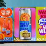
It seems you can’t move for well-designed, wellness-adjacent alcohol-free drinks brands right now. In the past couple of months alone we’ve covered a nightlife inspired Yerba Maté that went hard on Big Drink NRG and Rolus, a new botanically enhanced entry into the (apparently) burgeoning ‘braincare beverage’ category. Making it a hat-trick is London-brewed water kefir brand Agua de Madre’s...
Rolus by Re
Back in the early 00s – the era when arguably Hollyoaks was at its zenith, and bellybutton piercings their most bejeweled – Botox was gradually emerging from the hushed clinics of Harley Street and LA to become part of common parlance. As such, brands cottoned on to the word’s ‘eternal youth’ connotations: I distinctly remember a shampoo ad promising that...
TwelveLabs by Pentagram
Remember when the conversation around gradients was about making ‘bad’ design look ‘better’? When RGB colours were frowned upon because you couldn’t print them? Yeah, those ideas feel a bit outdated now. HP Indigo can now run fluorescents affordably, and business card mock-ups (in RGB) are more about selling than printing. Technology marches on, expectations and standards evolve, and everything...
Hip Pop by Robot Food
Running a design blog sharpens your eye for category conventions. Stick with it long enough, though, and you’ll start to see those conventions unravel. What once felt fixed begins to flex. This creates a challenge for writing about design: you’re constantly assessing the landscape, but that landscape is always shifting. Take minimalism, for example. Once the dominant aesthetic of the...
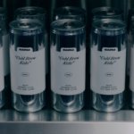
Yaté by Herefor
Long gone are the days when ‘energy drink’ connoted unwashed teenage gamers, amped up Twitch streamers, hungover/still going city boys on the Tube, or 2-4-1 deals on vodka Red Bull in sticky-floored suburban student nightclubs. Like many things – such as reading books, going for a walk, or having a bath – the energy drink sphere has now collided with...
Helions by Pentagram
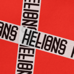
HELIONS… now that sounds impressive. Something to do with helium atoms and stellar fusion, the force that powers stars? Or perhaps it’s invoking Helios, the Greek god of the sun, blazing his chariot across the sky? Nope – it’s actually a tribute to Helions Bumpstead in Essex, a beneficiary of the British gift for naming that also gave us Pratt’s...
Fuku by Red Antler
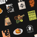
Fuku (no sniggering at the back please) is a ‘fine brining establishment’ – i.e. some sort of eatery, you can safely assume – specialising in a specific type of chicken ‘sando’, or in normal language, ‘sandwich’. According to Red Antler, the Brooklyn based design agency behind Fuku’s branding, ‘the Fuku sando first hit the scene as a secret menu item...
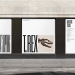
ROM by Leo Burnett
Okay, let’s get it out of the way… yes, there are elements of Pentagram’s 2018 Library of Congress in Leo Burnett’s work for the Royal Ontario Museum (ROM). In both projects, type is a frame for images of archive material. Is it BP&O’s responsibility to acknowledge similarities in all the work we publish, tracking a typology back to the start...
Saaristo by Bond
‘Saaristo’ is the generic term for ‘archipelago’ in Finnish, but – to the outside world – it’s sufficiently distinctive to refer to the entire region in Western Finland, which now makes up a new tourism brand. This brand intends to generate more interest in (and visitors to) the world’s largest archipelago: a collection of 40,000 islands. This scale makes it...
Suupaa by A Friend of Mine
There isn’t a shortage of well-executed, interesting branding projects out there – ones that are joyful, witty, slick, or just perfectly fit a brief – which do their job perfectly. But 99% of the time, you can sort of see where they came from – the broader cultural spheres they’re playing into (nostalgia; fauxstalgia; irony, for instance) or the wider...
North Road by Manual
Independent content studio North Road was founded in 2022 to unite a portfolio of companies covering everything from scripted entertainment (‘Chernin Entertainment’) and non-scripted content (‘Kinetic Content’) to non-fiction productions (under ‘Words + Pictures’). Across these entities, North Road is one of the largest global suppliers of TV and film content, and is able to work on over 70 active...