Branding
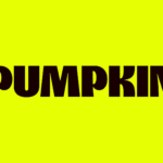
Pumpkin by Kuba & Friends
Another week, another branding project for those – love them or loathe them – ‘pet parents’. I honestly thought we were post-pet-parent, but seemingly we’re still very much in the midst of that icky phrasing – the “live, love, laugh” of dogs, a sort of endless bottomless brunch with the #girlies. I’m an ‘elder millennial’, but it all seems disgustingly,...

Six Six by A Friend of Mine
Six Six is an eyewear store and optometrist based in Melbourne, which opened early this year with the aim to be “more like a destination than a store”. Tasked with creating the brand identity to make that happen was A Friend of Mine, or AFOL for short (Embla, Great Wrap, Suupaa), a brand design studio also based in Melbourne which...
Nu-clear your skin
Juana is a Dubai-based company creating CBD-based “bioactive” skincare, founded by Yann Moujawaz Martini, a French-born entrepreneur with Syrian roots and a background in brand strategy or – as he himself put it in an interview – “a decade designing multibillion-dollar wellness and medical tourism mega-projects for governments and Fortune 500s”, after which, he says, he “flipped the script” and...
Off-kilter and elevated
St Paul’s Cathedral is undoubtedly one of the most iconic, recognisable landmarks of London’s skyline: its vast dome, all beautiful copper-tarnished turquoise, resplendent with dazzlingly golden pineapples (one of its architect Sir Christopher Wren’s favourite accoutrements, and back in the 17th century a distinct status symbol representing all that was bountiful and exotic). Until 1963, St Paul’s was the tallest...
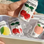
Gaptooth Soda by Saint Urbain
One person’s imperfection is another’s luck– especially, it turns out, when it comes to teeth. The front-tooth-gap, as exemplified and celebrated by the likes of Madonna (and, it turns out, Chaucer’s famously, unabashedly lustful “gap-toothed” Wife of Bath) is known in more scientific or medical terms as a ‘diastema’. Many see this aesthetic dental quirk as attractive; others not so...
Cute, curious and cuddly
Fitness and health tracking apps are not generally known for their sense of fun. The likes of MyFitnessPal, while great in terms of functionality, for the most part, keep the design stuff resolutely serious, no-nonsense, and perfunctory. Meanwhile the likes of Strava elicit joy through very few things, the main one being when people decide to run in a shape...
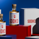
Like, so retro, but so the future
There’s really so little not to love about this branding for Sooki – in fact, I’d go as far as saying there’s nothing not to love. It’s purely, and simply, gorgeous; every goddam inch of it. Kudos, then, to The Collected Works, the New York City- and New Orleans-based independent design studio behind the identity design created to bring Sooki...
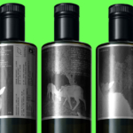
Where fallow deer roam
Deer feel like unlikely ambassadors/ mascots/ PosterCreatures for olive oil, but it turns out they work brilliantly – when, that is, in the superlatively capable hands of a studio like SMLXL. Said olive oil is D’arbequina, a name which more broadly simply refers to the sort of plant from which the oil is produced: Arbequina is a widely cultivated olive...
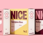
Pink! pink! everywhere!
Wine company Nice started life in 2019, and ever since, has aimed to be a far more straightforward alternative to the wildly confusing, jargon-packed, somewhat stuffy world of wine. In Nice’s words, the whole idea is to “liberate drinkers from wine headaches” both literal and metaphorical, “whether it’s inflexible packaging, confusing labels or next day regret”… Now after more than...
Goofy, playful and knowingly a bit silly
Design systems are often spoken about in terms of those moments of ‘surprise and delight’, but often, there’s little either surprising or delightful to be found. Blurr Bureau’s new brand identity for Yes! Apples, however, is so brimming with surprise and delight that those moments become the entire timeframe here: the Easter Eggs absolutely abound here, for the brand design...
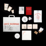
An act of restitution
Caffè Nazionale is a historic bar on Piazza Libertà in Arzignano, a small city in Veneto, Italy, which was the social heart of the town – a place for conversation, card games, billiards, and the daily ritual of an espresso at the bar – for generations, before falling into closure and decline. Having first opened in the 1950s, the Caffè...
Gloopy, bubbly, occasionally borderline illegible
It’s always confusing, surprising and slightly disappointing when you come across art or design-focused brands, agencies, platforms, publications or organisations that seem to have a total disregard for what they look like – as though their own central premise and raison d’etre is at odds with their look and feel. I won’t name names, because that feels both mean and...