Colorplan Embossed Paper
Yumn by Filthymedia
Yumn is a casual luxury restaurant located within Croydon’s Boxpark, a pop-up mall for independent and global fashion and lifestyle stores, cafes and restaurants, housed within converted shipping containers. Yumn is a smaller and more intimate version of Yumn Brasserie with a similar approach to interior in its mix of blue pinned leather upholstered seating and high quality finishes, but shares...
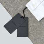
Helbers by Only
Helbers is a Parisian menswear label created by Paul Helbers, the former Head of Menswear at Maison Margiela and ex-Menswear Director at Louis Vuitton. The label has a carefully curated lookbook of garments and footwear with an unpolished elegance, and feature a subtle contrast of materials. Helbers has secured early acclaim for his AW16 collection, and is due to appear in stores around the world in the coming weeks. Paul worked with Leeds-based...
Linden Staub by Bibliothèque
Linden Stuab is a UK-based model agency challenging industry conventions with their mantra ‘Empowering Women’, and by acting as a mother agency to all of their models. The name Linden Staub, derived from the maiden names of the two founding partner’s mothers, is an expression of this, and alongside the agency’s strong human-focus, was the basis for their new brand identity, created...
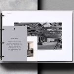
Wenford Dries by ico Design
Wenford Dries is a new property development in the scenic area of North Cornwall. It will be made up of loft-style homes, artist studios, allotments and wild gardens, set on the site, and within the structure of, a former clay drying factory that dates back to the beginning of the 20th century. This is said to have been sensitively restored. The development is billed as...
Johnny Roxburgh by Bunch
Johnny Roxburgh is an entertainer and party designer working with the rich and famous nationally and internationally. He has over thirty years of experience and has held a royal warrant for the last nine. In the words of The Scotsman, Johnny is capable of turning the whims and fancies of the world’s wealthiest one percent into glittering realities. These have included, but are certainly not limited...
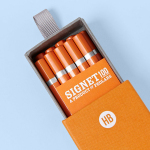
Signet 100 HB Pencils by Well Made Studio
Signet is a new pencil range developed by British home, outdoor and lifestyle retailer Pedlars, who applied their expertise to an own-brand product line following a lengthy international search for the perfect pencil. 100, the first of the Signet range and launched in November this year, is made from American basswood, finished in orange with a silver foil detail and crafted by a long-established family-run business...
The Empire Café by Graphical House
The Empire Café is a pop-up venue located in Glasgow’s Merchant City that looks to explore Scotland’s relationship with the North Atlantic slave trade through coffee, sugar, tea, cotton, music, visual art, poetry, debate, workshops, walks, film and literature. The café’s brand identity, a ship-like logo, bold sans-serif typography and both a limited and rich approach to print, designed by Graphical House, is described as linking a contemporary ‘artistic programme...
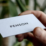
Penson Group by She Was Only
Penson is an award-winning interior design firm that help businesses to achieve their “cultural and commercial ambitions” by replacing dull and inefficient spaces with those that are beautiful and intelligent. Penson’s new visual identity, developed by London based design studio She Was Only to coincide with the firm’s 10th anniversary, delivers what the studio describe as a “clean and confident solution”, consistently executed, that better...
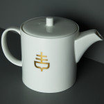
G . F Smith by Made Thought
G . F Smith is an independent British paper merchant with a heritage dating back to 1885 and a loyal staff, some of whom have provided over 20 years of loyal service. Made Thought, the design studio behind the visual identity for G . F Smith’s distinctive Colorplan range, were recently commissioned to develop a new brand identity for the company that would better...
Helsinki Food Company designed by Werklig
The Helsinki Food Company provides design and production services – including consultation, styling, photography and recipe development – to regional broadcast, print and event sectors. Created by visual communications agency Werklig, their visual identity – an economical single colour print treatment of a logo-type constructed from a single consistent line weight and culinary-related letter-forms across a variety of tactile and dyed craft substrates – sets...