The Empire Café by Graphical House
Opinion by Richard Baird Posted 30 July 2014
The Empire Café is a pop-up venue located in Glasgow’s Merchant City that looks to explore Scotland’s relationship with the North Atlantic slave trade through coffee, sugar, tea, cotton, music, visual art, poetry, debate, workshops, walks, film and literature. The café’s brand identity, a ship-like logo, bold sans-serif typography and both a limited and rich approach to print, designed by Graphical House, is described as linking a contemporary ‘artistic programme and poetry anthology with contributors gathered from across the Commonwealth’, and references cross sea trade of the past.

Graphical House’s treatment is a distinctive contrast of contemporary economy and restraint — delivered through type, shape, plenty of white space and a single ink — and traditional luxury — in the use of high quality dyed paper and print finish — that provokes thought with regards to the necessity and origins of many of our current and historical imports, and the themes explored as part of the café’s programme.


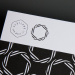
The bold, uppercase, sans-serif logotype is well spaced, the absence of stroke contrast and simple letter shapes leaves it largely neutral but with a subtle retrospective sensibility in its stacking. A similarly weighted logo-mark is well realised with a current on-trend sensibility but clearly draws on the shipping history of the country. The economy of form that binds both assets feels appropriate for the transient nature of a pop-up venue, balances a contemporary restraint with old world reference, provides a solid foundation for a number of finishes and is strong enough withstand a logo-centric application across cushions, ceramics, tables, print and website.

The simplicity of the logo and logotype, the use of white paper and a black ink austerity across some of the print work, and the functional modern furniture of the venue are juxtaposed alongside the high quality and flourish of gold stitched and gold leaf detail, an anthology of dyed paper and foil finish, and the café’s temporary location — a bold stone exterior in Merchant City that has a sense of Empire and an intentional irony within the context of the programme.
Design: Graphical House
Opinion: Richard Baird
Fonts Used: Caslon & Trade Gothic Next


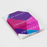
A poster that combines the texture of Colorplan’s candy pink paper with a coltskin emboss, a large gold and clear foil print finish, acutely draws together the ideas that proliferate the other print work, brand identity and choice of venue, with a clear exposé of continued exploitation, and almost feels aesthetically a little much in a way that is intentional and provocative. The poster is available from Graphical Houses’s shop with all profits going to AntiSlavery.org.
Design: Graphical House
Opinion: Richard Baird