Cold Pressed
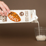
Bruce Juice by Marx Design
Bruce Juice is a 100% raw, cold pressed, fruit juice and plant milk brand new to the Australian market. It launched this year with five juice and vegetable blends, Red, Redder, Orange, Greener, Golden and Nutter, an almond milk, and a packaging and visual identity treatment by New Zealand based graphic design studio Marx Design. Using a mix of illustration and texture, loose hand drawn logotype and custom typography, bright...
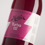
Mother Cold Pressed Juice by Mucho
Mother creates fresh cold pressed juices, milks, smoothies, cereal bars, snacks and detox systems from its location at the centre of Barcelona. Mother recently commissioned design studio Mucho to develop a name, visual identity and packaging treatment that would help express the love and care they put into crafting their range and the technological and industrial processes required to produce them....
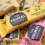
The Primal Kitchen by Midday
The Primal Kitchen is a UK based health food brand founded by nutritionist Suzie Walker with the intention of making the paleo lifestyle, a modern nutritional plan based on the presumed diet of Paleolithic humans, easier and more accessible. The Primal Kitchen commissioned design studio Midday to create a visual identity for the brand which would extend across the packaging for its cold pressed...
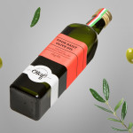
Olaf Olive Oil by Anagrama
Olaf is a Mexican cold-pressed extra-virgin olive oil produced by Olivarera Italo-Mexicana – a Mexican Italian collaboration – intended for healthy, home-cooked, family meals and makes up one-third of Olivarera ‘s olive oil range, which also includes Valentto and Olive Gold. Anagrama, the design agency behind Olaf’s new visual identity, print materials and packaging, describe their approach as taking “typical Italian visual clichés...
Valentto Olive Oil by Anagrama
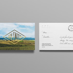
Valentto is a Mexican cold-pressed virgin olive oil produced by Olivarera Italo-Mexicana – a Mexican Italian collaboration – created for commercial kitchen and restaurant use. Multidisciplinary design agency Anagrama recently developed a new brand identity and packaging solution for Valentto that juxtaposes the natural detail of Italian landscapes alongside the industrial utility of a square tin structural choice, described by Anagrama as being...