Colour in Use: Yellow
Yum Bun by How&How
Arguably London’s street food scene has become less a ‘scene’, more a network of long queues sprawling their way across the capital faster than you can say ‘SEVEN pounds! For some strawberries!’ From Borough to Barbican’s Whitecross Street, Spitalfields to Southbank, Camden to Covent Garden; the menus are global, the prices hefty, the hype palpable, and the branding overwhelmingly forgettable....

Yellowbird by Gander
Sauces, oils, seasonings and condiments are consistently thriving categories in direct-to-consumer packaged goods. These high-margin, shelf-stable products can be easily differentiated with unique flavours and ingredients, and have high branding potential that can quickly adapt to trends. Right now, hot sauce its having its moment, with celebrities from Ed Sheeran to Brooklyn Beckham jumping on the band wagon, following trailblazers...
Isle of Wight Tomatoes by B&B Studio
Having grown up near Portsmouth, the Isle of Wight carries a certain resonance, though perhaps unfairly. Aged around 14, when getting served in off licences/particularly lax pubs wasn’t always a given, we’d sometimes pass the time watching the IoW ferry. It felt rather bleak, and somehow a bit futile, just bobbing back and forth between two destinations (Southampton and Cowes)...

Kindred Black by Ania et Lucie
There has always been something borderline magical about the fields of beauty, makeup and skincare – a hint of esoteric or mystical knowledge. When it comes to visual storytelling, this association offers plenty of rich inspiration, along with established style signifiers that are easy to follow. Nods to old-school apothecaries abound in the likes of Typology Paris and Le Labo,...
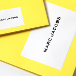
Marc Jacobs by Triboro
Fashion designer Marc Jacobs heads his own eponymous fashion brand, as well as diffusion lines The Marc Jacobs and Heaven by Marc Jacobs. He was also creative director at Louis Vuitton from 1997 to 2014, where he created the company’s first ready-to-wear clothing line. In his own words, Jacobs’ work is ‘a little preppy, a little grungy, a little couture’, and this...
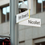
Nicollet by Pentagram
Nicollet Avenue runs between Loring Park and the Mississippi River and is described as the “Main Street” of downtown Minneapolis. It is a cultural and commercial centre, shopping and dining district, and home to flagship stores, major corporations, public transport hubs and landmarks. Nicollet Avenue also includes the Nicollet Mall, the first transit mall in the US, originally opened across eight blocks in 1967...

Dr Jart+ by Pentagram
Dr Jart+ is a South Korean skincare brand that formulates its various ranges to tackle specific conditions, and derives its name from the positioning phrase “Doctor Joins Art”, an articulation of the brand’s unique fusion of dermatological science and art, presumably, something along the lines of pragmatism combined with creative leaps. The balance between the psychological and physiological components of skincare—internal...

Don Alonso de Suquía by Bermudez, Porta & Casasus
A. Lozano Rodríguez, in his novella Don Alonso de Suquía, writes of the deeds of swordsman and fictional character Don Alonso de Suquía after the reconquest of Granada, at the beginning of the 16th century. This limited edition cover, designed by Barcelona-based Carlos Bermudez, Albert Porta and Guillem Casasus, touches upon location, period, theme and limited edition context using colour, type, material and finish....

Modern by Dwell Magazine by Collins
Modern by Dwell Magazine is a new range of home decor products, tablewear and furnishings for those who want to create a welcoming space with a modern aesthetic. It is a collaborative project between design and architecture magazine Dwell, designers Chris Deam and Nick Dine of Deam+Dine, and the American retailer Target. The range features over 120 products. From chairs, tables and glassware to kitchen utensils,...
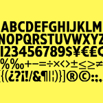
Have A Great Day Films by Hey
Have A Great Day Films is the production company of French filmmaker Jérôme de Gerlache. Jérôme is said to have a taste for professional risk-taking and a distinct way of making short films, advertisements and TV comedies. Barcelona based graphic design studio Hey recently worked with Have A Great Day Films to develop a brand identity that would reflect Jérôme’s personality, convey a...
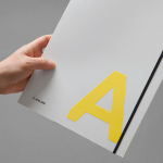
K. Apeland by Bielke&Yang, Norway
K. Apeland is a Norwegian independent civil engineering consultancy that specialises in construction technologies, and applies its experience to new builds, remodelling projects and renovation. It has a favour for steel-wood and concrete structures, which has won the consultancy a number of awards, and has a broad portfolio that covers public infrastructure, private offices and housing, as well as viewing platforms,...
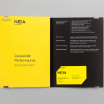
The National Institute of Dramatic Art by Maud
The National Institute of Dramatic Art is a national education and training organisation for the performing arts in Australia, and is responsible for developing the talents of some of the country’s biggest stars. With the continued democratisation of performance through digital platforms such as Youtube, and concerns that this had the potential to undermine NIDA’s conservatoire approach, NIDA pursues a...