K. Apeland by Bielke&Yang, Norway
Opinion by Richard Baird Posted 25 September 2015

K. Apeland is a Norwegian independent civil engineering consultancy that specialises in construction technologies, and applies its experience to new builds, remodelling projects and renovation. It has a favour for steel-wood and concrete structures, which has won the consultancy a number of awards, and has a broad portfolio that covers public infrastructure, private offices and housing, as well as viewing platforms, roads, bridges and quays.
Alongside a name change, shortened from Dr. techn. Kristoffer Apeland AS, K. Apeland worked with Oslo based graphic design studio Bielke&Yang to create a new visual identity system. This extended to business cards, letterhead, folder, posters, envelope, notepad and grid paper design, with a new website to follow shortly.
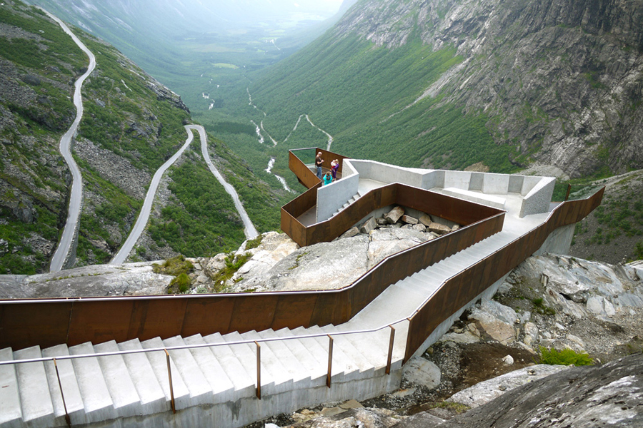
Trollstigplatået, Norway. Design: Reiulf Ramstad Architects. Build: K. Apeland. Image: © Landezine.

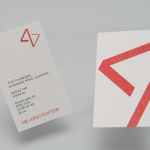
Bielke&Yang’s visual identity approach does a good job of drawing distinction from convention. Robust sans-serif characters, the use of a light concrete grey and a high visibility yellow, alongside the physicality of die cut and blind embossed finishes, and the utility of grids, hole punches, simple layouts and black ink across white board draw on the visual vernacular, structure and practicality that permeates the architecture and construction industries.
However, the large size, bright spot colour and cropped detail of Lineto’s Replica, which forms the foundation of a free-floating, adaptive KA monogram, applied in a variety of locations across stationery, expanding and contracting in relation to one another, with their proportion and space adjusting to context, framing and overlapping content, plays with this convention, introducing an element of conviviality and sense of creativity.
The result is striking and visually interesting, makes good use of contrast, balances a professional seriousness and creativity, and is founded on some relatable industry-spacific ideas such as space and structure. More from Bielke&Yang on BP&O.
Design: Bielke&Yang. Images: Mathias Fossum. Opinion: Richard Baird. Fonts Used: Replica