Cosmetic Packaging
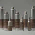
To My Ships by Formafantasma
There’s something almost monk-like about the branding for To My Ships, a new personal care brand founded by Daniel Bense. As former Head of Commercial at Aesop and Managing Director at Sunspel, Bense is clearly a man who understands that today, luxury isn’t about bling, gold ornamentation, and gauche, showy baubles; but about minimalism and understatement, and things that smell...

Kindred Black by Ania et Lucie
There has always been something borderline magical about the fields of beauty, makeup and skincare – a hint of esoteric or mystical knowledge. When it comes to visual storytelling, this association offers plenty of rich inspiration, along with established style signifiers that are easy to follow. Nods to old-school apothecaries abound in the likes of Typology Paris and Le Labo,...
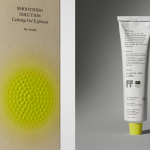
Soft Services by Decade
Skin is the human body’s largest organ while skincare is the fastest growing segment of the beauty industry. Yet with all their promises of ‘dewy’, ‘glowing’ and ‘blemish free’, most products on the market, are focused on the face. Direct-to-consumer business Soft Services creates skincare products for specific body skin problems, such as acne, ingrown hairs, stretch marks and fungal...
Tangent GC Organic Soap by Carl Nas Associates
Tangent GC began as a Scandinavian organic garment and shoe care company developing products that intended to increase the life of clothing and footwear, and entered the organic skincare market in 2016. The concern given to the longevity of skin becomes an understandable extension of that original intention. Carl Nas Associates, who have been working with Tangent GC on their packaging treatments for...
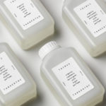
Tangent GC Organic Detergents by Carl Nas Associates
Tangent GC began as a Scandinavian organic garment and shoe care company developing products that intended to increase the life of clothing and footwear, and entered the organic skincare market in 2016. The longevity of skin being an understandable extension of that original intention. The company’s graphic identity, a typographical system designed by Essen International under the creative direction of Carl Nas, established...

TGC x Stenerhag by Carl Nas Associates
Tangent GC began as an organic garment and shoe care company developing products that intended to ensure longevity and entered the organic skincare market in 2016. Designed by Essen International TGC’s graphic identity, by way of a simple typographical expression, established a visual system of informational immediacy through the absence of superfluous stylistic detail and colour. This divided content and drew a...

Senja Cosmetics by Werklig
Senja is a Scandinavian premium cosmetics brand, founded by Senja Parkkinen, with a range of toners, cleansing foams and oils made from active natural ingredients all manufactured in Finland. With a desire to communicate an all-natural and contemporary positioning and capture the fresh air and harsh environmental conditions that produced many of these ingredients, the brand worked with Werklig to develop a...

A.N Other by Socio Design
A. N Other gives its perfumers the creative room to craft limited edition, luxury and high concentration fragrances free from the pressures of consumer trends, market segmentation and budgetary constraints. These are then sold direct-to-consumer through its website. A.N Other places greater value on the internal composition of each of its fragrances, and the inspirations and aspirations of its creators, than...

Tangent GC Hand Cream by Carl Nas Associates
Tangent GC began as a Scandinavian organic garment and shoe care company developing products that intended to ensure longevity, and entered the organic skincare market in 2016. The company’s graphic identity, a simple typographical expression, designed by Essen International, delivered a sense of informational immediacy through the absence of superfluous stylistic detail and colour, yet divide content and drew out a distinction in...
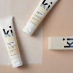
Ki Sunscreen by Akin
Ki Sunscreen was developed by national skincare clinic Caci to protect against the harsh New Zealand sun, and the skin damage and premature ageing that UVA and UVB rays can cause. It is made from the latest generation of ingredients proven to protect, and those that help to control oils and maintain a matt finish. This balance between clinically proven effectiveness and cosmetic...

REF by Kurppa Hosk
REF is an environmentally conscientious Swedish hair care brand with a range of products that are made from high quality organic ingredients. With a desire to enter the international market of the US and further into the Nordic regions, both dominated by well-established FMCG, Scandinavian design studio Kurppa Hosk were commissioned to rejuvenate REF’s visual identity. This included packaging design, art...
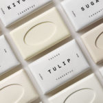
Tangent GC Soap by Carl Nas Associates
Tangent GC is a Scandinavian organic garment and shoe care company developing products that intend to ensure longevity. The company’s brand identity, a simple utilitarian typographical expression, designed by Essen International, delivered a sense of informational immediacy through the absence of superfluous stylistic detail and colour, dividing content in the arrangement, orientation and typesetting of Akkurat Mono. Venturing into organic personal skincare, Tangent GC worked with...