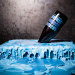
Brewdog Abstrakt by O Street
Brewdog’s Abstrakt is a limited edition craft beer concept that has released 20 different varieties since it began in 2010. Each beer is bottle-conditioned (bottled with a small amount of yeast, providing further fermentation and maturation), brewed and released just once, individually numbered and known only by their release code. It is a concept described as more art than beer, as boundary pushing and blurring...
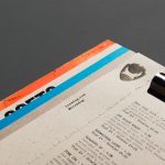
Brewdog Menus by O Street
O Street worked with craft brewery Brewdog; best known for their beers and big attitude but also a growing hospitality presence throughout the United Kingdom, to create a distinctive menu design and system for over fifty of their bars. This included both a full menu which features a handmade backboard, and a Daily Drafts menu, individually finished at each location....
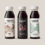
Hatch Cold Brew Coffee by Tung
Toronto-based Hatch is a coffee roaster producing ready-to-drink cold brew coffee from high quality natural ingredients using a craft-oriented twice-filtered manufacturing process and a unique bottling technology to seal in fresh flavour. Hatch intends to bring cold brew coffee from a niche but growing market into the mainstream and worked with Canadian graphic design studio Tung to help them achieve this through brand identity and packaging....
Tangent GC Soap by Carl Nas Associates
Tangent GC is a Scandinavian organic garment and shoe care company developing products that intend to ensure longevity. The company’s brand identity, a simple utilitarian typographical expression, designed by Essen International, delivered a sense of informational immediacy through the absence of superfluous stylistic detail and colour, dividing content in the arrangement, orientation and typesetting of Akkurat Mono. Venturing into organic personal skincare, Tangent GC worked with...
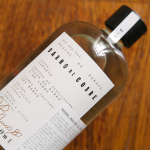
Barro de Cobre by Savvy
Barro de Cobre is a mezcal from Oaxaca, Southern Mexico, distilled twice; once using a clay pot and the second in copper. It is a unique process that takes time, but produces a strong yet smooth, clear but earthy character. The name Barro de Cobre, Copper Clay roughly translated, is an expression of this process, which also goes on to inform brand identity...
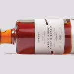
Uproot by Believe in
Uproot is a premium and limited edition maple syrup created to celebrate the opening of UK-based Believe in’s second design studio in Canada. It features a distinctive packaging design that takes a Canadian icon and infuses it with what the studio describes as a European design sensibility. Believe in, from its two studios and through their collaborative effort, will now support clients...
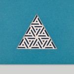
WallpaperSTORE* by A Practice For Everyday Life
WallpaperSTORE* is the online store of UK architecture, interior, fashion, art and contemporary design magazine Wallpaper*. It features and ships worldwide a broad but tightly curated catalogue of tabletop, lighting, desktop, stationery, grooming, technology and travel objects. Many of these objects, while individually distinctive, share a sense of contrast; in form and finish, materiality and colour, but also in their contemporary crafted quality....
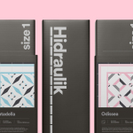
Hidraulik by Hey
Hidraulik is a Barcelona-based business producing floor mats, table mats and runners for contemporary spaces. These are inspired by cement panels hydraulically pressed, rather than fired, with a layer of coloured pigment. Hydraulic panels originated in the 1850’s and experienced a resurgence in the mid 20th century. At that time they would often feature brightly coloured and detailed patterns, and were popular during an era of...

Mathias Dahlgren Edition by Essen International
Mathias Dahlgren Edition is a set of contemporary kitchen appliances which are the product of a collaboration between the Grand Hôtel Stockholm, its renowned Swedish Michelin starred chef Mathias Dahlgren, and kitchenware retailer Dafra. Scandinavian graphic design studio Essen International worked with the trio to translate the culinary vision and creativity of Mathias Dahlgren into a modern graphic expression and packaging solution...
Faculty Brewing Co. by Post Projects
Faculty Brewing Co. strives to create an open and collaborative environment where visitors, of all levels of expertise, can learn about how craft beer is made with the intention helping them to navigating Vancouver’s thriving craft scene. The brewery boasts a 7 barrel, 1450 square-foot brewery with 6 fermentors, 6 bright beer tanks and 28-seat tasting room with an industrial and utilitarian interior design. It also...
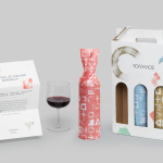
Sommos by Mucho
Summos is an online platform that gathers together and shares the knowledge of the six best sommeliers of the Netherlands and offers a seasonal subscription service that sends out a selection of some of the country’s best wines once every two months. Sommos worked with graphic design studio Mucho to develop name, brand identity and packaging. Based around the concept of group and innovation, and clearly informed...
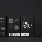
The True Honey Co. by Marx Design
The True Honey Company (TTHC) dedicates itself to the production of mānuka honey, a monofloral variety produced in Australia and New Zealand from the nectar of the mānuka tree. It has a unique colour and texture, and a high level of Dietary Methyglyoxal, an organic compound with antibacterial and antiviral properties. With a price range starting at 60.00AUD and rising to 230.00AUD per jar,...