Croatian Design
Galerija Kranjčar by Bunch
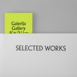
Galerija Kranjčar is an art gallery, located at the heart of Zagreb, opened in 2006 to showcase the work of Croatian contemporary artists and function as hub for a variety of cultural activities. The gallery is a long and unique space, one that balances the modern and historic. This can be seen in the meeting of smooth white walls, concrete floor...
Trika by Bunch
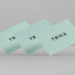
Trika is an interior design company, working on both public and private spaces, with a showroom and studio in the Croatian capital of Zagreb. They represent furniture and equipment manufacturers such as Billiani, Enea and Federicia, amongst many others, whose brand names are described as being synonyms for quality, comfort and design. Graphic design studio Bunch worked with Trika to develop a new brand identity....
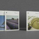
Smokovik by Studio8585
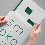
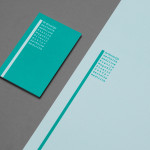
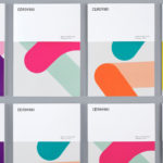
Smokovik is an exclusive property development, located on the Croatian Island of Krk, designed by renowned local architect Idis Turato. The development will be made up of both residential and commercial buildings that share a functional and sustainable build practice, a favour for modernity, flat surfaces and Mediterranean sea views. Smokovik’s brand identity, created by Studio8585 now working from Copenhagen, included logotype, brochure and website design, a...
KMP by Studio8585
Dr. Ksenija Magašić Pinezić provides affordable dental services locally and to international dental tourists in a warm and friendly practice located in the Croatian coastal city of Rijeka. Design agency Studio8585 worked with Ksenija to develop a new brand identity design—which went on to include a logo, stationery, business cards, tote bag and responsive website—that would make the most of a lengthy name....
Cerovski by Bunch
Cerovski is a young Croatian print production studio that revels in the challenge of “nebulous finishing, microscopic editions, absurd materials and crazy deadlines”. Bunch worked with Cerovski to develop a new brand identity for the studio—which included a custom logotype and typeface, website, and a variety of printed collateral—that delivers a distinctive contrast of utility and creative flourish, technology and individualised service...
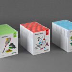
Ogopogo by Bunch
Ogopogo is a start-up that is introducing the boxed experience concept to the Croatian market. Their new brand identity, which include logo, print, packaging and website design developed by Bunch, juxtaposes the corporate formality and geometric consistency of a simple sans serif logo-type with the bespoke, crafted and playful qualities of bright folded paper photography....
ITI Computers and Diventa by Bunch
ITI Computers is a Croatian-based software company that specialises in the development of IT solutions for the leisure, tourism and hospitality sectors. Bound by a consistent typographic and monogrammatic design solution but divided by an organic and systematic contrast of context, creative agency Bunch developed a new logo and print solution for ITI and its leading management product Diventa, which delivers an interesting richness...