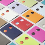
Schubertíada Vilabertran by Mucho
Schubertíada is an annual festival run by Associació Franz Schubert that celebrates the works of the 19th-century Austrian Romantic composer Franz Schubert. This takes place in the Spanish municipality of Vilabertran in July. The festival includes a programme of chamber concerts, lied recitals, instrumental solos and lectures. Schubert is known, not just for his compositions, but for his contribution to Lieder; German poetry...
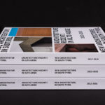
New Architecture in South Tyrol 2012—2018 by Studio Mut
New Architecture in South Tyrol—a travelling exhibition and catalogue—brings to light the unique architectural boom happening in Alto Adige, also known as South Tyrol, the predominantly German-speaking northern-most province of Italy. Selected by an international jury, the catalogue focuses on fifty-nine buildings from the region, realised between 2012–2018, and have gained local contemporary architects international recognition. These buildings are marked by...
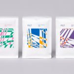
Felt Coffee by Studio fnt
Felt is a coffee shop in Seoul with their own brand of speciality coffee which has been sourced by way of direct trade and roasted in Gyeonggi-do, a populous (relevant later) province of South Korea. They opened their first store in September 2015 and a second in October 2018. The team at Felt see every part of the coffee experience;...
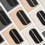
246 Queen by Studio South
246 Queen has a long and storied history. Opened in 1964 on Auckland’s Queen Street, it heralded a new era of modern architectural vision, exclusive boutique-based experience and an urban post-war retail sophistication. The building played host to fashion shows, designer concessions, furniture showrooms and contemporary dining. However, the architectural ideas drawn up by the original architects Rigby Mullan (Alan...
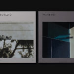
The Maitland by Studio Brave
The Maitland is a luxury 22 apartment residential property development from Gibson Developments located on Malvern Road in Glen Iris, a suburb of Melbourne, Australia. It is marked by an architectural, interior and landscape design language—created by Bruce Henderson (architecture), Charlotte Henderson (interiors) and Jack Merlo (landscape)—of colour, texture and form that connect it intimately to the neighbourhood and its leafy...
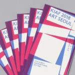
Korea International Art Fair 2018 by Studio fnt
Each year KIAF plays host to and brings to the Korea domestic market the artworks of international artists and galleries. This year, the 17th Korea International Art Fair took place between the 4–7 October in the city of Seoul. With a desire to become the pre-eminent art platform of South Korea, serve as a conduit between the Asian and international art...
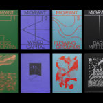
Migrant Journal by Offshore Studio
Migrant Journal is a six-part exploration of migration in all its forms. Indeed, it covers the very current and pressing political and socio-cultural implications of the migration of people fleeing from persecution, seeking better economic opportunities or under pressure from shifting environmental conditions, yet it also touches upon the more abstract movement of objects and ideas around the globe. Migrant...
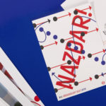
XVIth All Sokol Slet 2018 by Studio Najbrt
Slet is a mass gymnastics event and union of schools that has its roots in the latter half of 19th century Prague with the intention of providing physical, moral and intellectual training for the nation. Slet takes its name from the Czech word for flocking of birds. This can be understood in the sight of a stadium field filled with participants...

Tatau by Inhouse
Tatau chronicles the rich cultural history of Sāmoan tattooing, from its beginnings 3,000 years ago to the practices of today. Tatau takes the form of a 320 page hardback book (255 x 200mm) illustrated with historical photographs from the nineteenth, twentieth and twenty-first-century, diagrams, film stills and images of posters and related artefacts. These were brought together by Sean Mallon and Sébastien Galliot,...

Innsbruck International, Biennial of the Arts by Studio Mut
Innsbruck International, Biennial of the Arts is a 16-day event set over 10 locations presenting the work of over 20 international artists who are invited to make use of Innsbruck’s historical and contemporary venues. Together, these works reach across the wide spectrum of the visual arts; from painting and sculpture, film and sound to performances and installations. Although events of this kind...
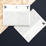
STK Magazine by Moodley
Steirische Terrior und Klassikweingüter (STK) is a free association of ten wineries that have committed themselves to a region-specific wine culture and outstanding quality. The STK seal is a protected trademark and guarantee of quality for wines produced in the Southern and South-Eastern region of Styria, Austria. STK was founded more than 30 years ago by a group of winegrowers who believed...

Atlantic Theater 2018 – ’19 Season by Pentagram
Atlantic Theater Company continues to work with Paula Scher and her team at Pentagram, this time on the campaign for their 2018–19 season. This is characterised by a contrast of bright fluorescent gradients and solid black ink. These fill, define and intersect the condensed sans-serif letterforms and graphic emblem of the theatre; the megaphone A, designed and introduced in 2015....