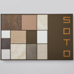
Soto by Richards Partners
Southside Group and Colliers International worked with New Zealand based studio Richards Partners to develop a graphic identity for their new property development, located in between Auckland’s Meadowbank and Remuera, which is made up of 58 ‘Residences’ and 7 exclusive ‘Pavilions’ designed by architects Monk Mackenzie and Hare Interiors. The Soto name and graphic identity designed by Richards Partners functions as a way...

BP&O Collections — Wine
A continually updated gallery that takes a look at the visual, material and structural language of the wine industry, populated by projects reviewed and published on BP&O. This post features work by Inhouse, Mucho and Frost, and covers small and large wineries and their labels, wine events, wine bars and shops. These take a variety of approaches, from the illustrative...

Sumer And The Modern Paradigm by Clase bcn
Sumer And The Modern Paradigm is an exhibition at Barcelona’s contemporary art gallery Fundació Joan Miró, and runs from 28th October 2017 to 21st January 2018. It intends explore and attempt to explain the influence of Mesopotamian art on modern artists, with a particular focus on the interwar period. The exhibition analyses work produced between the twenties and forties, takes a look...
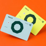
Holvi by Werklig, Finland
Holvi is a digital bank account created for entrepreneurs and micro-businesses with the intention of making banking, paperless bookkeeping and invoicing simpler and more efficient. Holvi is positioned as more than just a digital bank account, and comes with a plethora of integrated features. These include the seamless syncing of information between different systems, sending invoices in a few clicks, a...
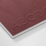
Abodo by Richards Partners
Abodo is a New Zealand-based timber specialist producing high performance and carefully crafted materials for architectural and structural contexts, and has a catalogue of cladding, decking, screening and timber panelling. Abodo worked with Richards Partners to better articulate its brand story, bring clarity to and emphasise the company’s respect for timber; where it comes from, where it is used and by...

BP&O Collections — Logotypes
A continually updated collection of logotype’s created as part of a new graphic identity design project, reviewed and published on BP&O. Between them, these highlight how sans-serif simplicity and serif flourish, significant character or subtly, implied or actual motion can contribute to a distinctive and communicative brand identity. This selection includes monolinear, extended, condensed, calligraphic, brush drawn and stencil cut examples, and features...
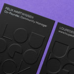
Loupedeck by Bond
Loupedeck is a Finnish startup and photo editing console designed to make the process of image manipulation faster in Adobe Lightroom for both Windows and Mac users. It is described as being an intuitive replacement for keyboard and mouse, is mapped exactly to Lightroom to encourage creative spontaneity and experimentation, and suited to beginners and professionals alike. To help establish and...
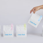
Little Wolf by Perky Bros
Little Wolf is an American small-batch coffee roastery, subscription service and café created by former accountant turned coffee roaster Chris Gatti. Tennessee-based graphic design studio Perky Bros recently worked with Chris to developed a new graphic identity that would link a variety of assets. These included stationery, business cards, individual coffee bags, tote bags, merchandise, subscription boxes and website. Perky Bros describe their...
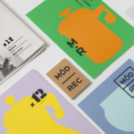
Modern Recreation by Blok
Modern Recreation (ModRec) is an international coffee subscription service that offers its subscribers an ever-changing selection of the very best in micro-roast coffees sourced from around the world. ModRec takes pride in its positioning; the rejection of artifice, pretence and mass culture in favour of what it says is a realness, spontaneity and individuality. This attitude, and the unique character of...

Whitlam Place by Studio Hi Ho
Whitlam Place is a collection of eleven residencies located in Fitzroy, Melbourne, developed by Milieu Properties and completed this year. The residencies are described as being ideally positioned within a leafy pocket of the city’s most vibrant cultural precinct, and feature views of the adjacent Whitlam Place gardens, Fitzroy Town Hall and city skyline. the residencies were designed to engage with the historic...

BP&O Collections — Tote Bags
A continually updated collection of tote bags designed as part of a broader graphic identity programme, reviewed and published on BP&O. Between them, these bring to light how colour, type, form, orientation, layout and contrast can make a standard format distinctive and memorable, contribute to an effective graphic identity and catch the eye from a distance. These can function as an expression...

Architects Accreditation Council of Australia by Toko
Architects Accreditation Council of Australia (AACA) is the national voice for architect registration boards around Australia. The council runs the Architectural Practice Examination, assess overseas qualifications, collates data on the profession throughout the country, facilitates international mutual recognition agreements and provides alternative pathways to registration for local practitioners and architects from overseas. The AACA worked with Sydney-based studio Toko to clarify the complexity...