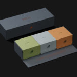
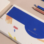
Port of Mokha by Manual
Port of Mokha is a coffee, sourced from Yemen, that is said to be the rarest, most expensive and best tasting in the world. As a brand it is critically acclaimed, winning awards and receiving the highest ratings in blind cuppings, and mindful, helping to support local communities. Port of Mokha’s story begins with the return and daring escape of...
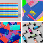
BP&O Collections — Multi-coloured
A continually updated collection of graphic identities and packaging design work, reviewed and published on BP&O, that feature a distinctive multi-coloured component. Between them, and in conjunction with form and context, these bring to light how the use of three or more colours can catch the eye and convey creative energy without appearing complex or overwhelming. This post includes a...
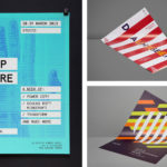
BP&O Collections — Posters
A continually updated collection of poster designs created as part of a broader brand identity programme, reviewed and published on BP&O. Between them, these bring to light how colour, type, form, orientation, layout and contrast, as well as substrate and print technique, contribute to a distinctive and expressive brand identity. These often catch the eye from a distance and follow...
Exploratorium After Dark by Collins
Exploratorium is a “public learning laboratory” and San Francisco based museum that enables visitors to question and make sense of the world around them through hands-on exhibits that touch upon science, art and human perception. These include a pitch-black dome, fog bridge, large-scale kaleidoscope, light displays and array of image bending mirrors. Every Thursday the museum hosts After Dark, an...
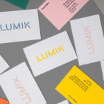
Lumik by Hey
Lumik is a Spanish lighting design and manufacture company, and partnership between the traditional metalworking company of Francesc and Ferran Martí, and interior designer and art director Frank Domínguez. Together they have 65 years of experience, and have built a catalogue of products with simple forms, moments of colour, elements of play and the industrial. These move between those that are...
Maisonette by Lotta Nieminen Studio
Maisonette is an American online retailer of luxury children’s brands, founded by former Vogue co-workers Sylvana Durrett and Luisana Mendoza Roccia. The retailer carries a carefully selected yet extensive catalogue of clothing, homeware, gifts and accessories that mixes local up-and-coming brands with those that are well-established and international. Maisonette’s visual identity, designed by New York based Lotta Nieminen Studio, intends to balance and juxtapose a...
BP&O Collections — Blind Embossing
A continually updated gallery of brand identity, packaging and graphic design, reviewed and published on BP&O, that feature a blind emboss or debossed detail. This post features work by Bibliothèque, Triboro and Bedow, and covers a variety of projects, from restaurants and lighting architects to galleries and fashion labels. Blind embossing has been used in a few different ways. These...

Deptford X by IYA Studio
Deptford X is an arts festival that takes place over ten days across a number of public sites and spaces throughout the district of Deptford, south-east London, with the intention of engaging audiences in active and unexpected ways. This year’s festival, the 18th, builds on a new curatorial approach which was first trialled in 2016. To coincide with and mark this...

Loyal Coffee by Mast
Loyal Coffee is a barista-owned and operated specialty coffee shop located in Colorado Springs. It features a high ceiling, exposed beams and concrete surfaces, natural material detail such as tree trunk stools, and crafted finishes that include a mosaic floor, carved wood panel and what looks like a ghost sign. Drawing on this, the surrounding landscape, and the loyal bond that...

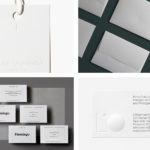
BP&O Collections — Swing Tags
A continually updated collection of distinctive swing tag designs created as part of a broader brand identity programme, reviewed and published on BP&O. Between them, these bring to light how colour, type, form, image, layout and contrast, as well as material choice and print finish, contribute to a distinctive and expressive brand identity. This post includes dyed papers and foils, illustration,...
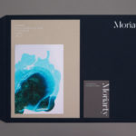
Moriarty by Bond
Inspired by the spontaneity and celebratory energy of parties and exploring the idea that curating great events is an art form, design studio Bond crafted a visual identity for new luxury event planning business Moriarty based around a series of abstract ink illustrations. These are paired with high quality dyed papers and boards, bringing a measured and distinctive contrast to printed...

Planned Living Architects by A Friend Of Mine
Planned Living Architects (PLA) is located on Australia’s Mornington Peninsula and has an architectural portfolio that shows a sensitivity and responsiveness to the uniqueness of each site, is environmentally-consciencious, materially mindful, beautiful and functional. The studio is well-regarded, has decades of experience and expertise working within coastal and rural areas, is known for its pared-back style, and has a philosophy that is...