Cashflow Vodka by Marx Design
Few brands dare to break the fourth wall, and all too often those that do, do it badly. Some smash through that wall Mr Blobby style – sure, it’s fun, but it’s so bold that it feels a little ridiculous, à la Brewdog’s ADVERT adverts by Uncommon. Some try to be a ickle-wickle bit clever but land on saccharinely twee:...
Muse Group by Collins
Muse Group exists as a collection of digital products covering all aspects of the creative process in music. This reviewer is familiar with Audacity and has used it in the past, but other platforms include Ultimate Guitar, MuseClass, MuseScore, and MuseHub. These tools are used by a range of professional musicians, budding amateurs, and everyone in between, working across all...
Windham Campbell Prizes by Pentagram
Back in 2013, Michael Bierut’s team at Pentagram (Twelve Labs, Becan & Natural History Museum) created the identity for Yale University’s inaugural Windham Campbell Prizes, a major literary award that honours outstanding achievement in the fields of fiction, non-fiction and drama. Bestowed by the estate of the writer Donald Windham and his companion Sandy M. Campbell, the awards are administered...
12 by Base Design
If New York really is the city that never sleeps, that’s in no small part thanks to coffee – and now, increasingly, a newer entrant to the socially acceptable uppers scene, matcha. Capitalising on the growing interest in the sludgy green pick-me-up is 12, a new-ish matcha-centric café and retail store that opened last year in Manhattan’s NoHo area. Sited...
BRiMM by Harriman Steel
Combining an online shop, journal, and collective, BRiMM describes itself as a platform for ‘planet-positive living’, drawing together some big ideas and ruthlessly sustainable brands. Based between London and Stockholm, it was founded last year by James Haycock, who’s billed as, ‘an exited founder, angel investor, and the vision behind’ it all. The fact the whole thing looks so great...

To My Ships by Formafantasma
There’s something almost monk-like about the branding for To My Ships, a new personal care brand founded by Daniel Bense. As former Head of Commercial at Aesop and Managing Director at Sunspel, Bense is clearly a man who understands that today, luxury isn’t about bling, gold ornamentation, and gauche, showy baubles; but about minimalism and understatement, and things that smell...
Yum Bun by How&How
Arguably London’s street food scene has become less a ‘scene’, more a network of long queues sprawling their way across the capital faster than you can say ‘SEVEN pounds! For some strawberries!’ From Borough to Barbican’s Whitecross Street, Spitalfields to Southbank, Camden to Covent Garden; the menus are global, the prices hefty, the hype palpable, and the branding overwhelmingly forgettable....
Siuru by Bond
Estonia’s Siuru plays with important questions, subverting and, at the same time, fulfilling expectations. Is it an art museum? A library? A cinema? Or a cultural institution? For a Bond (Veikkausliiga, Saaristo, Cable Factory) the design studio in charge of developing a brand identity for Siuru, this raised the concern, how do you brand something that seeks not to be characterised...
Ding by Wildish & Co.
When I left the UK and landed in the Czech Republic – my home between 2010 and 2018 – I found a notable difference in advertising and branding between the two countries. Specifically, I saw an abundance of brand mascots. Now, of course, mascots were also used in the UK and have a global historical precedent, but I was struck...

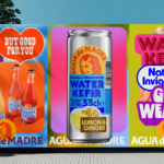
Agua de Madre by Chris Chapman
It seems you can’t move for well-designed, wellness-adjacent alcohol-free drinks brands right now. In the past couple of months alone we’ve covered a nightlife inspired Yerba Maté that went hard on Big Drink NRG and Rolus, a new botanically enhanced entry into the (apparently) burgeoning ‘braincare beverage’ category. Making it a hat-trick is London-brewed water kefir brand Agua de Madre’s...
Rolus by Re
Back in the early 00s – the era when arguably Hollyoaks was at its zenith, and bellybutton piercings their most bejeweled – Botox was gradually emerging from the hushed clinics of Harley Street and LA to become part of common parlance. As such, brands cottoned on to the word’s ‘eternal youth’ connotations: I distinctly remember a shampoo ad promising that...
TwelveLabs by Pentagram
Remember when the conversation around gradients was about making ‘bad’ design look ‘better’? When RGB colours were frowned upon because you couldn’t print them? Yeah, those ideas feel a bit outdated now. HP Indigo can now run fluorescents affordably, and business card mock-ups (in RGB) are more about selling than printing. Technology marches on, expectations and standards evolve, and everything...