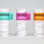
Tapped Birch Water by Horse
Tapped is an organic birch water, drawn straight from trees growing in Finland, and available in Bilberry & Lingonberry, Apple & Root Ginger and unflavoured varieties in the UK from Whole Foods Market, Planet Organic and online. Birch water is a traditional spring time drink and medicinal ingredient in Finland, tapped from birch trees which filter ground water up through their roots and trunk...
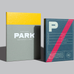
Park Restaurant & Distillery by Glasfurd & Walker
Park is a bar, restaurant and distillery located in the Canadian resort town of Banff, within the Banff National Park, and the province of Alberta. It is a region of diverse natural beauty which includes mountains, prairies, forests and desert badlands, and that attracts walkers, campers and skiers locally and internationally. The restaurant is a celebration of Banff’s alpine history and lifestyle. This runs...
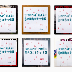
Second Hand Orchestra by Bedow
Second Hand Orchestra is a collection of tracks recorded for a documentary that was unfortunately and abruptly cancelled. Rather than let the work fall by the wayside, band leader Karl-Jonas Winqvist has released these as a limited edition album of 300 LPs. These feature a visual identity and packaging design of custom typography, individually numbered and block foiled sleeves, and screen printed t-shirts created by Stockholm...
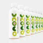
Unoco Raw Coconut Water by B&B Studio
UK based Unoco works with a community of smallholders in the Philippines to produce an unrefined, unpasteurised and untreated raw coconut water. This is drawn from young coconuts, characterised by their green rather than brown colour, picked at their nutritional prime and placed into bottles rather than tetra pak or cans using HPP. This process gives the water a distinctive pink colour, a result...
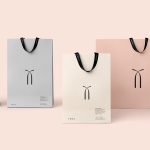
Twice Fashion by Socio Design
Twice Fashion is a Chinese luxury accessory brand established by Tina Tian and Dr Mirko Wormuth in 2007. Since then it has grown to become one of the country’s top accessory brands, with stores in Beijing, Tianjing and Chongqing. Twice Fashion is described by SocioDesign, the London based graphic design studio behind its rebrand, as having helped shaped China’s ‘fast’ fashion industry....
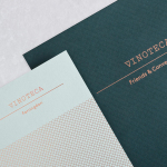
Vinoteca by dn&co
Vinoteca is a group of London based restaurants, founded by business partners and friends Brett Woonton and Charlie Young, that were inspired by the wine bars of Spain and Italy. Aside from the restaurant experience, and as a testament to the quality of their wine list, these restaurants also operate as local wine retailers. dn&co. were commissioned to refresh and formalise Vinoteca’s brand identity. With...
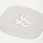
Tina Frey Designs by Mucho
Tina Frey is an American homeware designer with a studio in San Francisco. She is inspired by the fluid lines of the sea, the curves and contours of nature, objects picked up while traveling, and the translucent colour of ice lollies and jelly beans. The design of each of her products—which include plates, bowls and utensils—is rooted in simplicity and functionality. These are sculpted...
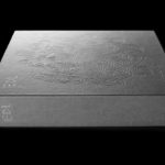
EDL Laminates by Bravo
Working with manufacturers in Italy, Korea and Taiwan EDL provides high pressure laminates for architects and interior designers throughout Asia, and is dedicated to anticipating trends, adopting the latest technologies and introducing its own break-through innovations that amome from a decade of industry experience. To coincide with EDL’s tenth anniversary, and a push further into the international market, the company worked with Singapore and New York...
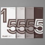
Clay by Studio Claus Due
Clay is a museum of ceramic arts and crafts, located in the Danish town of Middelfart, west of the capital. Exhibits range from a 235 year old plate to more recent and experimental pieces from contemporary artists. The museum worked with Studio Claus Due to develop a new visual identity system. This included business cards, stationery, signage, packaging, print communication and website, unified...
Momento Film by Bedow
Momento Film is a Swedish independent production company working with national and international directors to create compelling and surprising documentaries and fiction films. The company looks to confront subjects from alternative angles with the intention of shifting perspectives. This intention is the basis of its new visual identity, created by Stockholm based graphic design studio Bedow, and conveyed through the three-dimensional qualities...
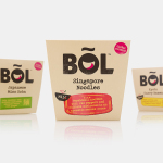
BOL by B&B Studio
BOL is a range of vegetable pots made from fresh natural ingredients using recipes inspired by local chefs and street market stalls from a variety of international destinations, packed and presented with a modern on-the-go convenience in mind. BOL was created by Paul Brown, the former general manager of Innocent’s food division, following the company’s exit from the category, and features...
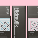
Hidraulik by Huaman
Hidraulik is a Barcelona based business producing rugs for contemporary spaces. These are inspired by cement panels hydraulically pressed, rather than fired, with a layer of coloured pigment. Hydraulic panels originated in the 1850’s and experienced a resurgence in the mid 20th century, these would often feature brightly coloured and detailed patterns, and were popular during an era of personalisation and interior expression....