Second Hand Orchestra by Bedow
Opinion by Richard Baird Posted 22 October 2015

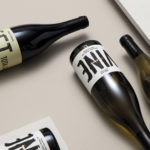
Second Hand Orchestra is a collection of tracks recorded for a documentary that was unfortunately and abruptly cancelled. Rather than let the work fall by the wayside, band leader Karl-Jonas Winqvist has released these as a limited edition album of 300 LPs. These feature a visual identity and packaging design of custom typography, individually numbered and block foiled sleeves, and screen printed t-shirts created by Stockholm based graphic design studio Bedow and bound by the concept of repurposing.

The repurposing of Karl-Jonas’ music, from backing tracks to a limited edition album release, underpins many of the aesthetic choices that make up its packaging. And rightly so, it is an interesting and unusual story that gives further value to the work, and has been effectively emphasised by Bedow by also making the most of things that have been discarded.
This extends to a logotype of letterforms drawn from iconic albums, the screen printing of reclaimed t-shirts, and the use of second-hand record sleeves, but also in the contrast of the controlled aesthetic, brand management and mass market of the mainstream music industry and the limited edition, loose, personable and individual hand drawn qualities of this particular album. This juxtaposition can also be seen in the sporting, fashion and cereal iconography of the t-shirts and the screen printed logotype on top.


There is a tension between this new identity and the distinctive and recognisable character of the components that it is built from. It is this tension, however, that delivers much of the unique personality of the work, communicates the story of the album and secures visual impact. The concept is clear, creatively applied and manages to find a balance between individuality and cohesion.

Although each sleeve is different, they remain unified by a clear graphic language in the form of a white panel, custom typography, block foil print finish and illustrative flourish.
The typography does a good job of touching upon the redefined context of the album through a juxtaposition of type, taking the previous and disparate communicative intentions of the albums these were drawn from, including the d from electronic band Daft Punk, the backward E of rap artist Eminem, and the bolt of hard rock band Kiss, and effectively unites them through colour and a hand drawn process.
The logotype is slightly subversive in its appropriation of other artist’s releases, which also comes through in the subtle cut and paste punk aesthetic and appropriation of preexisting artwork, yet its finish leans more towards the playful. It is oddly challenging in its busyness, when Bedow is know for its polished Scandinavian simplicity, but has a well-founded aesthetic and unexpected charm. Check out Bedow’s case study video here or see More from Bedow on BP&O.
Design: Bedow. Opinion: Richard Baird.