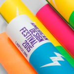
Latin American Design Festival by IS Creative Studio
The Latin American Design Festival is an organisation that promotes Latin American Design internationally and looks to highlight the social potential of design using lectures, workshops, exhibitions and complementary activities. This year’s festival took place in the Peruvian city of Lima with guest speaks that included Jessica Walsh, Brandlab and Anagrama. LAD’s visual identity, developed by IS Creative Studio and extending across posters, lanyards,...
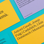
Urbanna by Forma & Co
Urbanna is a small Spanish tourist business, led by Anna Permanyer Jordi, that provides experienced guides who can speak Spanish, Catalan, German, French and English, to those visiting the city of Barcelona. Design studio Forma & Co worked with Urbanna to develop a visual identity solution that, rather than rely on ubiquitous images of the city, favours a convivial colour palette...
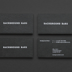
Background Bars by Campbell Hay
Background Bars provides bar, bar staff and equipment hire, pop-up and permanent bar design services, seasonal cocktail creation, bar management for corporate occasions, festivals, weddings and private parties, and income and report analysis. Alongside these, Background Bars also functions as a creative agency, helping brands to deliver compelling live events. Its visual identity, inspired by the name and which included website,...
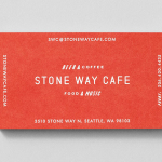
Stone Way Cafe by Shore
Stone Way Cafe, formerly the Tiny Ninja Cafe, is a Seattle based neighbourhood meeting point, music venue and internet cafe, in the area of Fremont, with a formidable, geometric, concrete exterior structure and a warmer interior of wood surfaces created by goCstudio. Design studio Shore, working closely with signwriters and fabricators, created a brand identity treatment for the cafe, which included...
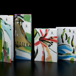
Marbella Club by Pentagram
Marbella Club is a hotel, spa and golf resort located in the Spanish coastal city of Marbella, on the shores of the Mediterranean sea. Built as the private residence of Prince Alfonso of Hohenlohe-Langenburg, and converted by the prince into an exclusive, private hotel and retreat in 1957, Marbella Club has a significant heritage, one that has played host to royalty,...
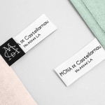
Mona De Castellarnau by Anagrama
Mona De Castellarnau is a US based luxury lifestyle brand that creates and retails a unique collection of crafted and meaningful objects that are said to reflect timeless beauty, simplicity and authenticity. Objects include home furnishings, accessories, bags and throws. Each are designed with an appreciation for tradition and provenance, an understanding of artisanal disciplines, and utilise simple forms, prints, patterns and...
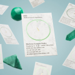
Ona by Mucho
Ona is a Spanish boutique travel agent providing its clients with personal, unique and private tours, day trips and stays in Barcelona and Catalonia. Its experienced guides offer professional insight into local culture, gastronomy, history, architecture, art and design, and provide round-the-clock assistance. Ona’s brand identity, designed by Mucho and based around the tagline “Tailored travel experiences”, is an unusual and distinctive...
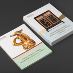
Balclis by Mucho
Balclis is a leading Spanish auction house, founded in 1979, with a varied catalogue of antiquities including jewellery, fine art, books and furniture. Quick to recognise the changing nature of the market and the way that people engage with the auction process, Balclis moved from local business to secure international recognition. With this in mind, and to keep up with industry changes,...
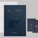
CC Bar by Freytag Anderson
Glasgow based design studio Freytag Anderson recently worked with Fraher Architects to develop the brand identity and collateral for Champagne & Cocktails at the Hilton Hotel, 22 Park Lane, London. Based around a monogram, midnight blue colour palette, hand crafted finishes of wood cut and etched glass detail, and both visual and material texture, Freytag Anderson delivered what they describe as a luxurious and old-world aesthetic that is...
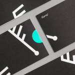
Fosnavåg Konserthus by Heydays
Fosnavåg is a city on the island of Bergsøya, situated off the west coast of Norway not far from the Altantic Ocean. It is home to a variety of maritime businesses including fishing, logistics and shipbuilding, and now the location of Fosnavaag Cultural Centre, a new concert hall founded by the local community. Fosnavaag Cultural Centre’s brand identity, created by Scandinavian graphic design studio...

Adisgladis by Bedow
Adisgladis is a Swedish clothing, accessories, outdoor gear and gadget retailer with premises on Stockholm’s Wollmar Yxkullsgatan street. It has a distinctive interior of copper pipe racks, die cut card hangers, wood fibre and chipboard surfaces, and a philosophy that embraces organic, up-cycled and positive living. Adisgladis’ new visual identity, developed by Stockholm based graphic design studio Bedow, draws on the...
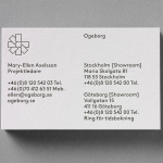
Ogeborg by Kurppa Hosk
Ogeborg is a Swedish, family-owned, manufacturer and supplier of high-quality carpet to the commercial sector, partnering with real estate owners, architects and interior designers since 1968. Stockholm based graphic design studio Kurppa Hosk worked with Ogeborg to develop a new strategy, visual identity treatment and website that would not only reflect some of the culture of the business but would help them...