Designed by Bibliothèque
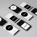
Chyna Club by Bibliothèque
Over the past few decades, high-street menu-scribbler Wagamama has become a rare beacon of actually-very-nice-food among a sea of uninspiring spicy chicken, Giraffes, and Five Guys (arguably, simply too many guys). It turns out Wagamama has some pretty big-name siblings: Mayfair’s Michelin starred, celebrity-beloved Hakkasan; Thai stalwart Busaba; Cantonese eaterie Yauatcha; and Turkish restaurant chain Yamabahce all sit within the...
Varnom Ross by Bibliothèque
Varnom Ross is a London-based specialist recruitment agency carefully pairing property professionals with private and public sector clients operating throughout the UK. Their specialism emerges from a single-minded focus on searching for and discovering the perfect synergy between individual character and collective corporate culture, professional skill set and task. This is achieved through personal conversation rather than the impersonal algorithmic governance...

David Collins Studio by Bibliothèque Design
David Collins Studio is an award-winning interior architecture practice working with brands, businesses and private clients who share their passion for detail, craft and refinement. These include Harrods, Nobu Berkeley, The Connaught Bar and those working within the hospitality, residential and retail sectors. The studio’s work is described as being iconic, timeless and having a dramatic glamour rooted in a...

Mere by Bibliothèque
Mere–pronounced Mary–is a modern two-storey restaurant and bar, located in London’s Fitzrovia, developed by chef Monica Galetti and sommelier David Galetti, working in collaboration with Westbury Street Holdings. The restaurant has a menu of simple dishes made from seasonal produce using classic techniques, and influenced by the French and South Pacific heritage of David and Monica, respectively. It also features a warm interior of...

Linden Staub by Bibliothèque
Linden Stuab is a UK-based model agency challenging industry conventions with their mantra ‘Empowering Women’, and by acting as a mother agency to all of their models. The name Linden Staub, derived from the maiden names of the two founding partner’s mothers, is an expression of this, and alongside the agency’s strong human-focus, was the basis for their new brand identity, created...
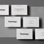
Flamingo by Bibliothèque
Flamingo is an insight and strategy consultancy, founded by Kirsty Fuller and Maggie Collier in 1997, that works with businesses, and at the intersection of people, culture and brands, to help enrich lives by shaping culture and evolving behaviours. The consultancy is described as a group and not just a network, collaborating and sharing across its seven offices throughout Europe, Asia, India and South America....