Varnom Ross by Bibliothèque
Opinion by Richard Baird Posted 10 January 2019
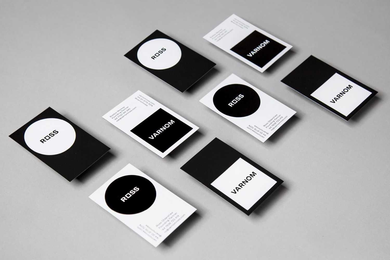
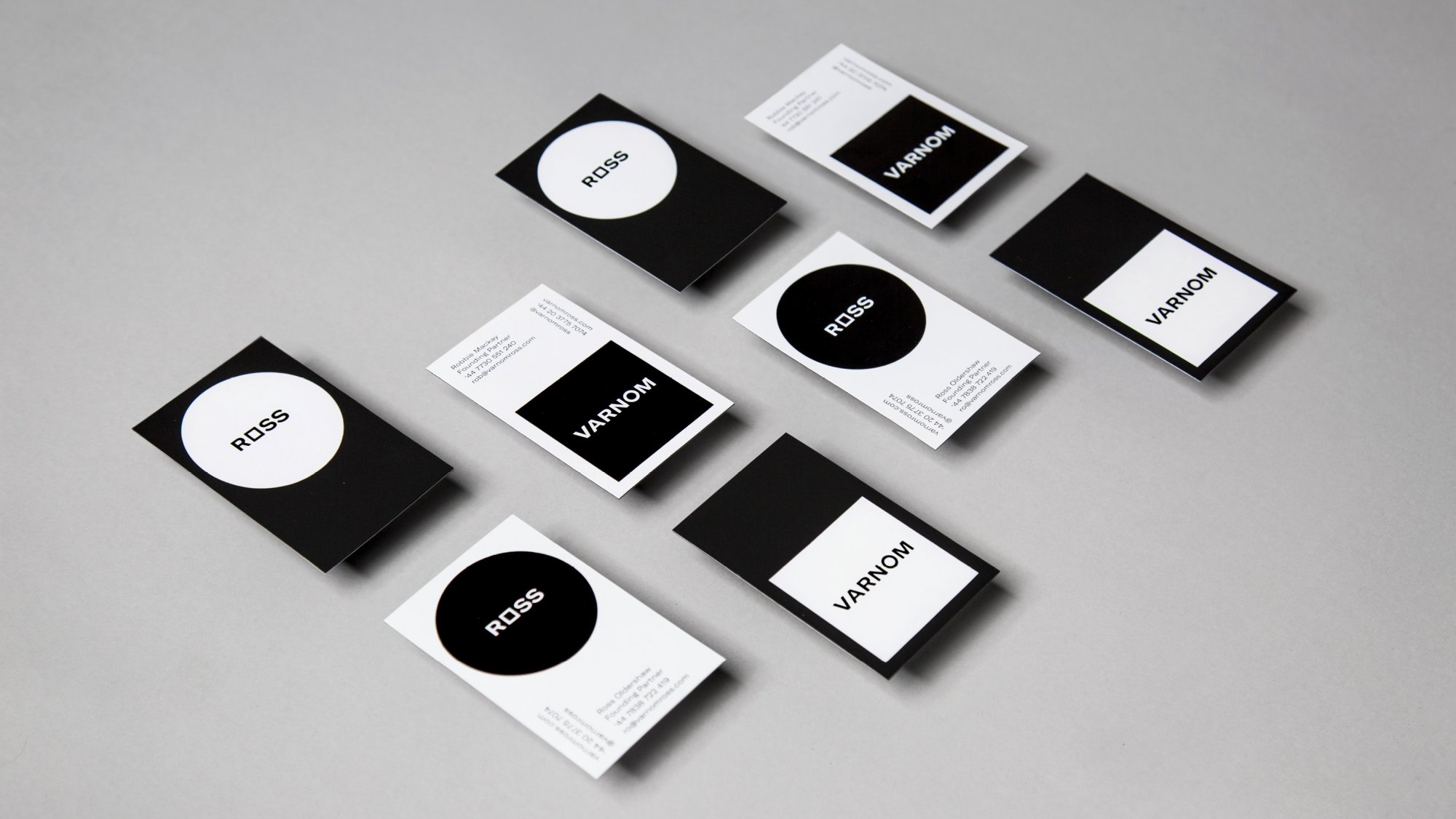
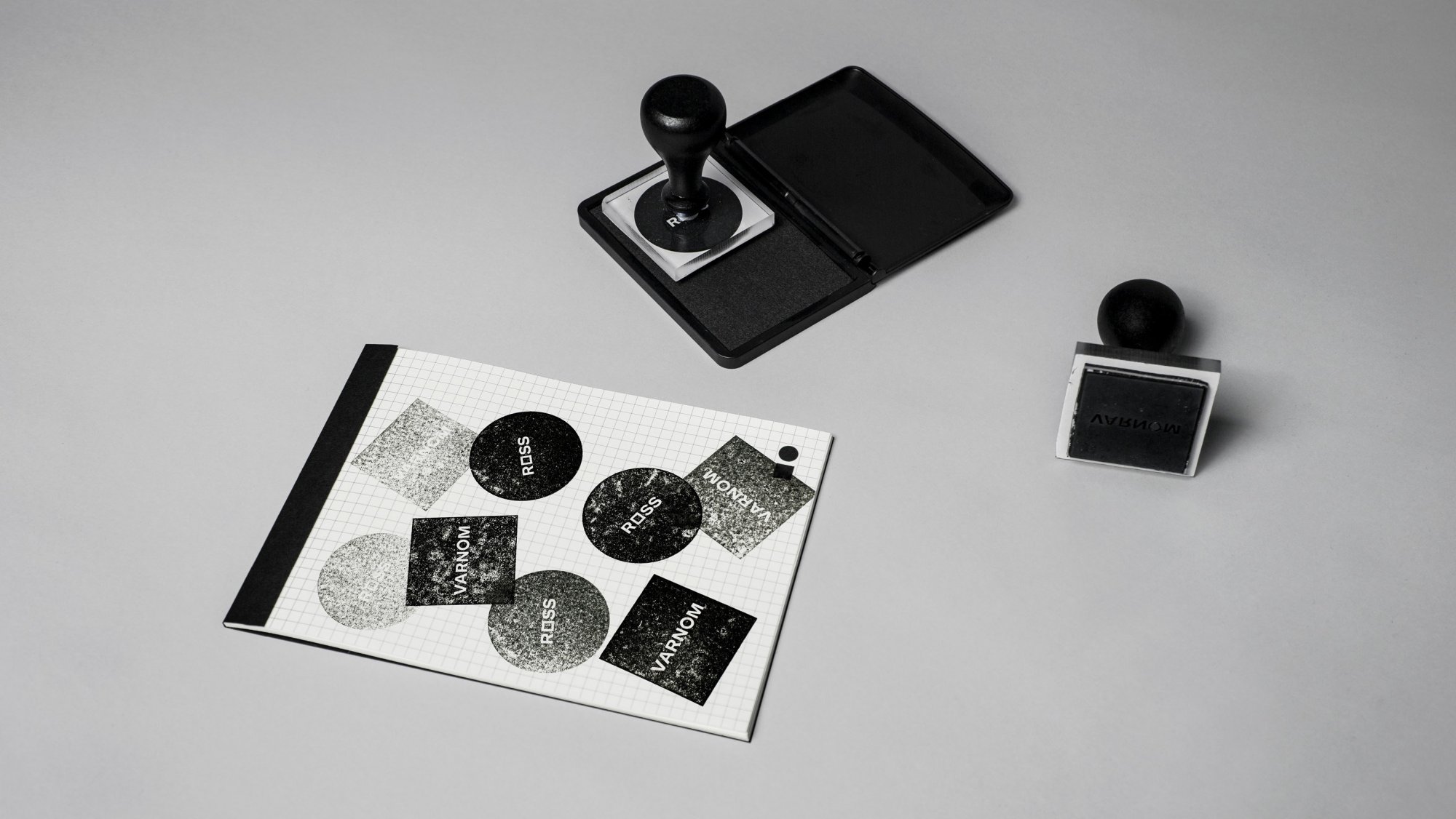
Varnom Ross is a London-based specialist recruitment agency carefully pairing property professionals with private and public sector clients operating throughout the UK. Their specialism emerges from a single-minded focus on searching for and discovering the perfect synergy between individual character and collective corporate culture, professional skill set and task. This is achieved through personal conversation rather than the impersonal algorithmic governance that characterises many of today’s recruitment firms. Varnom Ross worked with Bibliothèque to express this positioning through a distinct graphic identity of contrasts, graphic immediacy and personability across print (gifts, coffee cups, ink stamps, business cards and printed communications) and screen (website and social media posts).
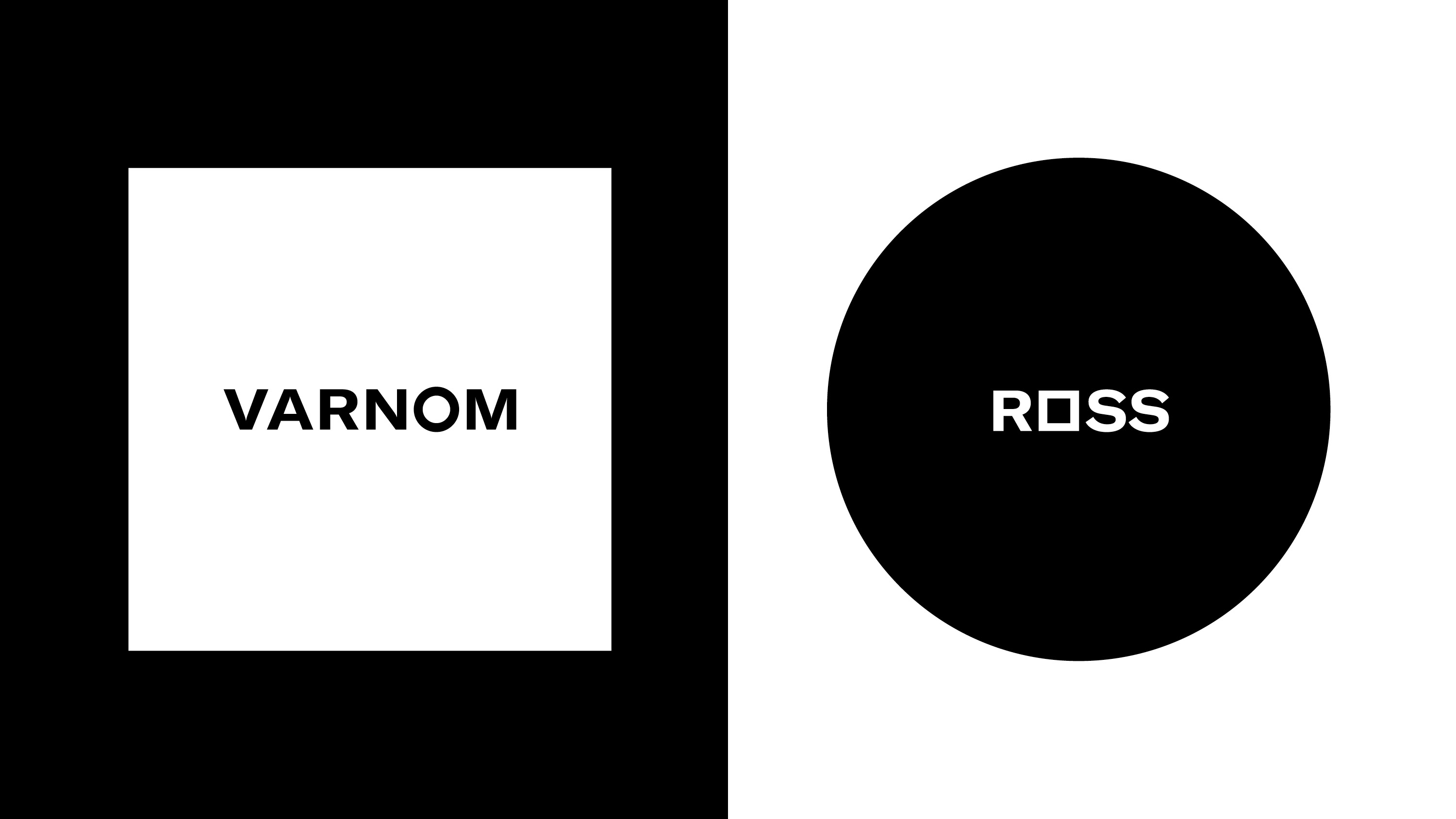
Varnom Ross searches for and facilitates the perfect fit. Finding and pairing. They engage both sides, requirement and expectation, individuals seeking opportunities (cross-platform), and those with opportunities who are seeking candidates. This is a balance of professional reliability and the personable and individual. This is expressed throughout a graphic identity of duality and balance, in colour and form, in the intersection of forms, within the approach to copywriting and in the searchlight/spotlight quality implied by motion.
The graphic expression is reductive, minimalist, however effectively plays with form language and is loaded with allusions to finding, pairing and fitting, with a slightly edgier visual character that moves it away from the corporate. GT America helps in the now-ness of its extended forms and in the geometric shapes placed within the wordmark.
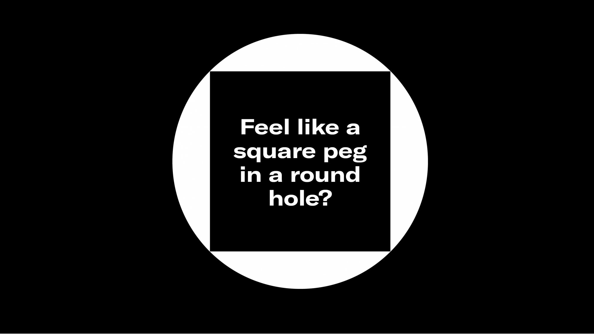
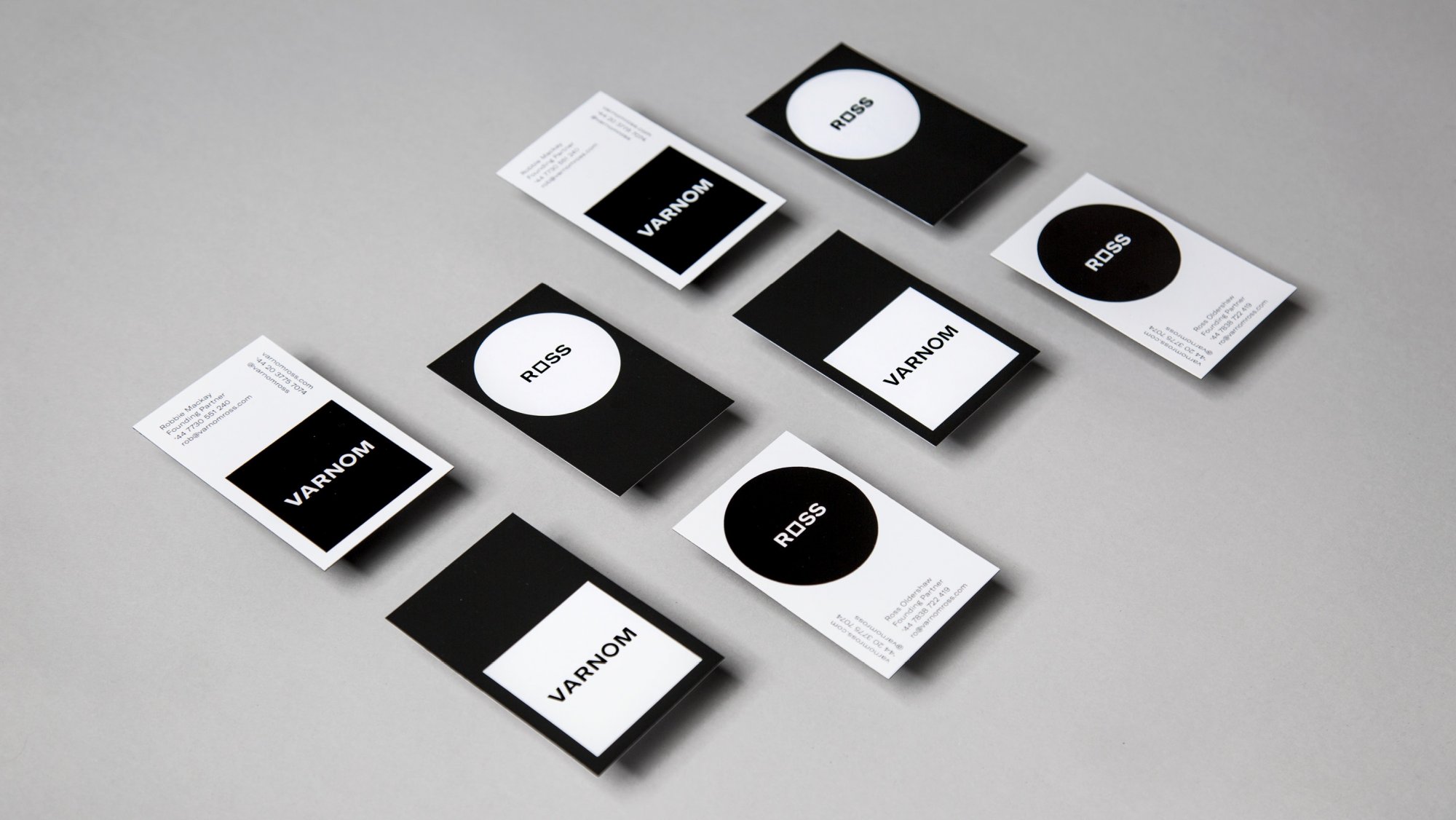
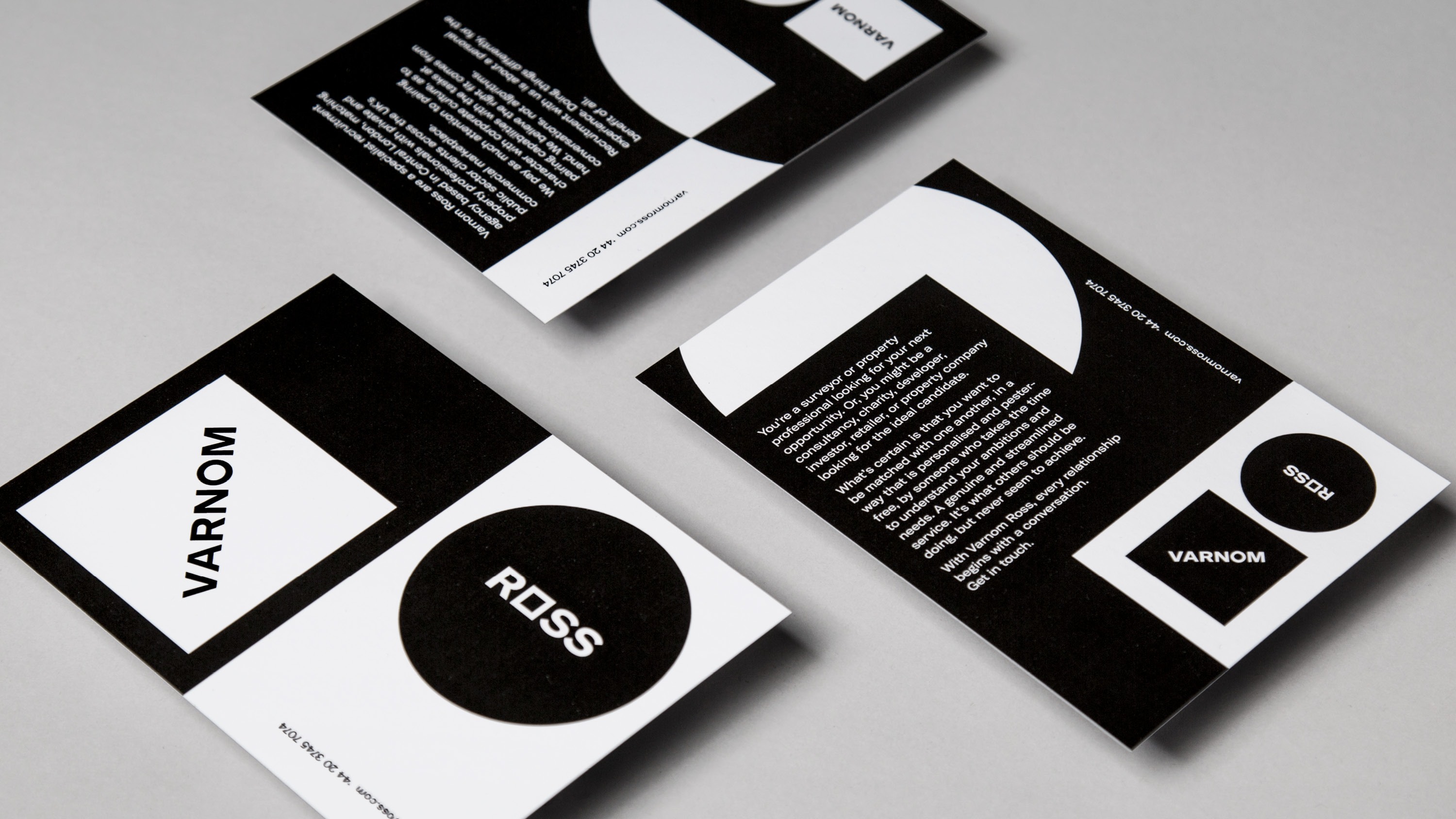
Duality, contrast and resolution are recurring motifs throughout, be that in form, direction, cropping, positive and negative space, circles set within squares (and vice versa), the suggestion of new fits in unexpected places and the “US” and “You” structure of the website and its use of form to divide content.
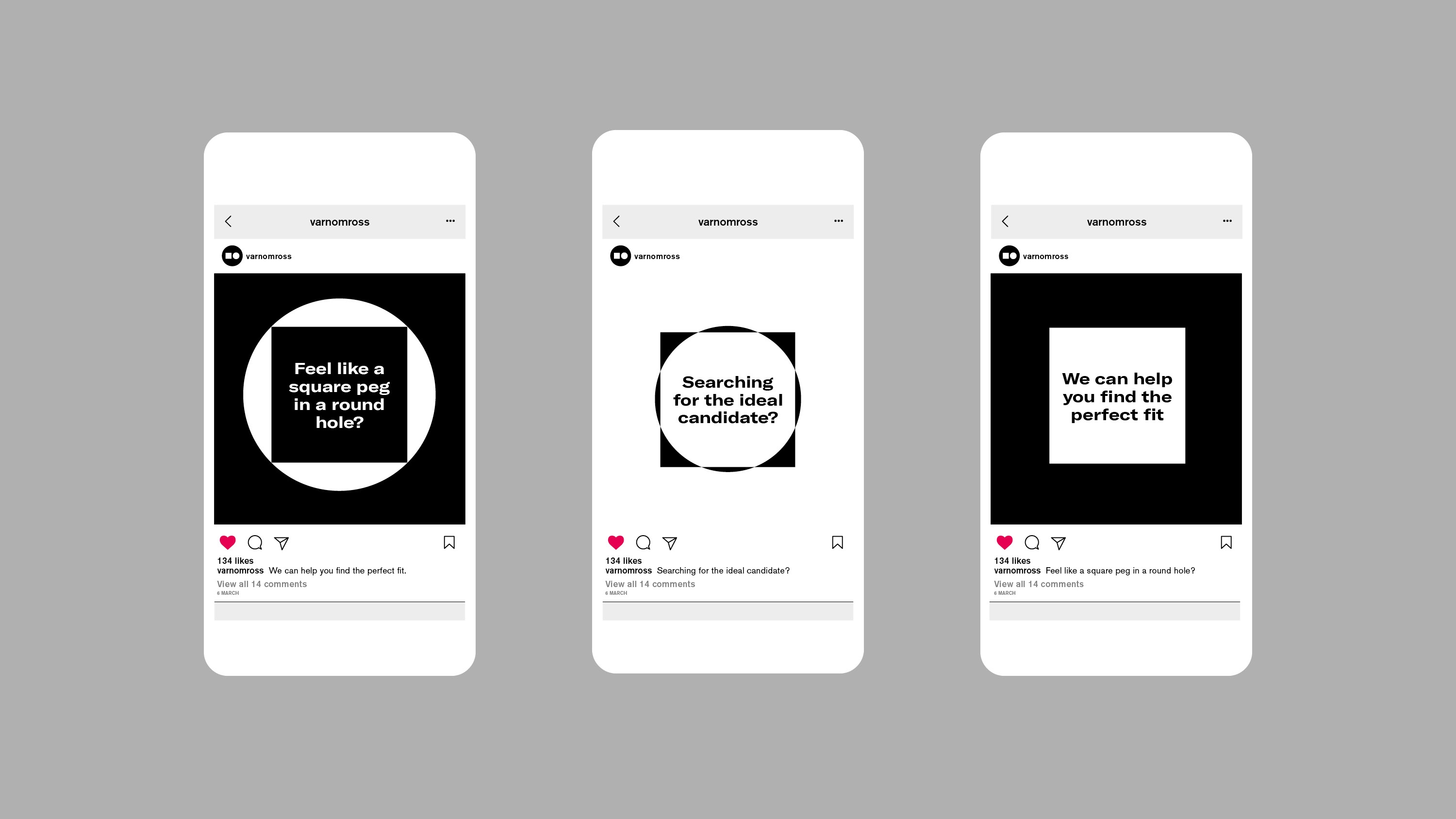
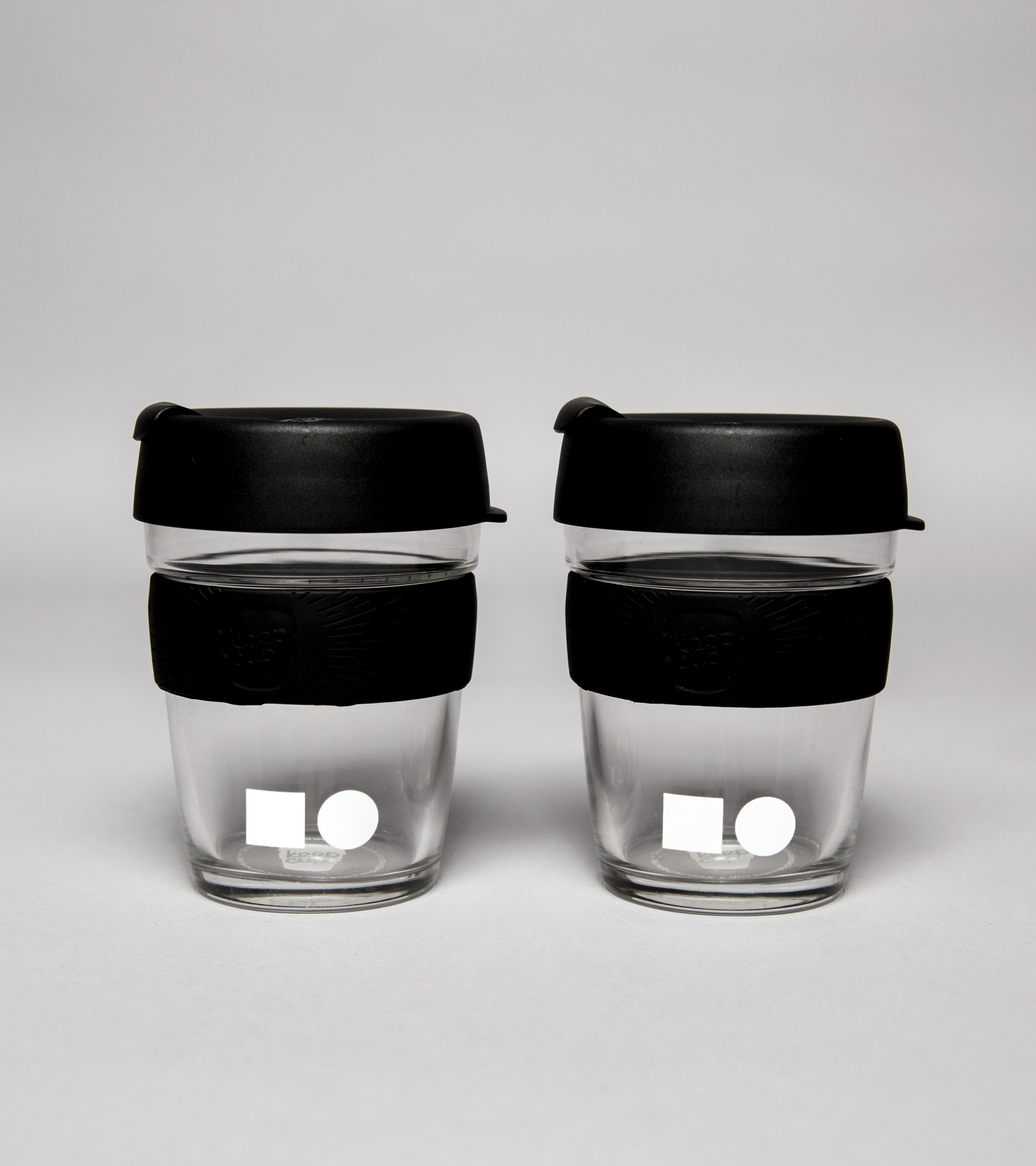
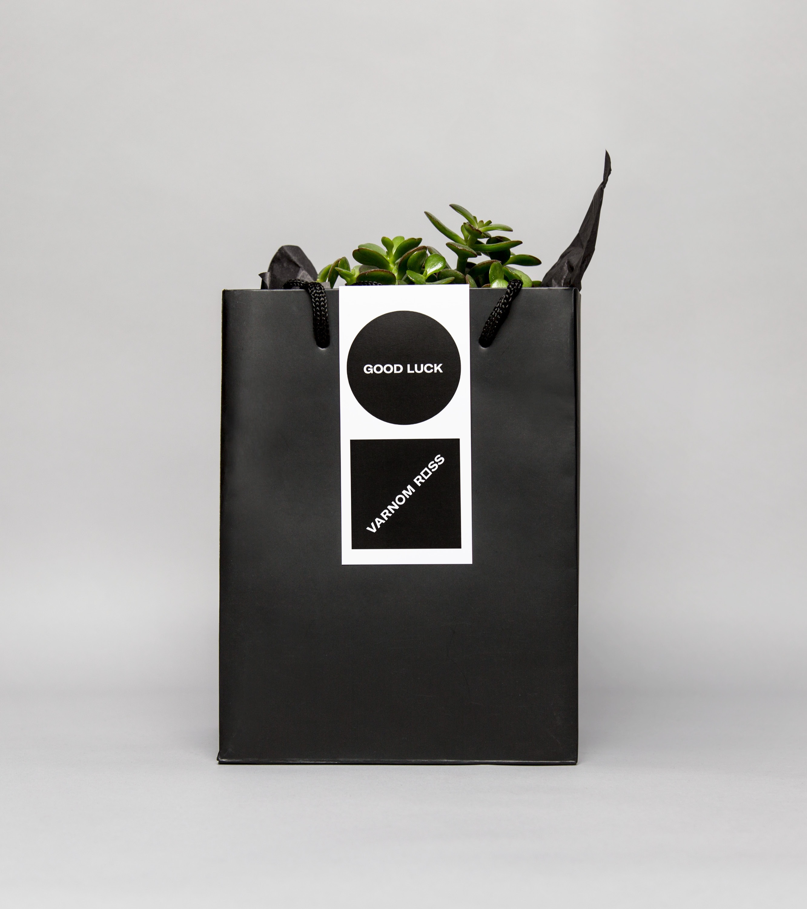
The concept; the confluence of searching and finding, and the use of words, shape, colour and motion manages to extract a lot of meaning and visual variety from simplicity. Its sensitive to context; this is an identity that exists within a constrained set of contexts; a 30-page brochure is unlikely. It does falter slightly in the context of coffee cups where visual identity reduced down to two forms side by side but this, in contrast, works well as the more useful profile image linking social media. Other details such as the ink stamps and gift bag function as surfaces and techniques to explore and bring to light the potential of the concept.
Where the black and white palette, its binary and technical associations, lack some of the personal warmth you might expect for a company that delivers an individual and personable approach its social media presence and tone of voice tempers this significantly. More work by Bibliotheque on BP&O.
Brand Identity: Bibliothèque. Opinion: Richard Baird. Fonts: GT America Extended.
