Hidraulik by Hey, Spain
Posted: | Author: Richard Baird | Filed under: Art and Design, Fonts in Use, Graphic Design Reviews, Packaging Reviews | Tags: Best Packaging Designs, Black Paper, Box Packaging, Brand Identity, Brand Identity Reviews, Branding, Branding Blog, Branding News, Branding Reviews, Business Card Design, Coloured Paper, Creative Packaging, Design For Print, Design News, Design Opinion, Design Reviews, Designed by Hey, Designed by Huaman, Designed in Barcelona, Fonts in Use: Circular, From Europe, Geometric Pattern, Graphic Design, Graphic Design Blog, Homeware, Illustration, Logo Design & Branding Blog, Logo Design Inspiration, Logo Design Resource, Logo Designs, Logotypes, Minimal Logos, Packaging Company, Packaging Design Blog, Packaging Design Resource, Packaging News, Packaging Opinion, Paper and Card Packaging, Spanish Design, Stationery Design, The Best Brand Identities of 2015, The Best Packaging of 2015, Type Foundry: Lineto, Typography | Comments Off on Hidraulik by Hey, SpainOpinion by Richard Baird.
Hidraulik is a Barcelona-based business producing floor mats, table mats and runners for contemporary spaces. These are inspired by cement panels hydraulically pressed, rather than fired, with a layer of coloured pigment.
Hydraulic panels originated in the 1850’s and experienced a resurgence in the mid 20th century. At that time they would often feature brightly coloured and detailed patterns, and were popular during an era of personalisation and interior self-expression. Hidraulik brings these right up to date, applying a similar aesthetic quality to a thin, flexible and moveable PVC surface.
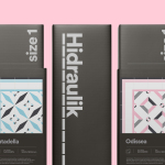
The first range was made up of Art Nouveau-inspired prints designed in house, and was followed up by modernist-inspired prints created by Huaman, the graphic design studio also responsible for Hidraulik’s brand identity and packaging.
This week sees the launch of Hidrualik’s latest range, created by Barcelona-based graphic design studio Hey. These build on the retrospective references of Huaman’s designs but with some of the idiosyncrasies of Hey’s own work, often convivial in colour, form and composition. Hydraulic describe this new range as diverging from but still honouring something of the modernist traditions that inspires the brand.
Hidraulik by Huaman, Spain
Posted: | Author: Richard Baird | Filed under: Art and Design, Fonts in Use, Logo Reviews, Packaging Reviews | Tags: Best Packaging Designs, Black Paper, Box Packaging, Brand Identity, Brand Identity Reviews, Branding, Branding Blog, Branding News, Branding Reviews, Business Card Design, Coloured Paper, Creative Packaging, Design For Print, Design News, Design Opinion, Design Reviews, Designed by Huaman, Designed in Barcelona, Fonts in Use: Circular, From Europe, Geometric Pattern, Graphic Design, Graphic Design Blog, Homeware, Illustration, Logo Design & Branding Blog, Logo Design Inspiration, Logo Design Resource, Logo Designs, Logotypes, Minimal Logos, Packaging Company, Packaging Design Blog, Packaging Design Resource, Packaging News, Packaging Opinion, Paper and Card Packaging, Spanish Design, Stationery Design, The Best Brand Identities of 2015, The Best Packaging of 2015, Type Foundry: Lineto, Typography | Comments Off on Hidraulik by Huaman, SpainOpinion by Richard Baird.
Hidraulik is a Barcelona based business producing rugs for contemporary spaces. These are inspired by cement panels hydraulically pressed, rather than fired, with a layer of coloured pigment.
Hydraulic panels originated in the 1850’s and experienced a resurgence in the mid 20th century, these would often feature brightly coloured and detailed patterns, and were popular during an era of personalisation and interior expression. Hydraulic brings these into the present, by applying a similar aesthetic qualitiy to a thin, flexible and moveable surface.
The range includes a variety of Art Nouveau prints produced in house, and modernist inspired designs developed by Huaman, the graphic design studio also responsible for Hidraulik’s brand identity, business card and package design.
Los Italianos designed by Huaman
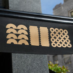
Posted: | Author: Richard Baird | Filed under: Food and Drink, Logo Reviews, Packaging Reviews | Tags: Best Packaging Designs, Brand Identity, Brand Identity Design, Brand Identity Reviews, Branding, Branding Blog, Branding Reviews, Business Card Design, Coloured Paper, Creative Packaging, Design For Print, Designed by Huaman, Designed in Barcelona, Gold Foil, Icon Design, Logo Design & Branding Blog, Logo News, Logos, Packaging Company, Pasta Packaging Design, Script Logotypes, Sign Design, Spanish Design, Stationery Design, The Best Business Cards of 2014, The Best Packaging of 2014 | Comments Off on Los Italianos designed by HuamanLos Italianos is a traditional Italian food producer and retailer with three locations across Barcelona but with its roots in the Piemonte region of Italy and a significant history that dates back to 1939. Los Italianos recently commissioned Spanish design studio Huaman to develop a new brand identity that would better position them within the gourmet category, introduce an elegance and modernity whilst retaining a sense of heritage. This was achieved through the simple leveraging of familiar, high quality and traditional design cues of a script, shield and foil, and fusing these with the contemporary distinction of bold geometric shapes informed by the diversity of Italian pastas. These were applied to business cards, packaging and signage.