Designed by Studio Lin

OMA NY Monograph by Studio Lin
The Office for Metropolitan Architecture (OMA) is an international architectural practice operating within the traditional boundaries of architecture and urbanism. It was founded in 1975 in Rotterdam by architects Rem Koolhaas and Elia Zenghelis and alongside Madelon Vriesendorp and Zoe Zenghelis. OMA now has seven offices. This year saw the launch of OMA New York’s self-published monograph, designed by Studio Lin, that takes a look...
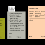
MOS Architects by Studio Lin
MOS is an American architectural practice that mixes playful experimentation with serious research. The practice, as it exists now, following two years of what seems to be an informal approach, was established in 2005, and has worked through a range of design experiments it describes as a make-believe of architectural fantasies, problems, and thoughts on what the practice would be building in the...

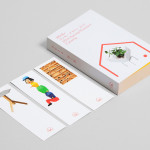
Kid O by Studio Lin
Kid O is a modern American toy company that creates products that engage and stimulate children through a rich variety of shapes, colours, and sizes. Designed by Studio Lin, Kid O’s new packaging treatment — which included over 50 boxes — takes the vivid colours of the industry, reduces these down to four, contains them within geometric boundaries and pairs...

Fort Standard designed by Studio Lin
Fort Standard is a New York based industrial design studio using long-lasting natural materials and traditional production methods in an innovative way to produce products, lighting and furniture with a simplicity, high functionality and an attention to detail. As the studio explain online, their ability to act as both designers and manufacturers not only informs their process, but yields smarter products...

Paul Loebach by Studio Lin
Paul Loebach is a Brooklyn based three dimensional designer who specialises in product, furniture and emerging manufacturing technologies. His new identity, developed by Studio Lin, is a wonderful union of craft, structure, space and geometry that neatly reflects his use of both traditional materials and contemporary processes....
Minke Design Store by Studio Lin
Minke is a Tokyo homeware store that stocks hard to find designer objects and furniture. The store’s identity, created by New York based design firm Studio Lin, neatly resolves the classic and the contemporary, the structured and the anarchic, creativity and practicality through a union of bold serif, modernistic structure, random geometric detail and a bright but restrained primary colour palette....