MOS Architects by Studio Lin
Opinion by Richard Baird Posted 17 September 2015

MOS is an American architectural practice that mixes playful experimentation with serious research. The practice, as it exists now, following two years of what seems to be an informal approach, was established in 2005, and has worked through a range of design experiments it describes as a make-believe of architectural fantasies, problems, and thoughts on what the practice would be building in the future. MOS now has a broad portfolio that includes institutions, housing and retail, installations, furniture, essays, software and film.
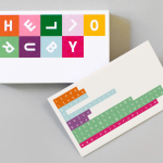
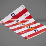
MOS Architect’s brand identity, developed by New York based Studio Lin, has a stripped down aesthetic with an intentionally generic quality that uses on-demand printing processes to cover promotional pieces, request for quote documents, publications, stationery and business cards.

Reading through the MOS website it is clear that there is a struggle against convention, and a desire to call it out. This is perfectly encapsulated in their office statement, which is an open and very personal criticism of an industry awash with a cold professionalism and a preference for generic and unhelpful language.
Unusually, and contrary to the office statement, the MOS brand identity knowingly embraces the cold professionalism and aesthetic reduction that permeates, and perhaps defines, identity within the industry. This manifests itself through simple typographic shape, the consistency of its implementation, grid based layouts, white boards, black ink, and the absence of flourish.
The difficulties of trying to express the experimental and dynamic nature of the studio, and the breadth of its experience, with an identity system with a specific communicative intention and set of designed assets, is avoided in the use of the generic and economical.
Differentiation, the foundation of identity, as expressed through the aesthetic of logos, stationery, print and promotion, appears to have been perceived as having little value when measured against portfolio and interaction with those at MOS, with identity simply serving as a foundation that clearly reads as contemporary and architectural.


Although described as generic—comfortably touching upon the form, structure, light and shade, repetition and reduction, positive and negative space that proliferates the architectural world—there is a semblance of individuality in the use of bright colour, copy across book covers, and typesetting across stationery, but also in its knowing use of convention. There are moments, amongst the familiar and current, that appear playful, identifiable, and interesting.

Low volume on demand printing, alongside the practical nature of type, afford MOS a temporary quality with the potential to adapt quickly. It is agile in its lack of specificity, utilitarian in its implementation and, much like a gallery identity, is capable of framing and emphasising work, and conveying thought without stylistic distraction. Neutrality, an open use of convention, paired with tone of voice, ultimately says a lot with very little, and feels well-suited to a studio dedicated to experimentation across a variety off fields. When change is frequent, new specialisations formed as quickly as they are discarded, this approach feels rather appropriate. More from Studio Lin on BP&O.
Design: Studio Lin. Opinion: Richard Baird. Fonts Used: Aperçu Mono & Akzidence Grotesk