Designed by Tsto

Lundén Architecture Company by Tsto
Lundén Architecture Company is a Helsinki-based design studio developing innovative structures, infrastructures and spaces. The studio, through their knowledge of strategic development, experimental building technology and urban design, drawn from their collaborations with experts from different fields, offer proposals that affect the future of the built environment. Projects have included a new school and community complex that inspires learning during...

Artek Helsinki by Tsto
Artek is a Finnish furniture and product design business and retailer with a flagship store in Helsinki. It was founded in 1935 by architect Alvar Aalto and wife Aino Aalto, the arts promoter Maire Gullichsen and art historian Nils-Gustav Hahl. Artek grew alongside and shared many of the qualities of the 20th century modernist movement, blending art and technology, and making the...
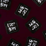
Bier Bier by Tsto
Bier Bier is located on the ground floor of a striking Art Nouveau building in the centre of Helsinki, and part of The We Are Group, alongside wine bar Vin Vin, restaurant Story and wine importer and wholesaler Viinitie. It has over 100 different types of beer and an interior of dark wood panels and carved frames, ocean green walls, light wood...
Yksi elämä by Tsto
Yksi elämä is a Finnish project set-up with the intention of encouraging people to become more interested in their own well-being and to improve public health care on both a professional and organisational level, as well as society in general. The project is a collaborative endeavour between the Brain Association, Diabetes Association and Heart Association of Finland. Design studio Tsto were asked...

Taidehalli by Tsto
Taidehalli is an art gallery, also know as Helsinki Kunsthalle, with a significant 86-year history. It is set within the walls of a distinctive building created by Jarl Eklund and Hilding Ekelund, and during its lengthy residency has secured its place as a key space within Finland for the exhibition of contemporary artworks. Taidehalli’s new brand identity, recently redesigned by Helsinki and New York based design...