Designed in Denmark
Qasa by Bold
Now that the likes of ed-tech (education technology) and fin-tech (financial technology) have become a natural part of everyday parlance, it was surely only a matter of time before prop-tech (property technology) entered the equation, too. Proptech largely refers to platforms and services that use tech to help people buy, sell, research, market, and manage a property – ranging from...
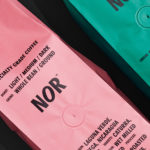
NOR Specialties by Re-public
NOR Specialities supports the development of plantation farmers and helps sustain local communities across Colombia, Guatemala, Nicaragua and Bolivia by way of its range of chocolate, cocoa nibs, roasted coffee beans and cold brew coffee products. NOR trades directly with family farms and producers of its raw ingredients, working with them to develop transparent and sustainable practices. Danish design studio Re-public worked with...
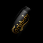
Carlsberg Black Gold by Kontrapunkt
Carlsberg is a Danish beer brand founded in 1847 by J.C. Jacobsen. It is part of the Carlsberg Group portfolio which also includes Tuborg, Kronenbourg and Somersby cider, as well as Carlsberg Export and Carlsberg Black Gold. Carlsberg has a significant heritage. And, like many other beer brands, has largely conveyed this using the visual language and associated legacy of the beer...
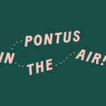
Pontus In The Air by Bold
Pontus In The Air is located at Sweden’s Arlanda Airport and was developed with the intention of being Europe’s leading airport restaurant in its blend of high quality, affordable prices and fast service. It features three distinct areas, The Brasserie, a classic bistro with table service inspired by the golden days of aviation, The Market, a self-service canteen with a more utilitarian finish, and...
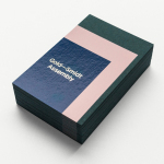
Gold—Smidt Assembly by Re-Public
Gold—Smidt Assembly is a Copenhagen-based pop-up art gallery that exhibits contemporary fine art across the globe, and offers a consultation service, collaborating with professional artists to curate sculptural pieces for commercial, public and residential spaces. Danish design studio Re-public worked with the gallery to develop a visual identity that would link a variety of assets that included signage, print communication and...
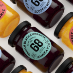
Danish Selection by Kontrapunkt
Danish Selection is a new range of high-quality fruit spreads cut with alcohol. The range includes blackcurrant infused with Jamaican rum, orange with cognac and a wild blueberry variety with Scotch whiskey. Orkla, the company behind Danish Selection, worked with Copenhagen based graphic design studio Kontrapunkt to develop a packaging treatment that would clearly communicate this new concept to consumers. Kontrapunkt’s solution is...
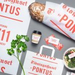
Tidningshuset by Pontus by Bold
Tidningshuset by Pontus is a 1000 m2 lunch restaurant, deli and bakery committed to sustainability, simplicity and quality, and was developed by famous Swedish chef and restauranteur Pontus Frithiof with the intention of challenging industry conventions. The restaurant is on the ground floor of a building owned by Dagens Nyheter, Sweden’s largest daily newspaper, which is situated in the newspaper district of Stockholm....
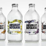
Absolut Botanik by Bold Inc.
Absolut Botanik is a new ready to drink, pre-mixed, single-source vodka range from distiller Absolut, flavoured with Scandinavian lingonberries, cloudberries and blueberries, blended with either pear, apple or lime. The range features a distinctive and bespoke single-serve bottle with a silver crown cap, and the Absolut logotype framed by rich illustrative detail. This mixes bold watercolour strokes with finer pen...
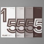
Clay by Studio Claus Due
Clay is a museum of ceramic arts and crafts, located in the Danish town of Middelfart, west of the capital. Exhibits range from a 235 year old plate to more recent and experimental pieces from contemporary artists. The museum worked with Studio Claus Due to develop a new visual identity system. This included business cards, stationery, signage, packaging, print communication and website, unified...
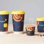
Pressbyrån by Bold
Pressbyrån is a Swedish convenience store with over 300 locations nationwide, and one of the country’s most recognised brands. It retails fresh pastry, sweets, coffee and hotdogs, alongside groceries, public transport tickets, magazines and papers, amongst a few other things. Stockholm based graphic design studio Bold worked with the store to create new packaging for its range of consumable products with the...