Tidningshuset by Pontus by Bold
Opinion by Richard Baird Posted 9 March 2016

Tidningshuset by Pontus is a 1000 m2 lunch restaurant, deli and bakery committed to sustainability, simplicity and quality, and was developed by famous Swedish chef and restauranteur Pontus Frithiof with the intention of challenging industry conventions.
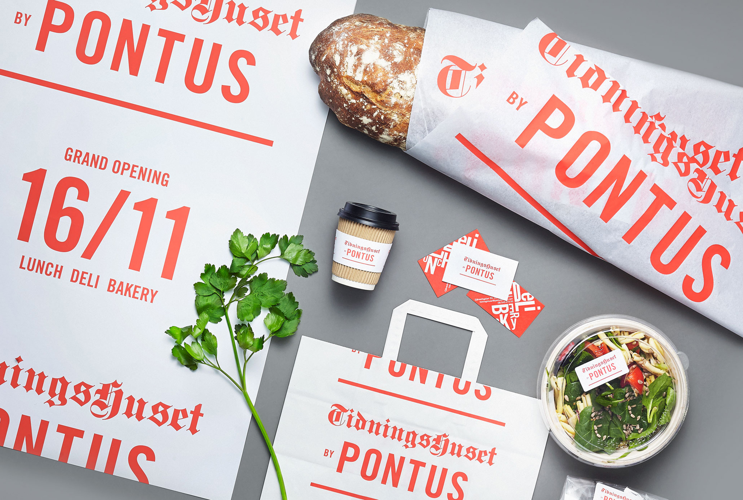
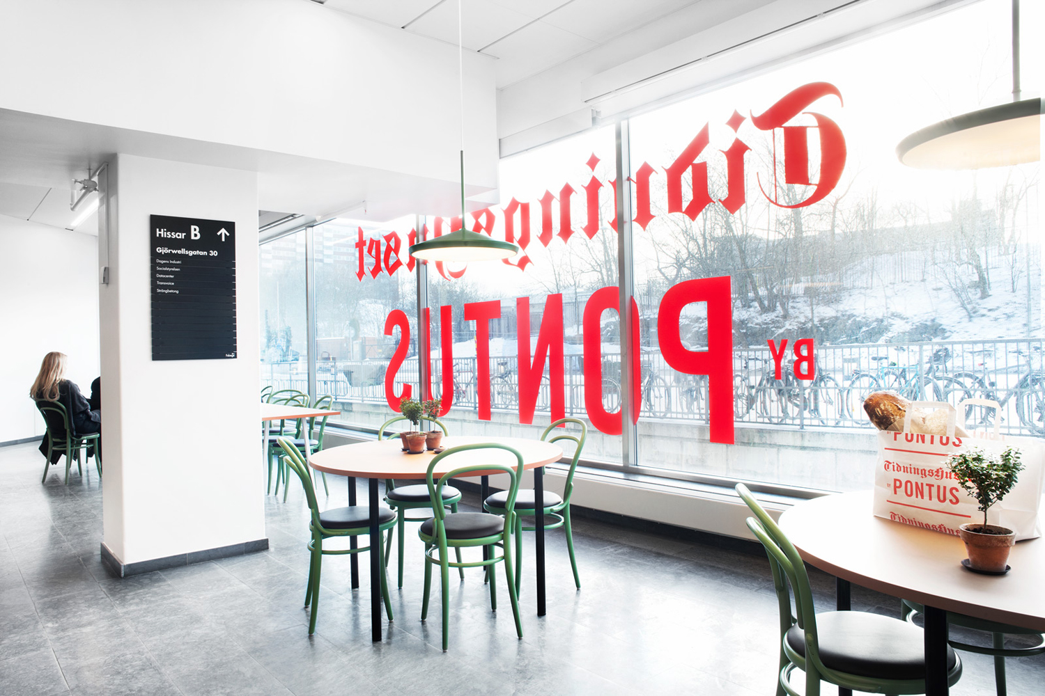
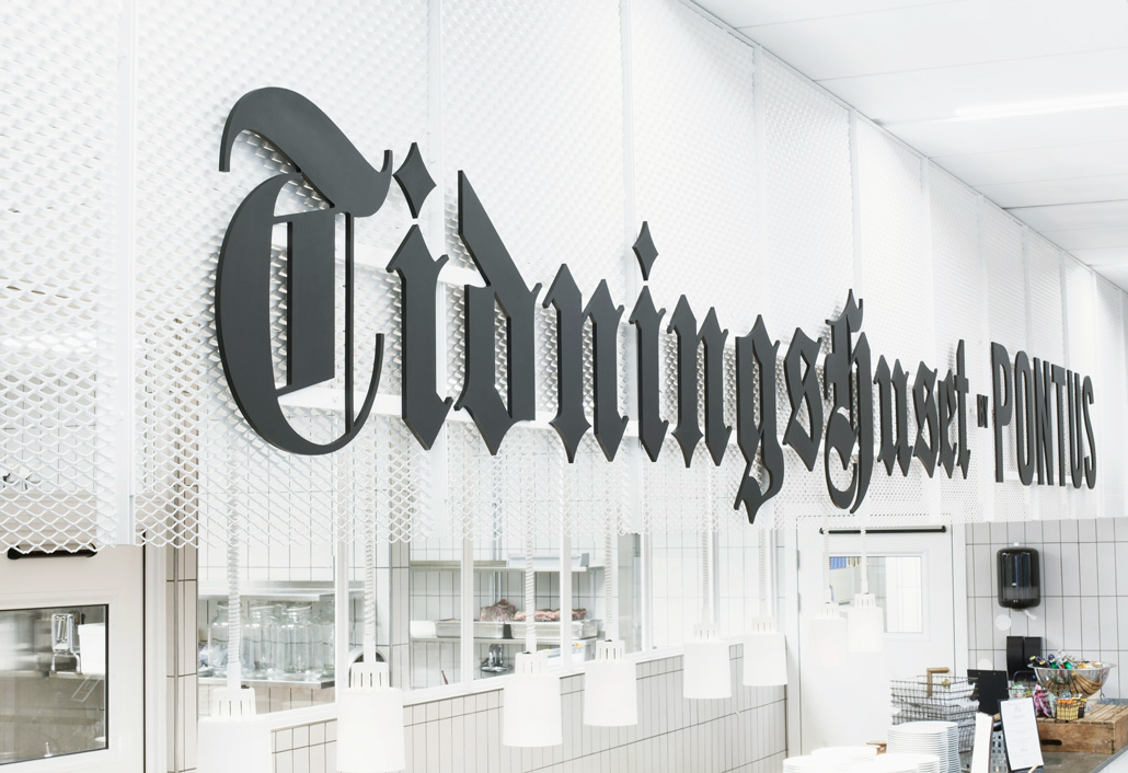
The restaurant is on the ground floor of a building owned by Dagens Nyheter, Sweden’s largest daily newspaper, which is situated in the newspaper district of Stockholm. Inspired by this unique location, Scandinavian graphic design studio Bold created a visual identity for Tidningshuset by Pontus that references the traditional mastheads and contemporary headlines of the newspaper industry. This is visualised through type contrast, a single ink print finish and dramatic signage.
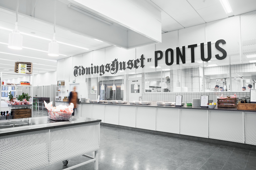
As an expression of Tidningshuset’s location, within the building of a venerable newspaper, and the progressive nature of its menu and interior, the ubiquity of traditional blackletter newspaper masthead and contemporary sans-serif headline, feels fresh and well-founded, drawing distinctive visual character from the old through new context and unusual juxtaposition.
The tension between establishment and progression effectively plays out not only in the obvious and acute contrast of type detail and reduction, but also in the authoritarian size of signage set within a very spacious and at times utilitarian interior design, and by supplanting the single black ink of newspapers with a vibrant, contemporary and energetic red.
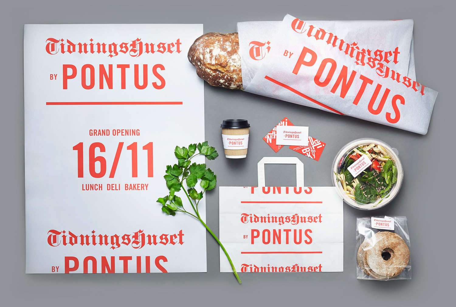
Identity, as it extends across packaging and print communication is straightforward. The simplicity but quality of the menu is effectively expressed through the absence of flourish, the use of a single but vibrant ink choice and the kitchen white of papers and boards, while crops to text give the impression that paper stock has been cut from a continuous roll.
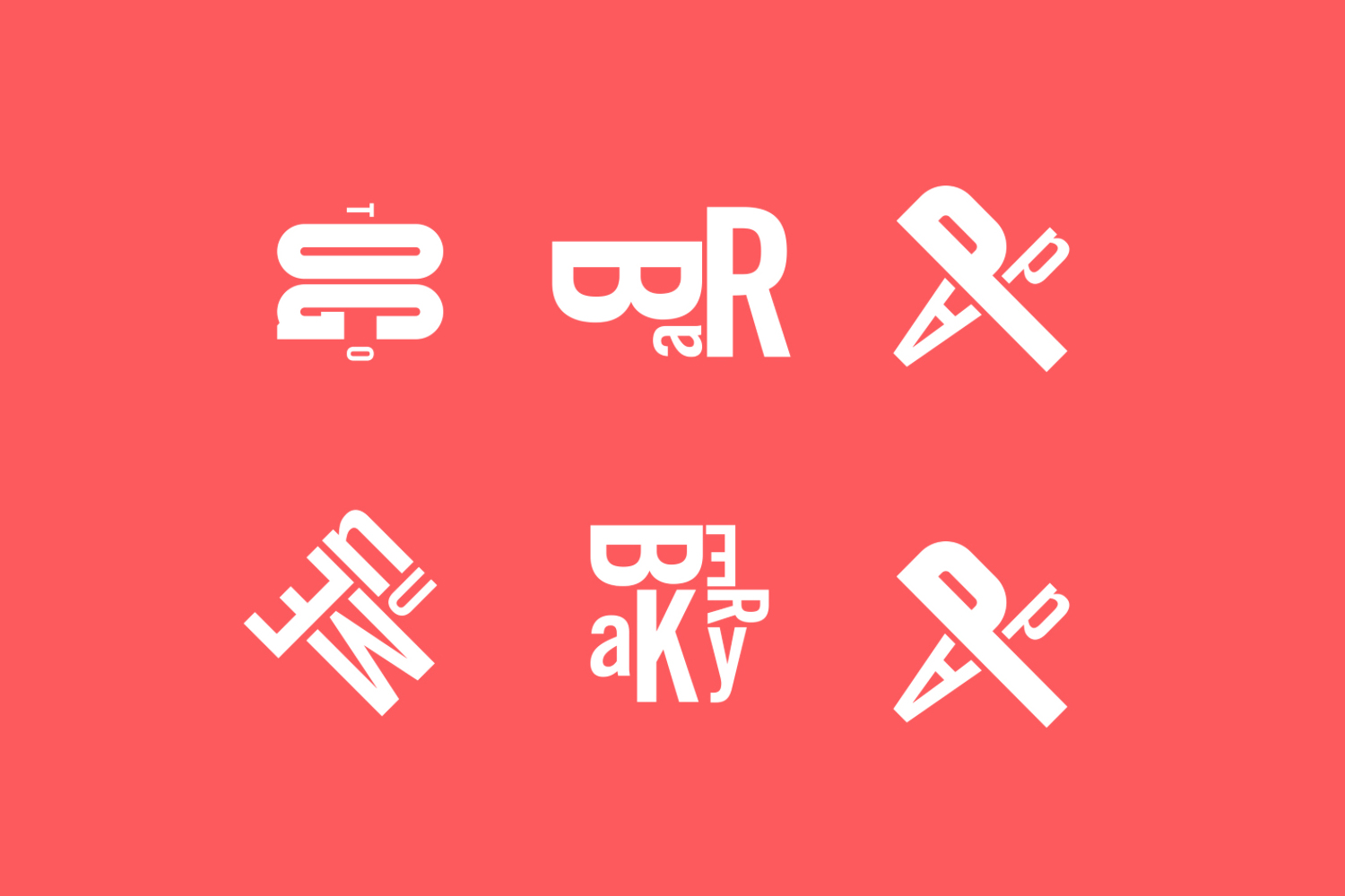
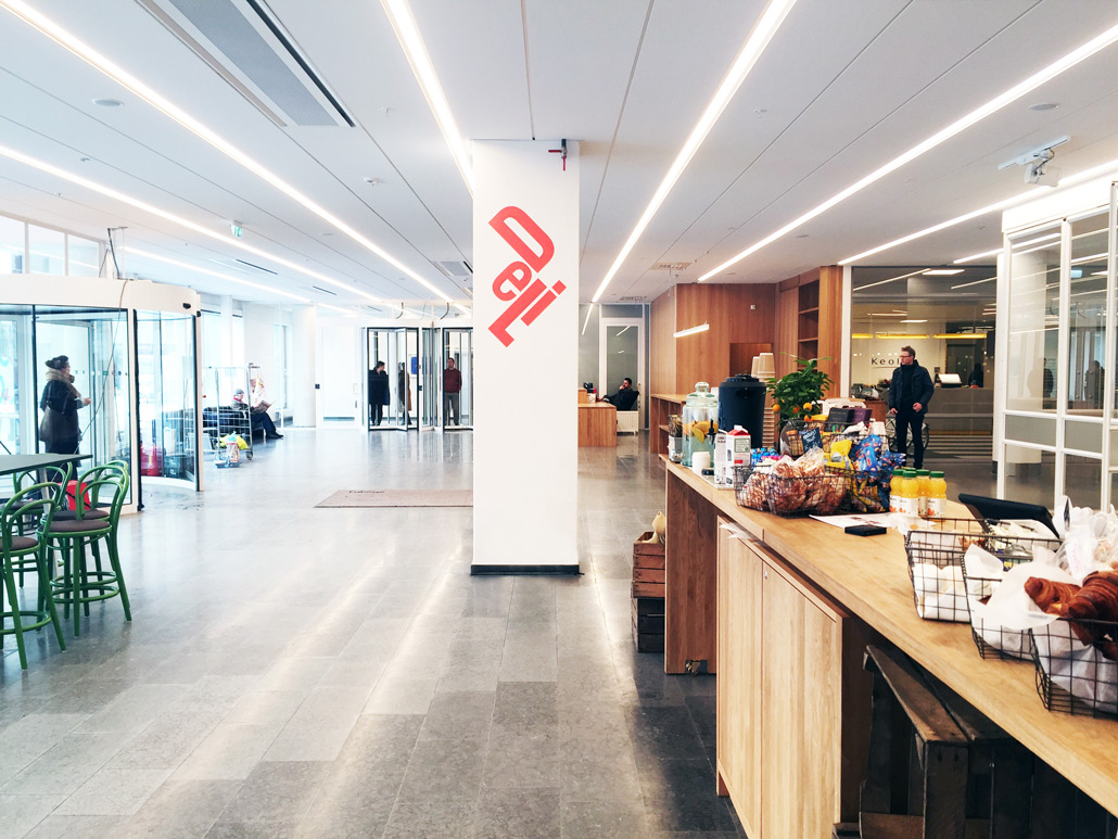
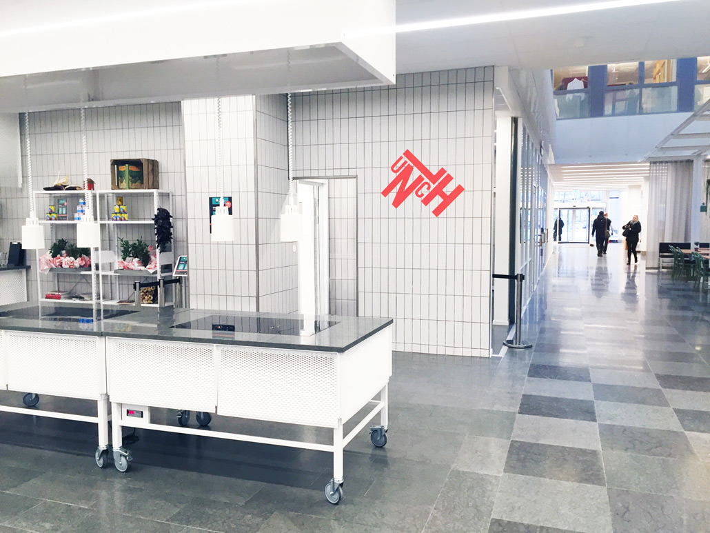
There are also moments of quirky character within the system. A series of typographical marks, which play with proportion and orientation, and draw their inspiration from letterpress type blocks, expand on the logotype but remain rooted in the printing press, add a little variation, and function to pick out key areas within the restaurant. Where logotype across the widows and as signage is large, impactful and proportional to space, the more compact typographical expressions get a little lost within the context of a very large interior.
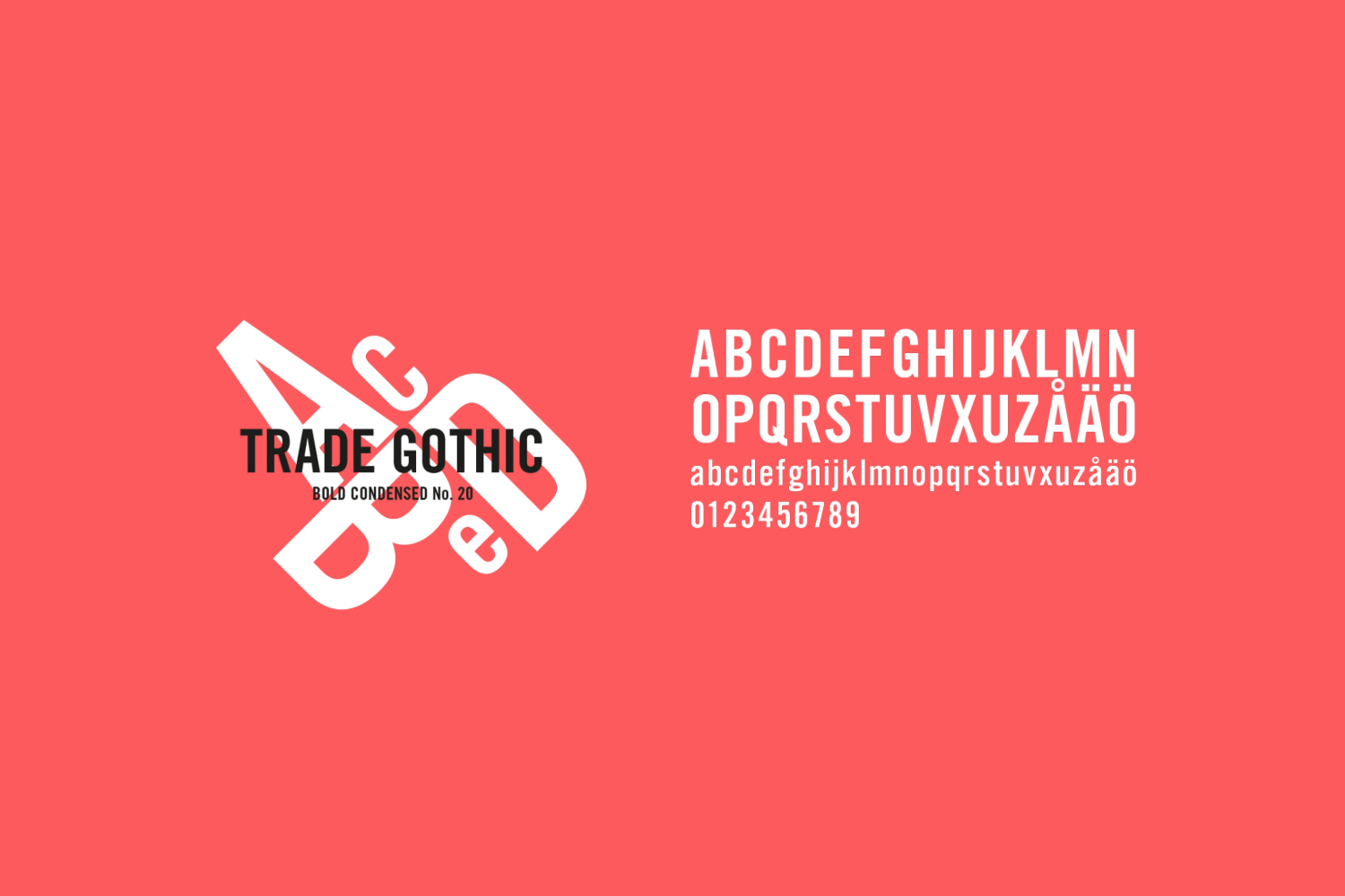
The combination of type choice, simple colour palette and name, drawing on the fame of Pontus Frithiof throughout Sweden, effectively brings together location heritage and a contemporary dining experience in a memorable way, and for the most part, particularly in signage, is implemented in a way that works well within the restaurant, yet is eye catching and communicative when used outside. More from Bold on BP&O.
Design: Bold. Opinion: Richard Baird. Fonts Used: Trade Gothic & Fette Gotisch.
