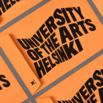
University of the Arts Helsinki by Bond
“The Finnish Academy of Fine Arts, Sibelius Academy and Theatre Academy Helsinki merged in the beginning of 2013 into the University of the Arts Helsinki. Bond created the complete branding solution for the new university. The strategy for the identity was to create a distinctive set of logotypes based on a common design language, and to introduce an anchor symbol...
Jeremy Maxwell Wintrebert by Hey
Jeremy Maxwell Wintrebert is a glassware designer and manufacturer currently working in France with a free hand glass blowing philosophy mastered while traveling internationally across the US and Europe. Spanish design agency Hey recently developed a new visual identity solution for Jeremy that captures the heat, craft and art of glass blowing through a smart combination of colour and laser...
Club at South Place Hotel by This Is Colt
Club is an exclusive private members area hidden from the public within London’s South Place Hotel. Its visual identity, developed by This Is Colt and designed to establish a connection with the parent brand but with “a personality of its own”, is built around a logotype constructed from the same contemporary, condensed sans-serif characters of the hotel’s identity but is paired with a morse code...
Jealous Sweets by B&B Studio
Jealous Sweets is a gelatine and gluten-free confectionery range made with natural fruit juices and no artificial flavours or colours. Design agency B&B studio were recently commissioned to develop a new visual identity and packaging solution for the range that would focus more on its premium position and purity of ingredients. Developed under the theme of ‘covetable candy’ – “a concept...

Fika by Designers Anonymous
Fika is a bar and kitchen located on London’s Brick Lane with a rustic menu prepared on site and to order, all of which can be taken away. Created by Designers Anonymous, Fika’s visual identity, which extends on-line, in-print and as signage, is an illustrative and photographic mix of characters, cartoons and quirky compounded imagery bound by a consistent logo,...
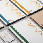
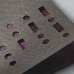
Minke by Atipo
Minke is a Spanish print production studio that favours ‘analogue splendour’ over mass manufacture, providing its clients with a variety of small-scale, mechanical and handcrafted processes. Their visual identity, developed by multidisciplinary design studio Atipo, reflects these services, processes and philosophy through a union of traditional and contemporary detail that exists across type, colour, material texture, print finish, pattern and die cut...
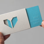
O Architecture by Heydays
O Architecture is a small, Lille-based multidisciplinary studio whose practices extend beyond traditional architectural services to include artistic installations, educational courses and editorial work. Their visual identity, ‘a solid circle with a disruption that creates a triangle reminiscent of an A’ – created by design agency Heydays – , unites the broad remit of the studio under a simple symbol with a revolving, holistic quality that...
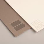
Bedroc by Perky Bros
Bedroc is a Tennessee-based consultancy firm that takes complex business issues and simplifies them with technology to reduce risk, optimise efficiency and creating revenue for its clients (ROC). The firm’s visual identity, created by multidisciplinary design agency Perky Bros, avoids the conventions of the industry and instead favours a direction that draws an analogy between bedrock and technology—the physical stability, sub-surface...