Distillery Logos and Packaging
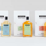
Kininvie by Here Design
The Kininvie distillery was established in 1990 as a third home for William Grant & Sons – it was initially built to relieve pressure on stock at neighbouring sites in Dufftown. Kininvie Works is a more recent development, created as an innovation arm to develop new recipes and processes. As such it is liberated from the rules and regulations that...
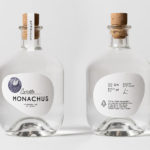
Monachus Distillery by Bedow
Atop of Croatia’s Istria peninsula, just where the land slips into the Adriatic sea sits the tiny small-batch gin distillery of Monachus. Stone shores, botanical covered hillsides, the smell of pine and scattered pin cones characterises the landscape. Drawing on this, the natural history of Istria and the name Monachus, borrowed from Monachus Monachus an endangered Mediterranean monk seal, Swedish design studio Bedow created a...
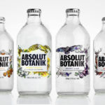
Absolut Botanik by Bold Inc.
Absolut Botanik is a new ready to drink, pre-mixed, single-source vodka range from distiller Absolut, flavoured with Scandinavian lingonberries, cloudberries and blueberries, blended with either pear, apple or lime. The range features a distinctive and bespoke single-serve bottle with a silver crown cap, and the Absolut logotype framed by rich illustrative detail. This mixes bold watercolour strokes with finer pen...
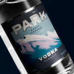
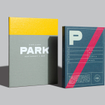
Park Distillery Vodka by Glasfurd & Walker
Park is a bar, restaurant and distillery located in the Canadian resort town of Banff, within the Banff National Park, and the province of Alberta. It is a region of diverse natural beauty, with mountains, prairies, forests and desert badlands that attract walkers, campers and skiers. Park Restaurant is a celebration of Banff’s alpine history and lifestyle. This runs throughout its interior, campfire-inspired menu and a...
Park Restaurant & Distillery by Glasfurd & Walker
Park is a bar, restaurant and distillery located in the Canadian resort town of Banff, within the Banff National Park, and the province of Alberta. It is a region of diverse natural beauty which includes mountains, prairies, forests and desert badlands, and that attracts walkers, campers and skiers locally and internationally. The restaurant is a celebration of Banff’s alpine history and lifestyle. This runs...
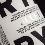
Kyrö Distillery Company by Werklig
Kyrö is a Finnish distillery, housed in a former dairy in the region of Isokyrö, that will yield a high quality 100% rye whisky in 2017 for national and international markets and currently batch produces a root variety for cocktails. Design studio Werklig was hired by the distillery to create their brand identity, which went on to include a logotype and custom typeface,...