Engineering Logos
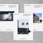
Obra Blanca by Savvy
Obra Blanca is an architecture studio, established in 2013, with offices in the Mexican city of Veracruz. The studio looks to transcend Mexico’s architectural landscape, remain independent and resistant to trends, and free to experiment and explore. It attributes a building’s value to its coherence, craftsmanship, materiality, functionality and context. Obra Blanca represents the last step in construction, the stage at which a building stops being just a structure and...
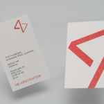
4B Arkitekter by Commando Group
4B Architects is an architecture studio with offices in Oslo, Norway, an experienced team and a holistic approach. It has a particular interest in low energy and sustainable projects, and has built a portfolio of restorations, public, cultural and commercial buildings, private housing and outdoor spaces. The studio’s team of founding partners (from its inception in 1971) and a generation of...
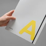
K. Apeland by Bielke&Yang, Norway
K. Apeland is a Norwegian independent civil engineering consultancy that specialises in construction technologies, and applies its experience to new builds, remodelling projects and renovation. It has a favour for steel-wood and concrete structures, which has won the consultancy a number of awards, and has a broad portfolio that covers public infrastructure, private offices and housing, as well as viewing platforms,...
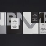
VBMS by Studio Dumbar
Visser & Smith Marine Contracting is the market leader for subsea power cable installation in Europe. It provides and lays grid-to-grid connections for offshore wind farms and similar facilities. Following investment from and partnership with dredging and marine experts Boskalis, Studio Dumbar worked with VMSC, now named VBMS (VolkerWessels Boskalis Marine Solutions) to provide strategy, brand identity and creative direction that would help launch...

Function Engineering by Sagmeister & Walsh
Function Engineering is described by Sagmeister & Walsh, the design studio behind their new brand identity, as specialising in “mechanical design and engineering for product development within, but not limited to consumer electronics, computing and networking, mobile, medical, robotics, entertainment, commercial and industrial equipment.” Narrowing in on Function’s expertise in designing hinge and linkage mechanisms, Sagmeister & Walsh designed a new...

Etxe by Blok
“Etxe is a small, innovative industrial design studio based in Mexico City. Their philosophy is to design to the very essence of a product. There is no room for extraneous elements; they believe that the beauty and artfulness of a product lies in its purest functionality. The identity itself is thus a distillation of their unique approach.” – Blok...