Extended Logotypes
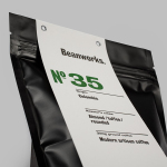
Beanworks by Paul Belford Ltd
Beanworks is a UK wholesale coffee roaster and supplier, coffee machine specialist and barista training school. It prepares its beans using a customised vintage Italian drum roasting machine that allow it to digitally monitor process, and produces a range of single and multi-origin coffee varieties. Although the roaster embraces contemporary artisanal coffee culture, when it comes to naming conventions it favours the utility of numbers,...
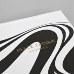
Belle Epoque by Mind Design
Belle Epoque is a French patisserie, located on Islington’s Upper Street, crafting cakes, chocolates, breads, viennoseries, tarts and quiches from high-quality ingredients in a kitchen designed to complement the unrivalled expertise of their chef. Originally commissioned to develop Belle Epoque’s website, Mind Design managed to expand the scope of the project into a full brand identity exercise that went on to include still life...
Léon Courville Vigneron by lg2 boutique
Léon Courville is a Canadian vintner growing grapes and producing wine from a 18 hector vineyard surrounding his home near Ville de Lac-Brome, Quebec. The uniquely rocky, chalky and clay soil, the region’s later farming seasons and the warmth from Lac-Brome gives Léon Courville’s wine a distinctive flavour profile, one that has secured international recognition. As well as being interested in...
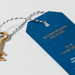
Hamptons House by Moffitt.Moffitt
Hamptons House is a Sydney based curator and retailer of furniture and homeware collections that celebrate the unexpected and draw influence from renowned New York holiday destination The Hamptons. Design studio Moffitt.Moffitt were recently engaged by the retailer to develop a new visual identity — which went on to include logo and logotype design, illustration, shopping bags, packaging, swing tags, stationery and membership key — that...
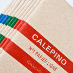
Calepino by Studio Birdsall
Calepino is a french manufacturer and brand of “traditional yet technical notebooks with an authentic vintage spirit” made from 100% recycled, locally sourced paper, covered with a cardboard from a factory with a heritage dating back to 1927 and assembled by hand. Calepino’s brand identity and print, recently designed by Florida based Studio Birdsall, juxtaposes the earthy craft textures of an...