Fabric Menu Covers
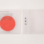
Omakase Room by Tatsu by Savvy
Omakase Room by Tatsu is a unique sushi dining experience located on New York’s Christopher Street. The concept is rooted in the centuries-old family traditions of Japanese Executive Chef and host Tatsu Sekiguchi and the celebration of the individual and personal. This can be experienced in the restaurant’s unique and intimate setting, one that seats only eight, and a menu...

Pontus In The Air by Bold
Pontus In The Air is located at Sweden’s Arlanda Airport and was developed with the intention of being Europe’s leading airport restaurant in its blend of high quality, affordable prices and fast service. It features three distinct areas, The Brasserie, a classic bistro with table service inspired by the golden days of aviation, The Market, a self-service canteen with a more utilitarian finish, and...
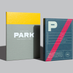
Park Restaurant & Distillery by Glasfurd & Walker
Park is a bar, restaurant and distillery located in the Canadian resort town of Banff, within the Banff National Park, and the province of Alberta. It is a region of diverse natural beauty which includes mountains, prairies, forests and desert badlands, and that attracts walkers, campers and skiers locally and internationally. The restaurant is a celebration of Banff’s alpine history and lifestyle. This runs...
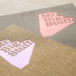
Mr Big Stuff by Can I Play
Mr Big Stuff is a Melbourne-based Southern American soul food restaurant and cocktail bar with a unique and distinctive interior designed by Technē Architecture and influenced by the music and film culture of the 1970’s and 80’s. The restaurant features an exposed concrete floor, timber and acoustic foam walls, neon signage and utilitarian furniture, as well as interior graphics and a brand identity treatment...