Designed by Face Creative
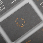
DNA Development by Face
DNA development is a New York based, privately held and vertically integrated real estate investment and development business that looks to create beautiful, functional and liveable spaces. This intention is reflected throughout their new brand identity, designed by Mexican graphic design studio Face, across business cards, stationery, notebooks and website....

Hardpop 7 Years by Face
Hardpop is an electronic music venue located in the Mexican city of Juárez. It plays host to both international and national DJ’s and has been acknowledged twice by DJ Magazine as one of the best clubs in the world. Hardpop’s brand identity, a contemporary interpretation of military insignia, and a mix of conventional and unconventional typographic forms created by graphic design...

Adrián Key by Face
Adrián Key is a San Pedro based architecture firm and architect working with the rich and famous from “one of the most exclusive corners of northern Mexico”. Design agency Face Creative developed a new visual identity for the firm with a “clean, simple aesthetic with bold and modern touches, an icon that cleverly encases the name of the brand in its design, and...

Highpark by Face
Highpark is a new residential project located in the middle of San Pedro Garza García and described by Face – the agency behind the development’s visual identity, print work and website – as ‘arguably one of Latin America’s most affluent municipalities’ and widely credited as an “architectural masterpiece”. Face go on to say that the “project needed to speak volumes about the...

Kinetica by Face
Kinetica is an international industrial design studio located in Santa Catarina, Mexico, that specialises in non-standard architectural projects. Their new visual identity, created by ‘supermodernist’ design agency Face, utilises a bold black and yellow colour palette, a straightforward sans-serif logo-type, plenty of space and a grid based collateral layout to establish a restrained and contemporary interpretation of heavy industry infused with subtle architectural cues....

Mal de Mar by Face
Mal de Mar is a San Pedro, MX based business and on-line journal where art, design, architecture, photography and travel combine. The journal’s new identity, developed by ‘supermodernist’ design agency Face, captures and binds the timeless pursuit of knowledge and experience through travel and culture with that of the modern technological world with a contemporary fusion of light, symmetrical and consistent line...