fast food branding
Yum Bun by How&How
Arguably London’s street food scene has become less a ‘scene’, more a network of long queues sprawling their way across the capital faster than you can say ‘SEVEN pounds! For some strawberries!’ From Borough to Barbican’s Whitecross Street, Spitalfields to Southbank, Camden to Covent Garden; the menus are global, the prices hefty, the hype palpable, and the branding overwhelmingly forgettable....
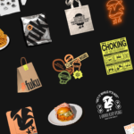
Fuku by Red Antler
Fuku (no sniggering at the back please) is a ‘fine brining establishment’ – i.e. some sort of eatery, you can safely assume – specialising in a specific type of chicken ‘sando’, or in normal language, ‘sandwich’. According to Red Antler, the Brooklyn based design agency behind Fuku’s branding, ‘the Fuku sando first hit the scene as a secret menu item...
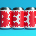
Ashton by LG2
For the rest of the world, Canada is synonymous with a few things – maple syrup; Celine Dion; wholesome, generally nice people; Neil Young; and when it comes to the realm of food, poutine (fries with cheese curds and gravy, for the uninitiated). Having opened back in 1969, Ashton is the oldest poutine chain in Canada. With 23 branches in...

Erbert by AUGE
Few countries on Earth take their food as seriously as Italy. It’s not difficult to justify the enormous pride Italians take in their spectacular culinary heritage, with their cuisine considered the ‘most exported’ on the planet. But while the wider world is undeniably in thrall, Italians’ patriotic palettes create and necessitate a notoriously conservative domestic cooking culture. Italian ingredients, recipes...
Mama Mexa by Seachange
Tacos are a Mexican staple, consisting of a small hand-sized corn or wheat-based tortilla topped with a range of fillings. They make for perfect on-the-go food, packed full of flavour. This combination of convenience (quick to make or eat) and tastiness has seen the traditional dish rise in popularity as an ideal product to package and sell in many markets....
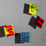
Brutal Burrito by Tres Tipos Gráficos
In 1984, the death of the wrestler Rodolfo Guzmán Huerta – commonly known as El Santo – sent shockwaves through Mexico. Over the course of five decades and 15,000 matches, the legendary fighter had captivated audiences, helping to fuel the growth of Lucha Libre around the world. Through his appearances in film, comic books and cartoons, he established himself as...
Oji by Seachange
Oji is a sushi brand of firsts. It is the first in New Zealand to use fully recyclable and biodegradable packaging and the first to use all free-range products. This is a significant move forward and marks the brand out from well-established competitors. Oji opened in New Zealand with two locations in Auckland’s Commercial Bay, a place where they source...