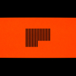
Fluorescent Paper
Northstar Film Alliance by Bond
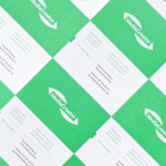
North Star Film Alliance (NSFA) is a joint venture between Estonia, Latvia and Finland. The Alliance intends to develop and promote themselves as one filmmaking region to international film and TV productions. It is a competitive marketplace, with other countries provide low tax rates and incentives to film big-budget spectacles on their stages using local crews. Together, the three countries...

Unfolded by Commission
Unfolded is a design and print festival that celebrates the creative work happening across Europe in the disciplines of design, printing and brand communication. This was held by and at The Gmund Paper Factory in Germany on the 9th November 2018. The event created a space for sharing ideas and fostering dialogue between creative individuals, providers of printing services, brand...

Galerija Kranjčar by Bunch
Galerija Kranjčar is an art gallery, located at the heart of Zagreb, opened in 2006 to showcase the work of Croatian contemporary artists and function as hub for a variety of cultural activities. The gallery is a long and unique space, one that balances the modern and historic. This can be seen in the meeting of smooth white walls, concrete floor...
Arde by IS Creative Studio
Arquitectura Diseño y Espacio, abbreviated to Arde, is a Peruvian architecture and design firm creating contemporary structures that have a strong sense of light and space, a preference for the geometric and often juxtapose exposed architectural surfaces with those that are natural and crafted. Lima-based IS Creative Studio recently worked with Arde on naming and visual identity that would link a variety of assets. These included stationery, business...
Simon Pengelly by Spin
Pengelly Design is a British furniture and product design studio, founded by Simon Pengelly in 1993, that embraces a material and process led approach to problem-solving, and an aesthetic that has a lightness, simplicity and timelessness. Since its foundation, the studio has gone on to secure and complete a variety of national and international furniture, transport and product design projects in collaboration...
Laji Hair & Make by UMA
Laji is a hair and make-up studio located in the city of Osaka, Japan, with a distinctive interior design developed by dot architects. It features chipboard dividers and mirror frames, pegboard panels, strip lighting, exposed concrete ceilings, brick walls and utilities, concrete cast with wood surface texture, red stained floors as well as custom furniture created by Ryohei Yoshiyuki. It is a...
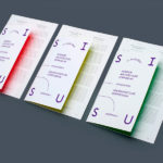
Interior Architecture Symposium by AKU
SISU was a symposium that took place in the summer of 2014 in the city of Tallinn. Organised by The Estonian Society of Interior Architects it was a place were recognised theoreticians and practitioners from Europe, Australia and Estonia met to discuss Dynamics of Theory and Practice within the field of interior architecture. The symposium’s identity, designed by AKU, leverages many...
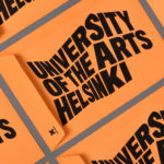
University of the Arts Helsinki by Bond
“The Finnish Academy of Fine Arts, Sibelius Academy and Theatre Academy Helsinki merged in the beginning of 2013 into the University of the Arts Helsinki. Bond created the complete branding solution for the new university. The strategy for the identity was to create a distinctive set of logotypes based on a common design language, and to introduce an anchor symbol...
MediaCreator by Lundgren+Lindqvist
Media Creator is a Swedish print production and project management company that utilises a flexible web-based system that pairs a ‘intuitive computerized system’ and translation service, with ‘alert’ and ‘friendly’ staff to streamline their entire print process. Utilising a predominantly two-tone colour palette, san-serif typography and bright contemporary illustrative detail, MediaCreator’s new visual identity, which included a new logo, stationery set and...
Griab by Kollor
Griab is a Swedish engineering firm, founded in 1957 and located in Helsingborg, Sweden, that specialises in delivering a holistic design and build service that includes land planning, wastewater management, architecture and construction. Developed by multidisciplinary design agency Kollor, Griab’s visual identity, “inspired by the the straight lines and shapes commonly seen in architecture” and created to help reinforce the firm’s environmental...