Fonts in Use: Druk
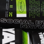
Yaté by Herefor
Long gone are the days when ‘energy drink’ connoted unwashed teenage gamers, amped up Twitch streamers, hungover/still going city boys on the Tube, or 2-4-1 deals on vodka Red Bull in sticky-floored suburban student nightclubs. Like many things – such as reading books, going for a walk, or having a bath – the energy drink sphere has now collided with...
Supertrash by Seachange
Supertrash is a family-run New Zealand-based refuse collection service that helps to divert waste from landfill by employing circular solutions; these are typically recycling, reusing or repurposing. Although small they have big ambitions and are innovative and disruptive in their approach and ideology. Since 2012 Supertrash has diverted almost 6m kg of waste away from landfill. It is a challenge posed...
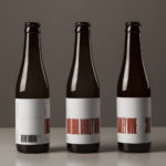
O/O Long Boil Barley Wine by Lundgren+Lindqvist
O/O Brewing is a craft brewery set up in 2011 by Olle Andersson & Olof Andersson. They presently operate out of the facilities of Stigbergets Bryggeri in the Swedish city of Gothenburg, but are due to open their own brewery in the Autumn of 2017, with the intention of increasing volume and gaining further control over quality. O/O worked with Scandinavian studio Lundgren+Lindqvist, who have created packaging design for a...
Goldsmiths, University of London by Spy
Goldsmiths is a world-renowned public research university founded in 1891 and located in south-east London. It provides a diverse programme of study, but specialises in creativity, and covers the arts, design, humanities, and social sciences. Goldsmiths’ heritage, which was reflected in its previous identity in a familiar and conventional manner, makes way for a far more current visual expression created by...