Supertrash by Seachange
Opinion by Richard Baird Posted 10 September 2019

Supertrash is a family-run New Zealand-based refuse collection service that helps to divert waste from landfill by employing circular solutions; these are typically recycling, reusing or repurposing. Although small they have big ambitions and are innovative and disruptive in their approach and ideology. Since 2012 Supertrash has diverted almost 6m kg of waste away from landfill. It is a challenge posed to and question asked of the incentives corporate firms have to build revenue streams largely around burying rubbish.
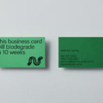
Built around the strategic positioning statement (and visible strapline) “Turning trash around” design studio Seachange developed a visual identity around the youthful, innovative and energetic disruption of what they describe as a tired and disingenuous industry. This is achieved through a striking palette of white, fluorescent pink and black, the tall condensed letters of Commercial Type’s Druk, an explosive graphic device and spherical spinning logo. These are applied across and link tote bags, lorry livery, business cards, mailers and website.
The visual identity flows from the concept and ideal of a low impact circular economy. Graphically it is a simple combination of colour, type and form but there a bunch of nice ideas at play throughout.
The bold and condensed forms of Druk, printed in a fluorescent pink, running off the edge of printed communications and right up against the edge the screen all support a position of bold action, disruption and change (think of the visual vernacular of protest), and, to some degree, allude to repurposing, as though the printed materials had been cut from something else.
Copywriting, “Trash Talk” for their blog heading, and “Dirty Talk for Great Good” as well as tone of voice online, also support their purpose, and recognise the often unpalatable thought of refuse collection and sorting. For most people, their thoughts go no further than the household bin, so this kind of play is invitation through playful double meaning. The visual language of a pink explosion, one that you might associate with a comic and neatly ties to the super prefix, functions as a useful secondary device, a gesture of disruption, this works well in pink across the surface of a refuse lorry.


The logo is particulalrly neat. It manages to reference a global problem and the notion of the circular economy through form language, and is a smart visual element that flows from the positioning statement “turning trash around” in its motion onscreen. Further, in its three-dimensional rendering allows it to sit over and stand out from various communications, whilst sharing commonalities with the type style. Words and shape given it an effective form language that can be applied in single colour across a variety of contexts including the limitations of bin. As an isolated graphic device, it looks neat stitched into a cap and emblazoned across t-shirts, capturing something of the 70’s environmental movements. The colour palette also has something of a 70s psychedelia to it but with a modern reductive attitude.


Supertrash is a small company trying to make a big impact, and the visual identity manages to capture this spirit in colour, type and form language. Animated, the logo gives the impression of continual action, just as the earth does not stop spinning. Freed from the green and blue of environmental action it leans far more towards the energy of youthful and modern upstart, shouting out on the street, demanding attention. In the visual identity’s context, across the side of a refuse lorry, it is a provocation to find out more.


Merchandise helps reconfigure the choice of waste management service into something of a lifestyle choice, and display this choice openly and proudly. Visually identity serves as a unifying rallying call that connects waste conscientious people and employees. The bright pink is a tough one to pull off, but when the message is clear, and the ideology compelling, it can work. Seachange’s approach also serves a larger narrative as it is documented as a graphic design project online, then shared and reposted. That the message of the company migrates internationally and inspires others. More from Seachange on BP&O.
Fonts: Druk & Graphik Regular