Goldsmiths, University of London by Spy
Opinion by Richard Baird Posted 23 October 2015

Goldsmiths is a world-renowned public research university founded in 1891 and located in south-east London. It provides a diverse programme of study, but specialises in creativity, and covers the arts, design, humanities, and social sciences.
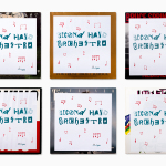
Goldsmiths’ heritage, which was reflected in its previous identity in a familiar and conventional manner, makes way for a far more current visual expression created by British graphic design studio Spy. This included an unassuming sans-serif logotype, a bold and expressive typographical system based around the font family Druk, a revised tone of voice and bright spot colour alongside those that are described as subdued. This unites a variety of print communication including, but not limited to, posters, postcards and welcome packs.

The change, which moves from rigidity to one of flexibility, tradition to modernity, reflects a significant shift in positioning and a desire to able to communicate with both a diverse and specific target audience in a more distinctive manner, tell a story and convey the values of a university made up of a tightly nit community of staff and students as always learning and always questioning.
This is achieved through polarity, typographically using extended and condensed letterforms, bright and dark colour, a mix of full bleed and thumbnail imagery, and language choices that move between the serious and convivial, formal and informal, statements and questions, the implicit and explicit, and from the esoteric to the more general.
Inspired by ‘socio-political’ posters, type is effectively used as compelling and impactful image, and as a vehicle for concise statements that make up the university’s new tone of voice. The serif flourishes of Publico draw on the university’s heritage, and continues to play with disparity, while the restrained and nuanced qualities of Graphik secures a current yet functional foundation from which to set body copy.


Druk and its 22 weights are used with great confidence throughout. Although there is a logotype consistently and abundantly applied, it is unassuming, with identity largely coming through the Druk’s idiosyncratic character. Its implementation in print and the use of further contrast in colour, language and image size, as well as the layout of posters, make sure that there is an identifiable Goldsmiths brand identity and not just the personality of Druk, which although relatively new, has already been picked up by a number of high-profile magazines.

A juxtaposition of condensed and extended letterforms, and the use of shallow and sharp angles, which appear to be squashed, stretched and thrown about, emphasised by arrows, gives the robust qualities of Druk a surprisingly energetic and dynamic quality. This also runs through a colour palette of vivid spot colours, effectively drawn out further with light and dark backgrounds.
Cropped thumbnail photography and full bleed panels, profile shots and abstracts, collage-like qualities, bold image and fine type, and a grid based structure but with moments of divergence, mix distinctive visual impact with communicative detail up close, variation as well as a consistency and cohesion. This is, however, completely missing from the website, which favours the formal, and a token use of Druk.

The result is thoroughly contemporary, bright, youthful and full of energy, with a little of a modernistic, show poster, jazz undertone. Heritage is very nearly entirely discarded yet remains within the name, something that is likely last. It is visually impactful but with a clear voice and set of messages. Although predominantly built around a single font family there is an expressive and communicative breadth to the work in its use of contrast and extremes across colour, type and language. These choices make it communicatively agile but cohesive with a memorable visual character. More from Spy on BP&O.
Design: Spy. Opinion: Richard Baird. Fonts Used: Druk, Graphik, & Publico