
Tulura by Build
Tulura is an independent luxury botanical skincare brand created Eileen Feighny, a former professional model brought up in Korea and now working from New York. The first of Tulura’s products is a two-step moisturising program that includes a vitamin peptide serum and a botanical facial oil made from seasonal ingredients hand picked and custom-blended. Ingredients are chosen for their effectiveness, and formulations created without the use...
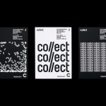
Collect by Spin
Collect is an international art fair that this year took place between the 2–6 of February at London’s Saatchi Gallery. Presented by the Crafts Council, Collect gave visitors the chance to see and buy museum-quality and contemporary ceramics, glass, jewellery, wood, metal and textiles created by established and emerging artists and makers represented by over thirty of the world’s best galleries. Collect’s...

Lundén Architecture Company by Tsto
Lundén Architecture Company is a Helsinki-based design studio developing innovative structures, infrastructures and spaces. The studio, through their knowledge of strategic development, experimental building technology and urban design, drawn from their collaborations with experts from different fields, offer proposals that affect the future of the built environment. Projects have included a new school and community complex that inspires learning during...
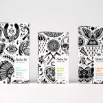
Electric Ink by Robot Food
With the rise in the popularity of tattoos and the lack of credible long-term care products, Leeds-based design studio Robot Food formulated, branded and packaged Electric Ink, a tattoo care range for the mainstream market. The range includes a serum that enhances colour, an oil that delivers a freshly-inked look, and a daily moisturiser. Each feature distinctive packaging design that draws on...
Blackhorse Lane Ateliers by StudioSmall
Blackhorse Lane Ateliers is a UK-based premium selvedge and organic raw denim jeans brand. It was founded in 2016 by Han Ates, who has over 25 years experience in the textiles industry, and is located in a renovated 1920s factory building with a distinctive profile in Walthamstow, North London. Blackhorse Lane Ateliers is committed to implementing a sustainable and ethical production model....
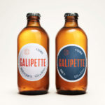
Galipette Cidre by Werklig
Galipette is a premium cidre made from 100% pure fermented apple juice (pur jus) pressed from apples that are hand picked from orchards in Brittany, Northwest France. Galipette is available as a Brut and a sweeter Biologique. These are free of gluten and added sugar and created for the international markets of Europe, North America and China by the Cider Supply Company,...
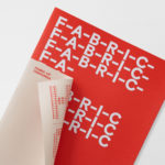
Fabric of Onehunga by Richards Partners
Fabric is a residential property development project and new pocket neighbourhood within the area of Onehunga, one of Auckland’s oldest suburbs and a brownfield site of warehouses with a light industrial heritage. Developers Lamont and Co., alongside Colliers International, commissioned graphic design studio Richards Partners to create a brand identity for the development that would link brochures, specifications pack, website and a variety of print communications for the...

Galerija Kranjčar by Bunch
Galerija Kranjčar is an art gallery, located at the heart of Zagreb, opened in 2006 to showcase the work of Croatian contemporary artists and function as hub for a variety of cultural activities. The gallery is a long and unique space, one that balances the modern and historic. This can be seen in the meeting of smooth white walls, concrete floor...
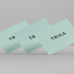
Trika by Bunch
Trika is an interior design company, working on both public and private spaces, with a showroom and studio in the Croatian capital of Zagreb. They represent furniture and equipment manufacturers such as Billiani, Enea and Federicia, amongst many others, whose brand names are described as being synonyms for quality, comfort and design. Graphic design studio Bunch worked with Trika to develop a new brand identity....

Run Mfg by Perky Bros
Run Mfg is an independent race design and production company, creating unique running events with a high-level of detail and creativity, founded by husband and wife team Nathan Barnhart and Elaine Lau working from their studio in Chicago. Nathan and Elaine commissioned graphic design studio Perky Bros to develop a brand identity that would link a variety of printed collateral,...

In Search Of The Present at EMMA by Werklig
In Search Of The Present is a new series of exhibitions on a 3–4 year cycle held at Helsinki’s Espoo Museum of Modern Art (EMMA). These intend to tackle many of the existential questions that we face in an ever changing world. The first exhibition, inspired by Olavi Paavolainen’s essay collection from 1929, took place between October ’16 – January ’17 and was a study in the representations...
Vi Novell 2016 by Atipus
Vi Novell 2016 is a young wine from Catalonia with an intense ruby colour and a fresh and fruity flavour profile. It is the seventh in an ongoing series, and is dedicated to the party; the open-air dance, the joy and celebration of the beginning of the season, the first sip of wine, shared with friends, and the continued enjoyment of a long tradition...