Gold Ink
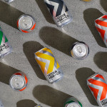
Detour Beer Co. by Weave
Craft beer has become a hugely competitive market to enter. It seems a rather obvious thing to write, but it’s quite something to have been part of the generation that saw its rise. It’s also provided a lot of great imagery for design blogs, and moved freely between both brand building and just plain visual delight. To see large fridges within...
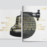
Brigade Court by Jack Renwick Studio
In The London Borough of Southwark sits the Grade II listed building and former headquarters of the London Fire Brigade, the city’s first fire station and a site currently under development. This will see it transformed into residential apartments with period conversations of the original Victorian building alongside a modern new-build. It is a one-of-kind property development that offers a...
Allsorts Black & White Edition by Bond
Bond continue to work with Scandinavian confectionery brand Cloetta, owner of liquorish brand Allsorts, on the packaging for their Allsorts Black & White edition. The packaging for Allsorts’ originals range looked to bring the distinctive shapes and colours of the liquorice to the forefront using geometric forms and bright colour, enhanced by the black background of a simple card box. It was an approach rightly described...
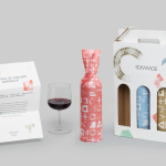
Sommos by Mucho
Summos is an online platform that gathers together and shares the knowledge of the six best sommeliers of the Netherlands and offers a seasonal subscription service that sends out a selection of some of the country’s best wines once every two months. Sommos worked with graphic design studio Mucho to develop name, brand identity and packaging. Based around the concept of group and innovation, and clearly informed...
Farah by Post
Farah is a men’s fashion brand with a seasonal catalogue of shirts, polo shirts, knitwear, jackets, footwear, bags and accessories available online and from high street and department store premises in the United Kingdom. Following two years of collaboration, London based graphic design studio Post were commissioned by Farah to refresh its visual identity, from tags, retail concept, internal communications and art...
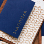
Madrina by Mast
Madrina is a Dallas based Mexican restaurant with a menu that plays with French culinary influences and Mexican tradition. The restaurant has a distinctive interior of exposed concrete beams, delicate gold light fixtures, leather upholstered chairs, beveled mirrors and tiled flooring. Like the menu, the interior is a fusion of influences, yet remains cohesive and distinctive. American graphic design studio Mast set out to...
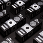
Latin American Design Festival ’16 by IS Creative Studio
The Latin American Design Festival is an organisation that promotes Latin American Design internationally and looks to highlight the social potential of design using lectures, workshops, exhibitions and complementary activities. This year’s festival, as with previous events, took place in the Peruvian city of Lima, with guest speaks that included Stefan Sagmeister, Yuko Shimizu and Stockholm Design Lab. IS Creative Studio, who worked on LADFest’s 2015 visual identity, continue to...
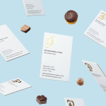
Bombonería Pons by Mucho
Bombonería Pons is a family owned Barcelona based business, established in 1960, dedicated to producing the finest handcrafted chocolates. With a desire to engage with a younger consumer Bombonería Pons worked with international graphic design studio Mucho to develop a brand identity that would be sensitive to its traditional values and history yet give it a contemporary appeal. This extended across packaging, brochure, stationery, business cards and...
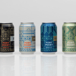
Fort Point Beer Co. by Manual
Fort Point is a San Francisco-based small batch craft beer company that references traditional styles yet is firmly rooted in the present, and has a philosophy that values craftsmanship and innovation, creativity and technique. In 2015, working with local graphic design studio Manual, Fort Point launched a new graphic identity and packaging system to unite its expanding range. Fort Point’s forward-thinking, fast-growing...
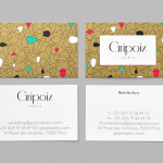
Gripoix Paris by Mind
Gripoix is a Parisian costume jewellery manufacturer with a significant history, one that stretches back to the late 19th Century and the Art Nouveau period. Gridpoix’s pieces are created using a traditional kilncasting technique, known as pate de verre, which sees molten glass poured into a thin linear framework, giving each a luxury and uniquely crafted quality. This traditional process, and the period in which...
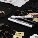
Scotland Can Make It! by Graphical House
Scotland Can Make It! is a limited edition collection of souvenirs, created by leading Scottish designers and artists in collaboration with manufacturers from across the country, for the Glasgow 2014 Commonwealth Games. The souvenirs are described by Graphical House, the design studio behind the collection’s brand identity and website, as being part of a programme of events that celebrate ‘Scotland’s cultural heritage, creative...
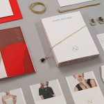
Mark Milton by ico Design
London-based design studio ico Design have recently completed their brand identity work for Mark Milton, a jeweller with a family heritage within the industry that dates back to 1947, and who carefully selects and retails a range of necklaces, earrings, bracelets and rings for women. Bound by the theme of curation, ico Design’s solution provides the Mark Milton brand with a high quality communicative breadth...