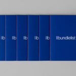
Bundlelist by Bunch
Bundlelist is an online platform that simplifies and draws together international mobile bundle costs, with a specific focus on mobile retail data, and facilitates comparisons between countries and mobile operators. Design studio Bunch worked to develop UX, UI and visual identity for the platform, which included logotype and a bundle of promotional notebooks....
High Street Wine Co. by Conductor
High Street Wine Co. is a wine bar and shop located in the Pearl neighbourhood of San Antonio, Texas. UK-based graphic design studio Conductor, working closely with architects Dado Group, created a visual identity that expresses something of the cheerful personality of its hosts, the ambience and community of a busy bar and its distinctive interior design. Drawing on the name for...
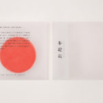
Omakase Room by Tatsu by Savvy
Omakase Room by Tatsu is a unique sushi dining experience located on New York’s Christopher Street. The concept is rooted in the centuries-old family traditions of Japanese Executive Chef and host Tatsu Sekiguchi and the celebration of the individual and personal. This can be experienced in the restaurant’s unique and intimate setting, one that seats only eight, and a menu...
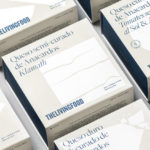
The Living Food by Francesc Moret Studio
The Living Food is a Barcelona-based grocery store and deli stocking organic and vegan foods. Francesc Moret Studio worked with the store to develop a packaging design for its range of nine vegan cheeses. Drawing on the brand’s established visual identity of silhouettes, the studio built a visual language with a bold graphic style, typographical detail, and a modern and distinctive...

Don Alonso de Suquía by Bermudez, Porta & Casasus
A. Lozano Rodríguez, in his novella Don Alonso de Suquía, writes of the deeds of swordsman and fictional character Don Alonso de Suquía after the reconquest of Granada, at the beginning of the 16th century. This limited edition cover, designed by Barcelona-based Carlos Bermudez, Albert Porta and Guillem Casasus, touches upon location, period, theme and limited edition context using colour, type, material and finish....
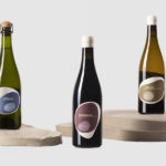
Pepe Raventós Natural Wines by Mucho
Bastard Negre, Xarel·lo and Ancestral are a small batch natural wine collection created, with minimal intervention, by Spanish vintner Pepe Raventós. Although Pepe is in charge of a vineyard that has been in his family’s hands for over 22 generations, and maintains the philosophies of his father and grandfather, this small collection was produced in the garage of his house,...

Kosmopolis by Hey
Kosmopolis is a five day literature festival that takes place in Barcelona every two years, but also has a programme of ongoing events in between. The festival, since 2002, has been organized by the exhibition and arts centre Centre de Cultura Contemporània de Barcelona, and intends to promote literature in its many different forms. It does this through a series of talks and...
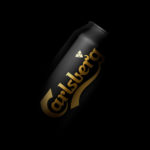
Carlsberg Black Gold by Kontrapunkt
Carlsberg is a Danish beer brand founded in 1847 by J.C. Jacobsen. It is part of the Carlsberg Group portfolio which also includes Tuborg, Kronenbourg and Somersby cider, as well as Carlsberg Export and Carlsberg Black Gold. Carlsberg has a significant heritage. And, like many other beer brands, has largely conveyed this using the visual language and associated legacy of the beer...

Kristin Jarmund Architects by Snøhetta
Kristin Jarmund Architects is an oslo-based architectural studio with a design philosophy that is focused on using a simplicity of form and a clarity of purpose to address complex problems, while at the same time, allowing for a contextual and human sensitivity. Reduction, as well as the duality inherent to the studio’s work, was the founding principles of their new...
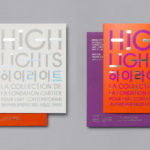
Highlights by Studio fnt
Highlights is an exhibition of works from French contemporary art museum The Collection of the Fondation Cartier pour l’art contemporain at the Seoul Museum of Art (SeMA). The exhibition runs from May 30th to August 15, 2017, features work by artists such as Ron Mueck, David Lynch and Sarah Sze, and also includes commissioned pieces and major artworks by Korean artists. Highlights is curated...

June’s by Föda
June’s is a cafe and bar located on the corner of South Congress Avenue, Austin, Texas. It offers breakfast, brunch, and grab-and-go pastries and coffee throughout the morning, and has an all day bistro menu that is served late into the evenings. The bistro menu is complemented by a changing wine and bar program managed by Master Sommelier June Rodil. June’s...

REF by Kurppa Hosk
REF is an environmentally conscientious Swedish hair care brand with a range of products that are made from high quality organic ingredients. With a desire to enter the international market of the US and further into the Nordic regions, both dominated by well-established FMCG, Scandinavian design studio Kurppa Hosk were commissioned to rejuvenate REF’s visual identity. This included packaging design, art...