Fitness, Health and Beauty
Creative Spark’s bold, no nonsense identity for hair loss brand Leo
Leo is billed as a “hair rejuvenation brand”,founded by duo Jason Saks (who carries the rather sweet, and quite funny job title of Director of Hair Loss) and his son Joe, with the broad aim to make hair loss feel “less isolating and less complicated”. According to Manchester-based design agency Creative Spark, which has created the superb new identity,...
Six Six by A Friend of Mine
Six Six is an eyewear store and optometrist based in Melbourne, which opened early this year with the aim to be “more like a destination than a store”. Tasked with creating the brand identity to make that happen was A Friend of Mine, or AFOL for short (Embla, Great Wrap, Suupaa), a brand design studio also based in Melbourne which...
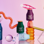
Nu-clear your skin
Juana is a Dubai-based company creating CBD-based “bioactive” skincare, founded by Yann Moujawaz Martini, a French-born entrepreneur with Syrian roots and a background in brand strategy or – as he himself put it in an interview – “a decade designing multibillion-dollar wellness and medical tourism mega-projects for governments and Fortune 500s”, after which, he says, he “flipped the script” and...
Cute, curious and cuddly
Fitness and health tracking apps are not generally known for their sense of fun. The likes of MyFitnessPal, while great in terms of functionality, for the most part, keep the design stuff resolutely serious, no-nonsense, and perfunctory. Meanwhile the likes of Strava elicit joy through very few things, the main one being when people decide to run in a shape...
Free your mouth
You don’t really hear the word ‘quip’ all that often – it feels somewhat antiquanted in a way, a little eccentric, somehow very English. The sort of thing gracing the cover of the sort of book someone bought as a gift for someone they don’t really know very well, nor particularly care about – maybe 101 of Oscar Wilde’s Wittiest...

Equipped for Life
The protein market has absolutely boomed in recent years – a trend that doesn’t look as though it’s going away any time soon: a 2025 survey from the US-based International Food Information Council (IFIC) revealed that the most common diet that Americans followed in the past year was “high protein”, and that consumers use “good source of protein” as the...
Mix and Match
Ten or so years ago I’d wager that most of us hadn’t even heard of padel, but the tennis-adjacent pursuit has boomed in recent years: there’s reportedly a whopping 30 million padel players worldwide, as of stats from late 2024. Despite the fact the name sounds somewhat Ye Olde-ish – it wouldn’t be surprising to see a reference or two...

Evil Ray by Seachange
Until fairly recently, arguably sunscreen brands have had to do little in the way of brand design. Instead, they’ve been able to coast along relying on their credentials alone – and the fact that (in the UK at least) there hasn’t been a ton of competition. Things have been largely almost medicinal and rigidly adherent to category tropes: orange, yellow,...
Cocolab by Wedge
It’s pretty hard to get excited about dental floss. Oral care, for the most part, lives firmly in the realm of obligation rather than desire, a twice-daily chore that sits somewhere between setting your alarm and taking the bins out. It’s precisely this emotional dead zone that Cocolab (formerly Cocofloss) set out to disrupt when it was founded in California...
Current State by Werner Design Werks
Current State is a skincare line launched by sisters Emily and Lanie Parr a couple of years back, which aims to “disrupt the status quo”, according to Werner Design Werks which created its boldly multicoloured branding. There’s a lot to love about this packaging and brand design – not least, that expansive approach to colour. It seems that Werner Design...
Project Send by Foreign Policy
Since their advent, kinetic and variable type have become a familiar part of the lexicon of brand design. It’s little surprise really: they offer a way to make an identity consistent yet dynamic; uniform but multifarious; endlessly flexible with countless opportunities to modify mood, tone, and messaging. But few projects seem to use kinetic type as a way to visually...

To My Ships by Formafantasma
There’s something almost monk-like about the branding for To My Ships, a new personal care brand founded by Daniel Bense. As former Head of Commercial at Aesop and Managing Director at Sunspel, Bense is clearly a man who understands that today, luxury isn’t about bling, gold ornamentation, and gauche, showy baubles; but about minimalism and understatement, and things that smell...