Holographic Block Foil
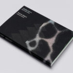
Leandro Erlich: Both Sides Now Catalogue by Studio fnt
Both Sides Now was an exhibition of works by Argentinian contemporary artist Leandro Erlich. This took place at the Seoul Museum of Art between December 2019 and March 2020. Erlich’s installations employ mirrors, reflective surfaces, water and other materials to form optical illusions with the intention of transforming familiar, everyday spaces. Studio fnt worked to develop an identity for the exhibition that would...
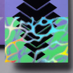
Leandro Erlich: Both Sides Now by Studio fnt
Both Sides Now, a title borrowed from Joni Mitchell’s famous song, is a solo exhibition of Argentinian contemporary artist Leandro Erlich’s work that took place at the Seoul Museum of Art between December 2019 and March 2020. Erlich’s installations, often receiving international acclaim, mirrors, reflective surfaces, water and other various materials to create optical illusions to transform familiar, everyday spaces such as...
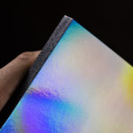
Next To The Ocean by Lundgren+Lindqvist
Valand Academy in Sweden offers a complete range of undergraduate, postgraduate and artistic research opportunities. This is a unique educational environment, the only one of its kind in Sweden. Next to the Ocean is an exhibition of works created by 23 of the students from the BFA, MFA and research programmes, which was held at Röda Sten Konsthall in Gothenburg. The exhibition serves...
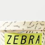
Zebra Dream by TCYK
Zebra Dream is a range of organic, soy and dairy-free coconut based ice-creams made from fair-trade ingredients. With a desire to capture a larger portion of the market whilst retaining its die-hard following, Australian design studio The Company You Keep (TCYK) reimagined the brand from the ground up, redesigning Zebra Dream’s graphic identity and packaging, taking it from a dark pack with a...
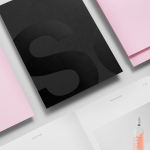
Studio South by Studio South
Studio South, formerly APLUS, is graphic design studio working within the fields of brand identity and packaging from their office in the city of Auckland, New Zealand. In conjunction with a new name and site launch, which coincides with the expansion of studio space, South have also developed a new visual identity treatment. This extends across business cards, folders and headed paper, a...
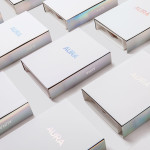
Lorient — Aura by Believe In
Aura is a new range of high end products from door sealing system manufacturer and specialist Lorient. These include drop seals, perimeter seals, door bottom seals, threshold plates and ramps designed with a distinctive curved profile that is described by Lorient as creating a sophisticated visual aesthetic that also spreads and diffuses sound. Design studio Believe In recently worked with Lorient to develop a brand identity for...
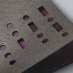
Club at South Place Hotel by This Is Colt
Club is an exclusive private members area hidden from the public within London’s South Place Hotel. Its visual identity, developed by This Is Colt and designed to establish a connection with the parent brand but with “a personality of its own”, is built around a logotype constructed from the same contemporary, condensed sans-serif characters of the hotel’s identity but is paired with a morse code...