Homeware

Parkette by Kinoto
Cute, bright, and striking; there’s very little not to love about this identity for Parkette. Based in Hamilton, Canada, Parkette is billed as a boutique shop ‘dedicated to kids and the kids at heart’, selling crafts kits, clothes, accessories, books, homeware, toys, and ‘other treasures’. The name is taken from a term many locals in Hamilton use to describe a...
NAU by Toko
NAU is a new Australian furniture brand created by the premium designer furniture and lighting retailer Cult, and features work by futurist designer Gavin Harris and Adam Goodrum, a designer that believes an object justifies its existence through story and detail. Design by Toko worked with Cult to develop name, and create a logo and graphic identity for NAU that...
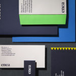
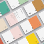
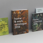
Enea by Clase bcn
Enea is a contemporary furniture manufacturer, located in Spain’s Basque Country, collaborating with respected designers such as Josep Lluscá, Gabriel Teixidó and the trio Lievore Alhterr Molina. Enea has a distinctive catalogue of versatile, comfortable and durable products, developed for both the private and commercial markets, with unique character in their play with form, colour and texture. With a desire to differentiate...
Blå Bär by BVD
Blå Bär (Swedish for blueberries) sells a variety miscellaneous goods from Scandinavia from its store in Osaka, Japan. These include, but are not limited to, glass and kitchenware, soft furnishings, ornaments and jewellery. Many of these could be described as having something of a shared Scandinavian simplicity of form, lightness of colour, natural material quality and cheerful character in pattern...
Artek Helsinki by Tsto
Artek is a Finnish furniture and product design business and retailer with a flagship store in Helsinki. It was founded in 1935 by architect Alvar Aalto and wife Aino Aalto, the arts promoter Maire Gullichsen and art historian Nils-Gustav Hahl. Artek grew alongside and shared many of the qualities of the 20th century modernist movement, blending art and technology, and making the...
Modern by Dwell Magazine by Collins
Modern by Dwell Magazine is a new range of home decor products, tablewear and furnishings for those who want to create a welcoming space with a modern aesthetic. It is a collaborative project between design and architecture magazine Dwell, designers Chris Deam and Nick Dine of Deam+Dine, and the American retailer Target. The range features over 120 products. From chairs, tables and glassware to kitchen utensils,...
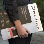
Norwegian Structure by Bielke & Yang
Structure is an exhibition of Norwegian contemporary crafts and design that began its European journey at Milan Design Week in April 2017 and is currently being held at Norwegische Botschaft in Berlin until April 2017. The exhibition features the work of 26 designers and studios, and covers a variety of products and prototypes; from furniture to lighting, to ceramics, textiles and home accessories....
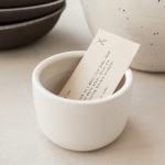
Natasha Alphonse Ceramics by Shore
Natasha Alphonse is a ceramic artist raised in the Saskatchewan province of Canada who now works from a studio in the US city of Seattle. Her ceramics are characterised by a mix of simple forms, irregular surfaces and an earthiness in colour and texture. With a desire to scale her brand into a viable business Natasha worked with American graphic design studio Shore to develop...
WallpaperSTORE* by A Practice For Everyday Life
WallpaperSTORE* is the online store of UK architecture, interior, fashion, art and contemporary design magazine Wallpaper*. It features and ships worldwide a broad but tightly curated catalogue of tabletop, lighting, desktop, stationery, grooming, technology and travel objects. Many of these objects, while individually distinctive, share a sense of contrast; in form and finish, materiality and colour, but also in their contemporary crafted quality....
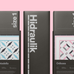
Hidraulik by Hey
Hidraulik is a Barcelona-based business producing floor mats, table mats and runners for contemporary spaces. These are inspired by cement panels hydraulically pressed, rather than fired, with a layer of coloured pigment. Hydraulic panels originated in the 1850’s and experienced a resurgence in the mid 20th century. At that time they would often feature brightly coloured and detailed patterns, and were popular during an era of...
Smithey Ironware Company by Stitch
Smithey is an ironworks producing kitchenware from its location in Charleston, South Carolina. Smithey’s first product, a 10 inch skillet, features a smooth, non-stick cooking surface, created using a handcrafted method of finishing and polishing. This process was developed in response to the rough, coarse and sandpaper-like finish that proliferates the ironware market, which creates an uneven surface temperature, makes it...
Arco by Raw Color
Arco is a family run contemporary furniture design and manufacturing company that currently rests in the hands of fourth generation family members, and has a respectable 110 year history. Arco has tables and chairs at the heart of its collection and specialises in woodwork, a reflection of its location in Winterswijk, an area of dense natural woodland in East Netherlands. Eindhoven-based graphic design studio Raw Color worked with Arco Creative...