
Plow by Perky Bros
Plow is a Tennessee based customer acquisition service and telecom/energy contractor for the large to mid-size business sector. Their identity, created by multidisciplinary design agency Perky Bros, neatly communicates the experience, professionalism and advisory nature of Plow’s service, the commodities they manage and their renewable energy options through a logo-type built from a stencil cut serif typeface and apostrophe detail set...
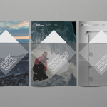
New Zealand Antarctic Research Institute by Richards Partners
Established in 1996 The New Zealand Antarctic Research Institute is the body responsible for developing and managing New Zealand’s scientific research and conservation activities in Antarctica, Southern Ocean and Ross Sea region while also raising ‘public awareness of the international significance of the continent’. The institute’s new identity, which replaces an illustrative fern and penguin mark, was designed by Auckland-based...
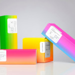
Bermellón by Anagrama
Bermellón is a Mexican confectionery shop that specialises in the premiumisation of traditional spicy treats typically sold on street markets. The shop’s identity and packaging, designed by Anagrama, fuses a bold and intense fluorescent colour palette with the fine detail and craft qualities of an adhesive label....
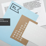
Paul Loebach by Studio Lin
Paul Loebach is a Brooklyn based three dimensional designer who specialises in product, furniture and emerging manufacturing technologies. His new identity, developed by Studio Lin, is a wonderful union of craft, structure, space and geometry that neatly reflects his use of both traditional materials and contemporary processes....

Nuts.com by Pentagram
Originally established in 1929 as the Newark Nut Company, Nuts.com is a family owned on-line retailer of nuts, dried fruit, snacks, chocolate, tea and coffee. Following a recent url change, international design agency Pentagram, lead by partner Michael Bierut, created a new visual identity and packaging solution ‘that would help establish Nuts.com as a distinctive brand’. Based around a bright and distinctive colour palette,...
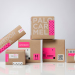
Caramela by Anagrama
Caramela is a Monterry-based chocolate boutique and caterer that creates traditional treats inspired by European pastries. Their identity, designed by independent design agency Anagrama, is an unusual but striking mix of a sweet neon pink and clinical white, a subtle 80’s retro-fashion polkadot pattern, the practical/industrial and craft aesthetic of an unbleached and uncoated substrate, adhesives and white screen print, finished with a simple but...
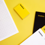
Kinetica by Face
Kinetica is an international industrial design studio located in Santa Catarina, Mexico, that specialises in non-standard architectural projects. Their new visual identity, created by ‘supermodernist’ design agency Face, utilises a bold black and yellow colour palette, a straightforward sans-serif logo-type, plenty of space and a grid based collateral layout to establish a restrained and contemporary interpretation of heavy industry infused with subtle architectural cues....
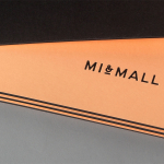
Mi&Mall by Atipo
Mi&Mall is an online shopping destination and resource that brings together and supports small to medium designer brands for people interested in fashion, trends and exclusive collections. Based around a simple logo-type, ampersand, a pale colour palette and a tactile print and material choice, Mi&Mall’s visual identity, created by Spanish multidisciplinary design studio Atipo, mixes high fashion and boutique craft...
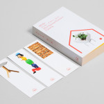
Minke Design Store by Studio Lin
Minke is a Tokyo homeware store that stocks hard to find designer objects and furniture. The store’s identity, created by New York based design firm Studio Lin, neatly resolves the classic and the contemporary, the structured and the anarchic, creativity and practicality through a union of bold serif, modernistic structure, random geometric detail and a bright but restrained primary colour palette....
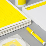
Ideo Architekci by For Brands
Polish design studio For Brands (formerly Artentiko) have published images of their latest visual identity project commissioned by Wrocław based architectural studio Ideo Architekci. Based around a modular and dynamic grid based framework, modernistic typeface and a bright industrial colour palette, Artentiko’s solution manages to capture the fundamental aspect of architectural planning and a consistent but expansive approach....
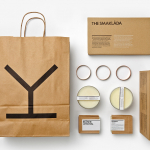
Spritmuseum by Stockholm Design Lab
Spritmuseum (formerly Vin & Sprithistoriska Museet) is a Stockholm based art gallery, museum, tasting room, meeting-place, bar, restaurant and open-air café with a unique spirit theme. Its new identity, developed by multidisciplinary design agency Stockholm Design Lab, is based around a bold word-mark constructed from a typeface now synonymous with the Absolut brand (and Swedish design) and pairs it with a simple but iconic four stroke...
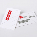
Modhouse by A Friend Of Mine
Modhouse is an Australian design and building firm that specialises in sustainability, modular construction techniques and interior design. The company’s new brand identity, created by holistic design studio A Friend Of Mine, visualises their specialist approach with a set of elemental and geometric containers, bold sans serif typography and a colour palette that juxtaposes bright creative colours with warm architectural greys....