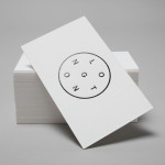
Longton by Longton
Longton is a Melbourne-based multidisciplinary design studio, established in 2012 by Michael Longton, that offers its clients holistic design solutions built on Michael’s past experience—under his previous agency And—with large, international businesses such Sony Music, Billabong, Stussy and Warner Music. The studio’s brand identity—an unusual, modernistic arrangement of neutral sans-serif characters, recurring circular forms and a single consistent line weight forming a logo—has a...
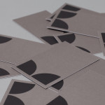
K2LD Architects by Studio Hi Ho
K2LD is a small Melbourne-based architecture and interior design firm with a project history that includes individual private homes, community precincts, multi-unit developments and large-scale commercial projects. The firm’s identity, an abstract, structural and modular amalgamation of initials (check the ideation animation here), uncoated materials and a monochromatic colour palette – developed by brand and communication studio Hi Ho – unapologetically embraces the established and reductionist cues of the industry....
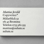
Mattias Jersild by BVD
Of all BVD’s recent projects, which includes their packaging for 7-Eleven – a blog favourite this and last week -, it is their work for Swedish copywriter Mattias Jersild that really stood out for me. It is an incredibly simple but wonderfully laid out, spaced and restrained solution that introduces variety through an interesting mix of lowercase, sentence case and uppercase typography set...
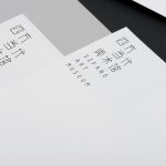
Sifang Art Museum by Foreign Policy
Sifang Art Museum is a gallery and creative space located in the Pukou region of Nanjing, China dedicated to art, architecture and international collaboration. Their visual identity, a bilingual logo-type set across a collateral of unusual trapezoidal cut detail and monochromatic colour palette—developed by Singapore-based creative and strategic design agency Foreign Policy—draws together the themes of architectural space, the dimensionality created by light and shadow,...